— Website REdesign —
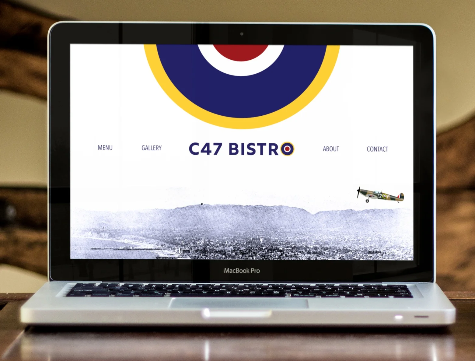
C47 Bistro
Aviation + American Cuisine
C47 Bistro is based on an aircraft-themed restaurant located at the Santa Monica Airport. Opened in 1991, the restaurant pays homage to the Douglas Aircraft factory which once occupied a portion of land upon which the Santa Monica Airport now sits.
This website redesign taps into that aviation history while shedding the outdated 1990s look and feel of the original site. It playfully brings the site into the 21st century while showcasing the quality food and welcoming decor found at the restaurant. (A side-by-side comparison of the original and revised design can be seen at the bottom of this page.)

Video: Desktop/Laptop
Because web design in the 90s didn’t predict the future world of mobile devices, those site designs are difficult to read on mobile. So aside from giving this website a fresher, more contemporary look, it also needed to be made responsive in order to accommodate the numerous and varied devices people now use.
Video: Responsive/Mobile
Original vs Redesign: A Comparison
The following side-by-side comparisons explicitly show how the redesign has changed from the original website.
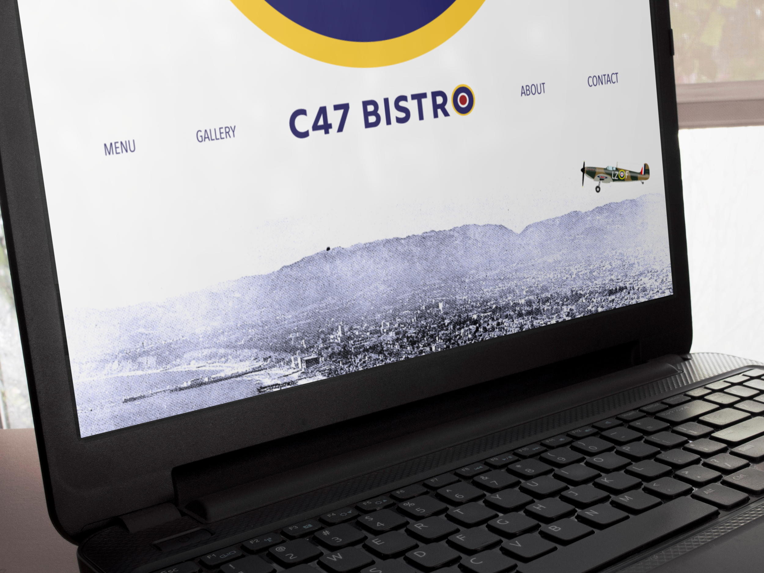
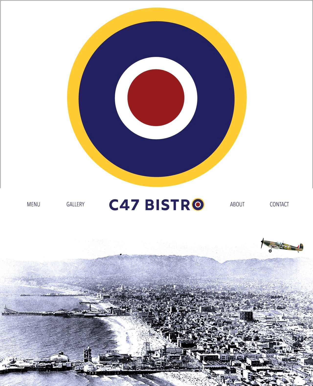
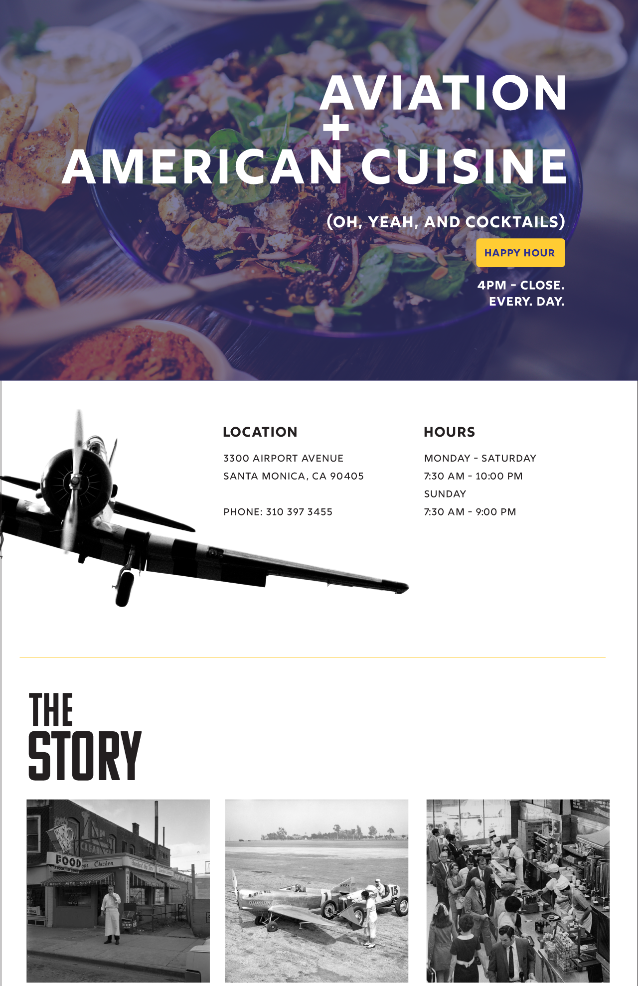
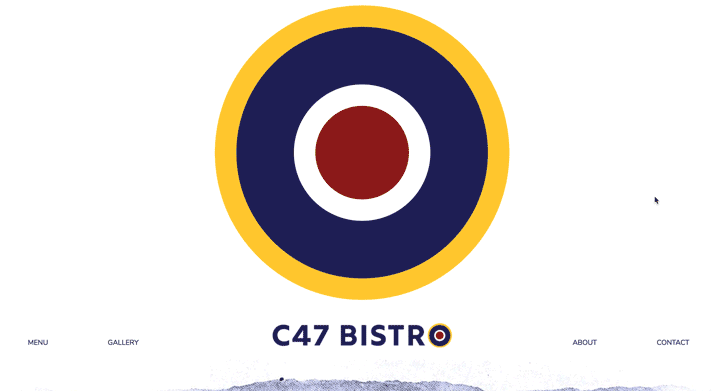
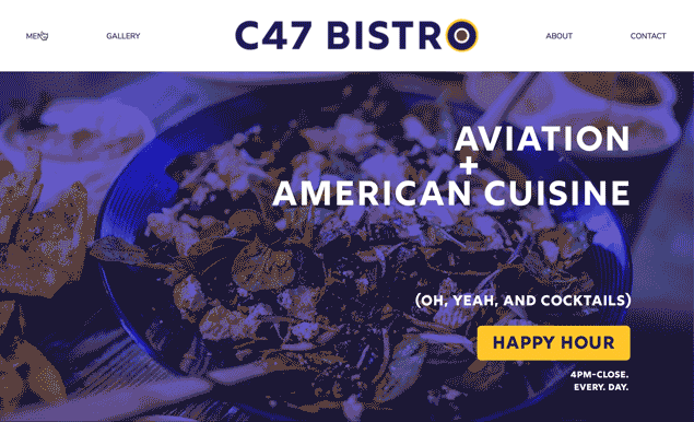
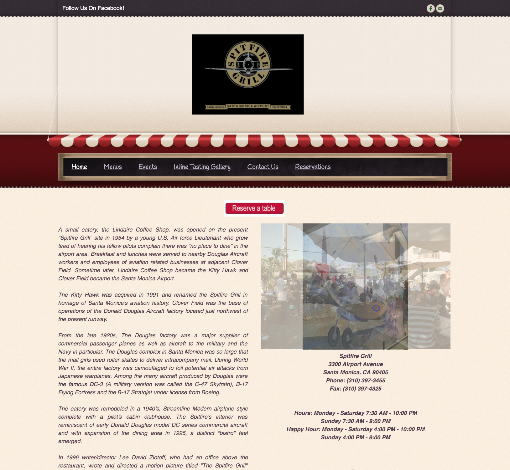
Home Page
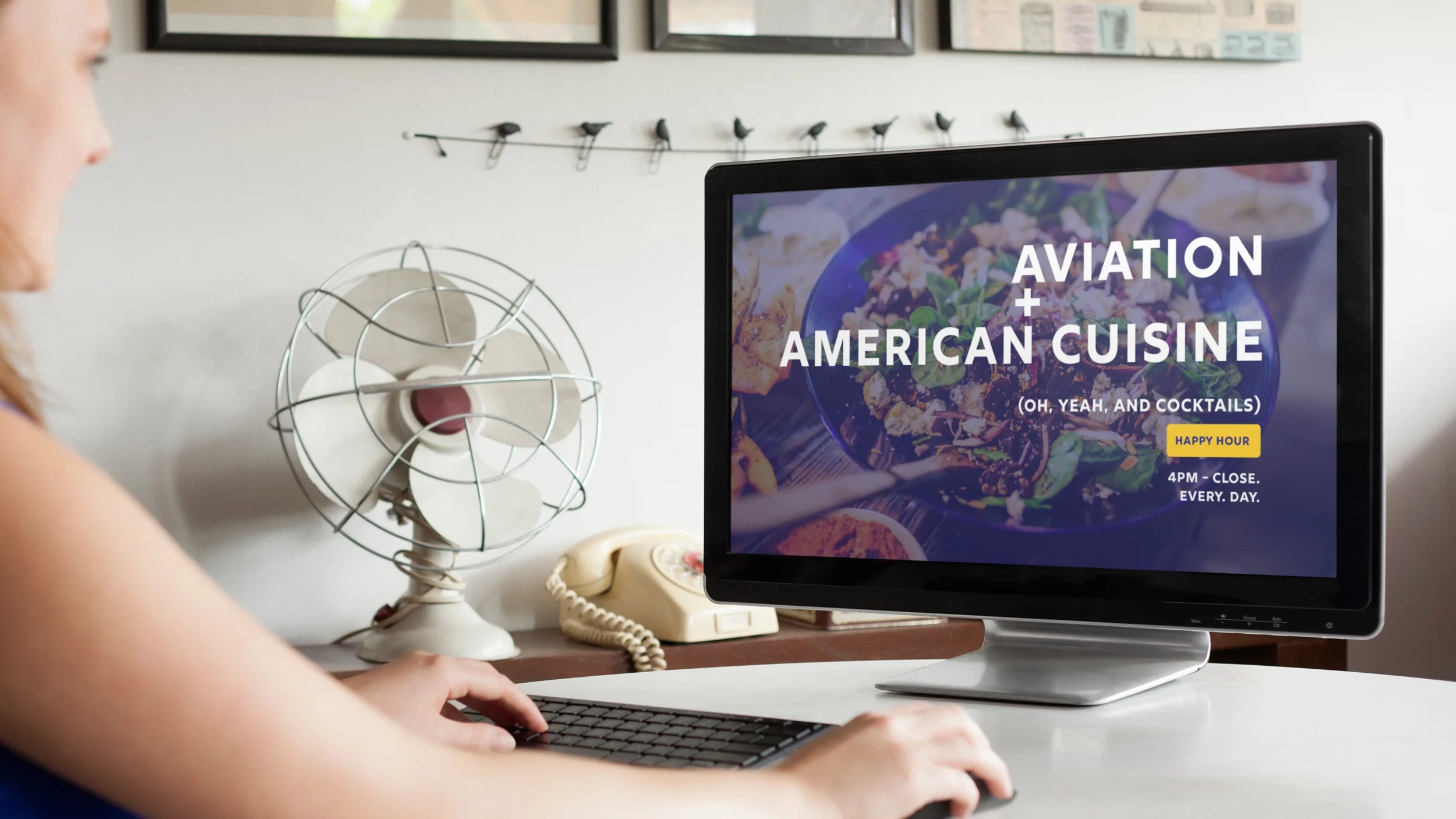
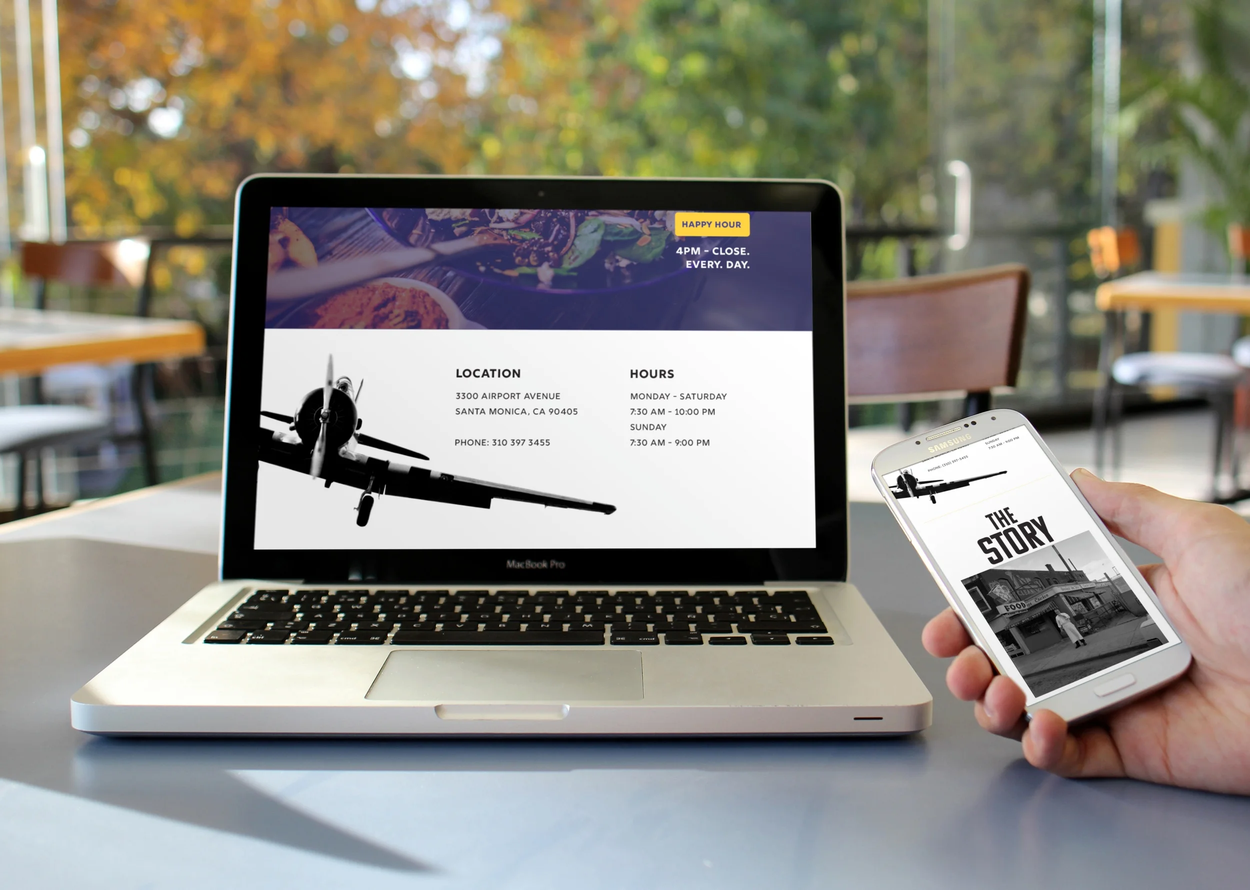
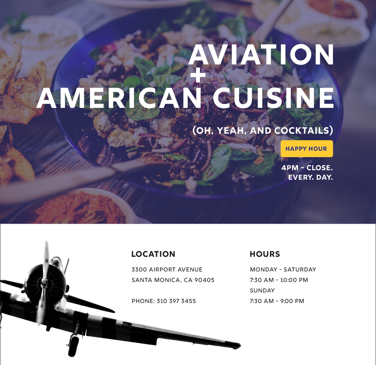
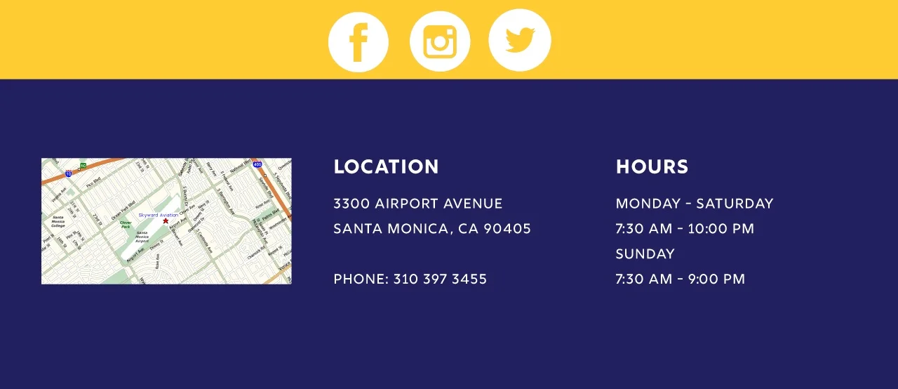
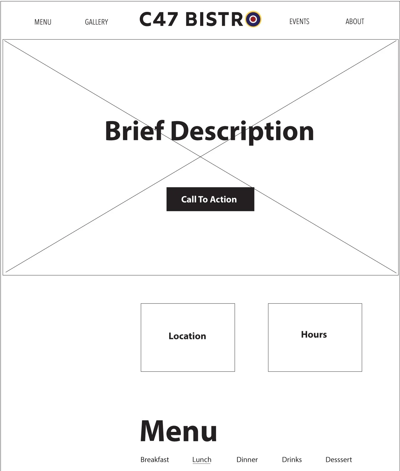
The new Home page accomplishes a couple of things beyond the aesthetics: It uses a “call to action” to promote their Happy Hour, and it adds an additional section for location and hour information so users can quickly see when the restaurant is open.
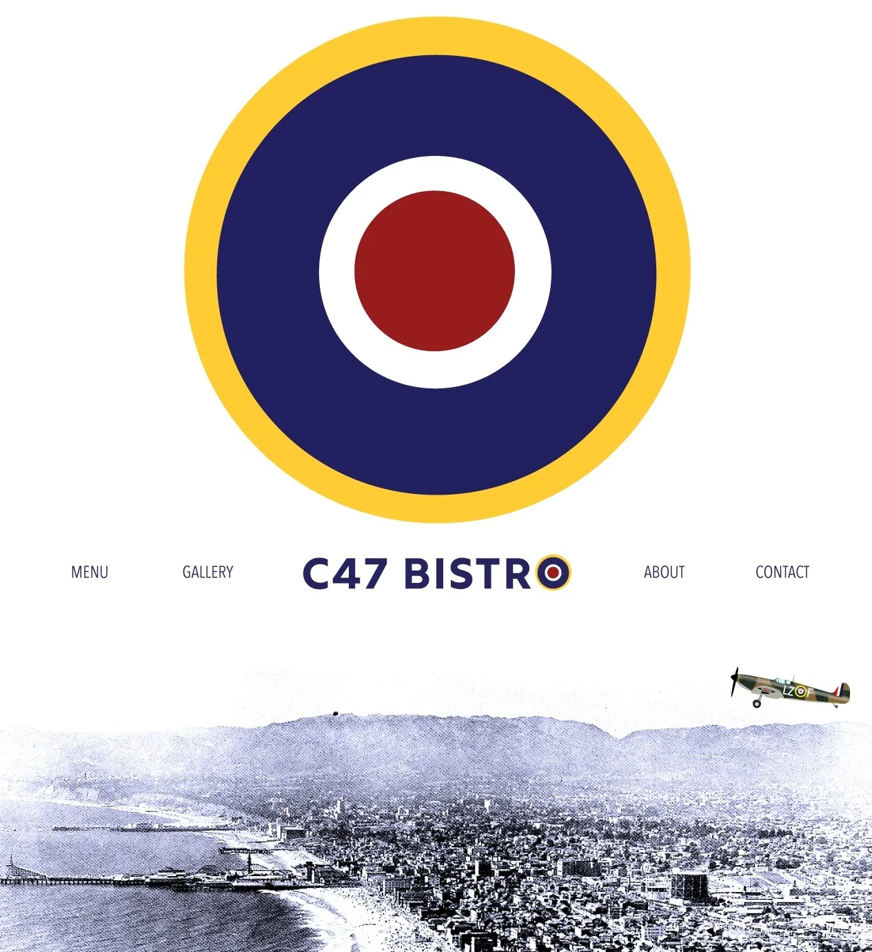
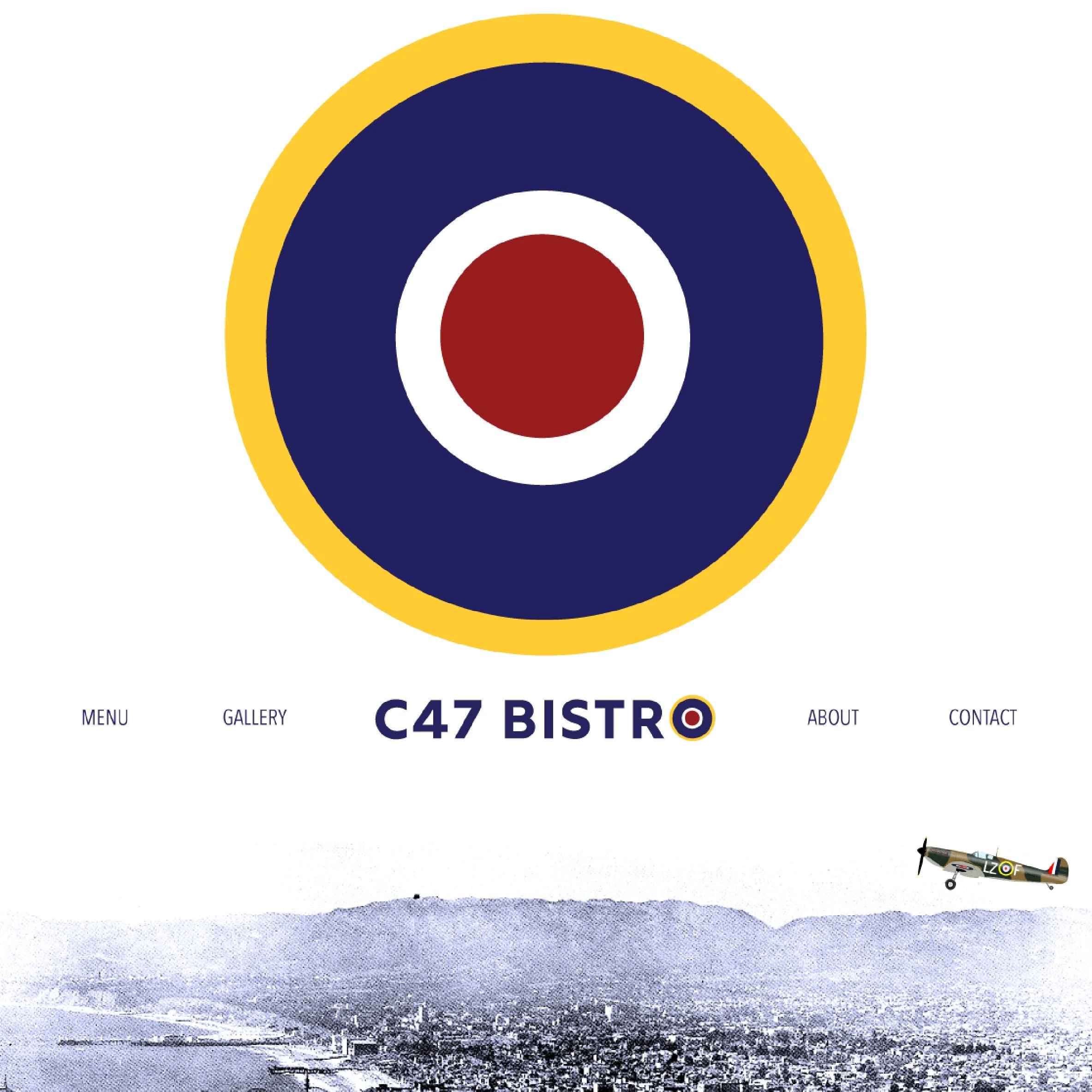
CSS animations (both for the roundel and the airplane), as well as the microinteractions found on the links, are used to help add interest to the site.

CSS Animation: Roundel
CSS Animation: Airplane
Microinteraction: Links
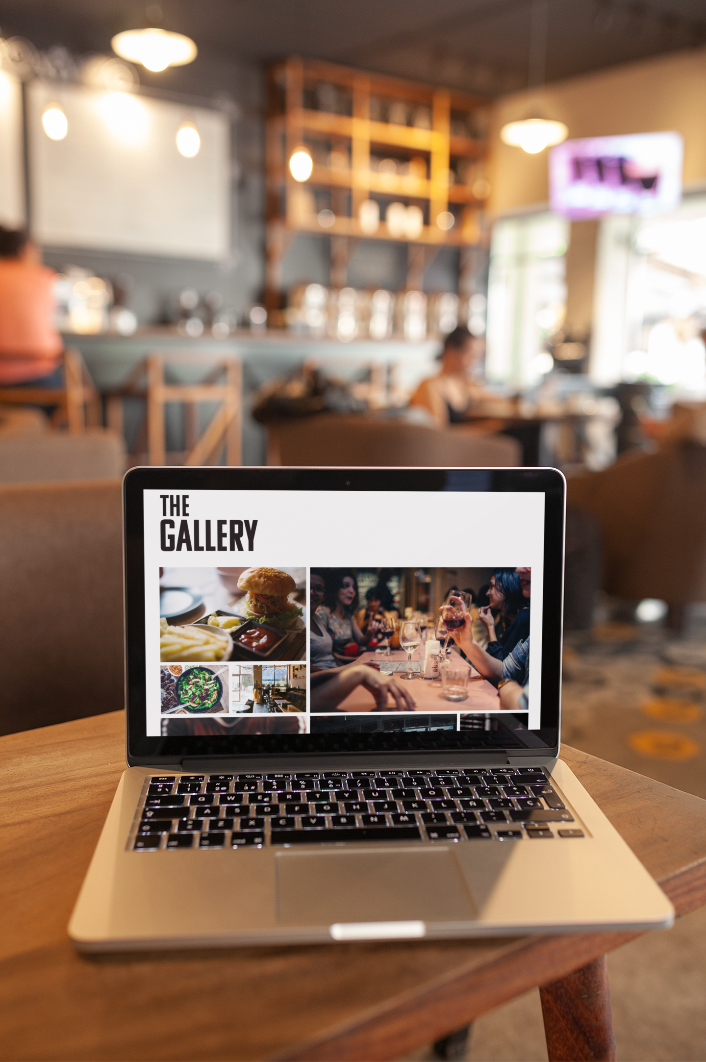
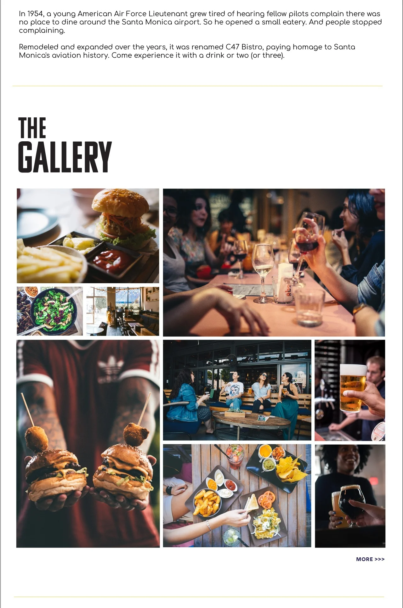
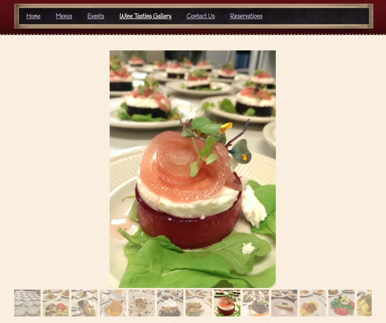
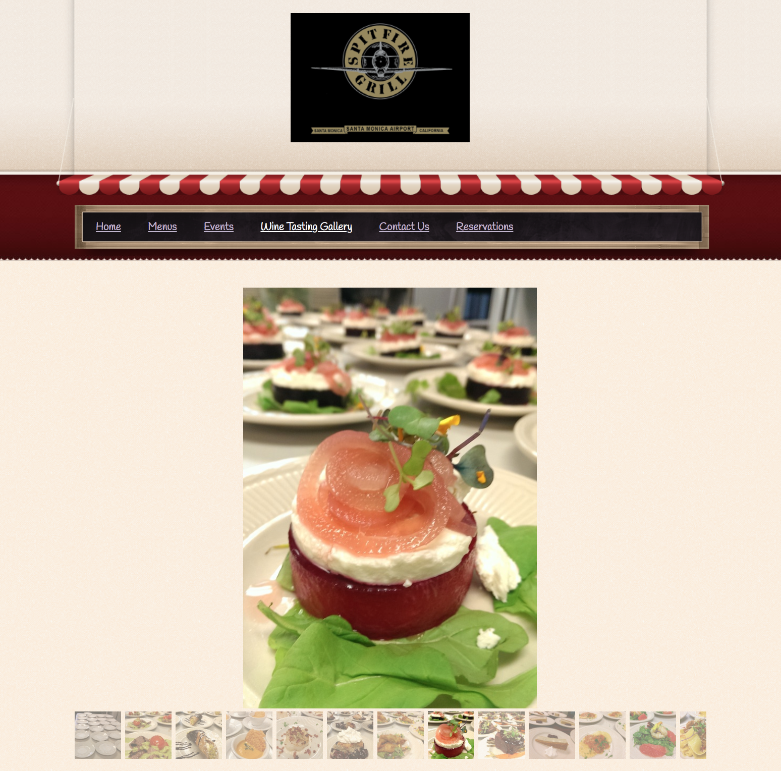
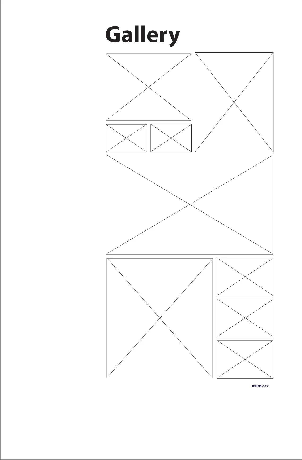
Gallery
Instead of using a carousel with thumbnails, a lightbox is now used. The grid format allows all users to easily see the images without clicking.
By showcasing people and decor (not just food), the images give users a better sense of the restaurant’s atmosphere.
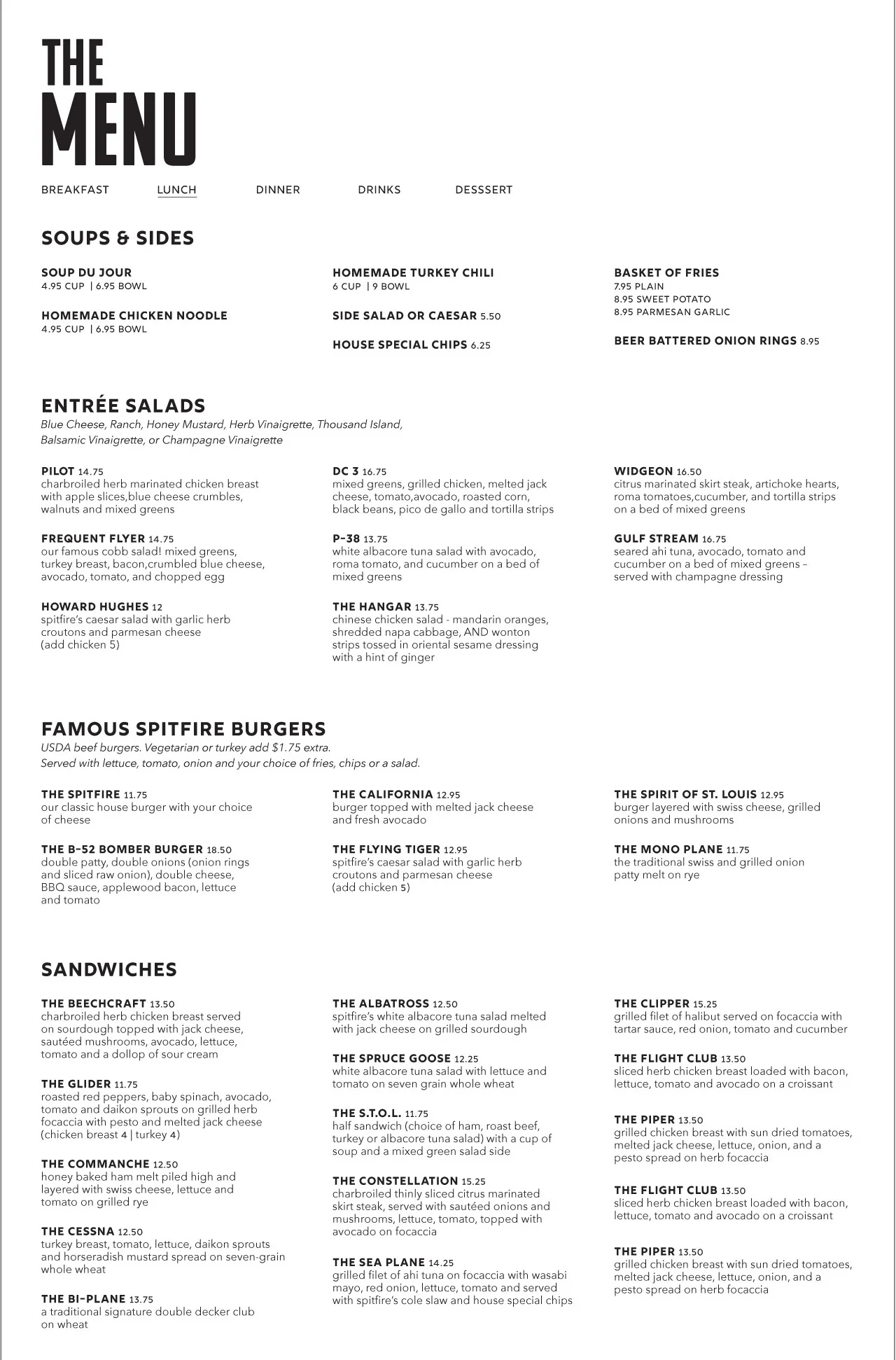
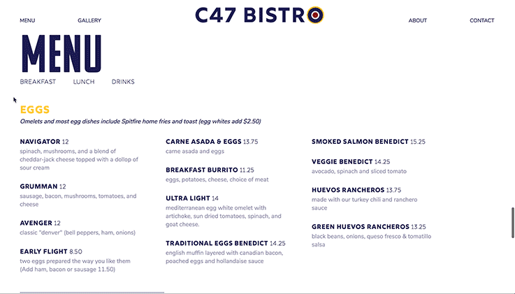
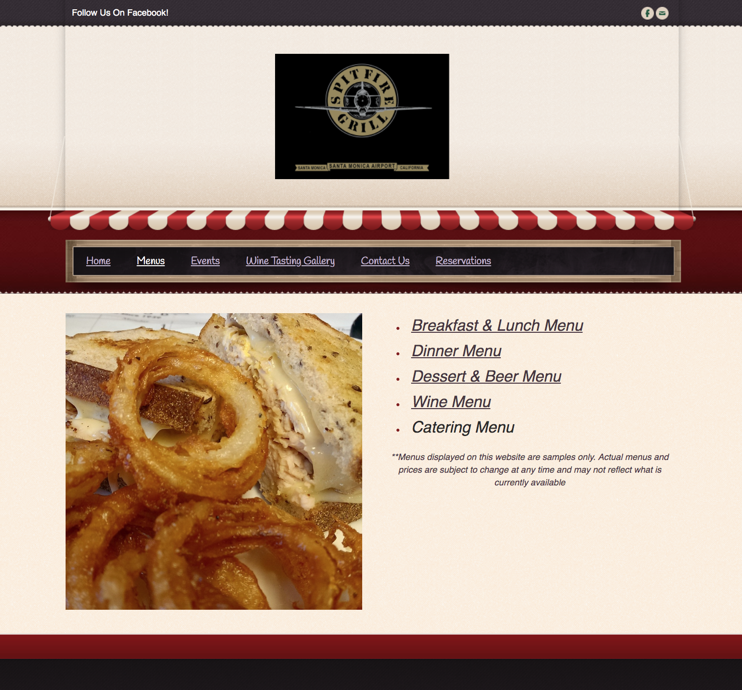
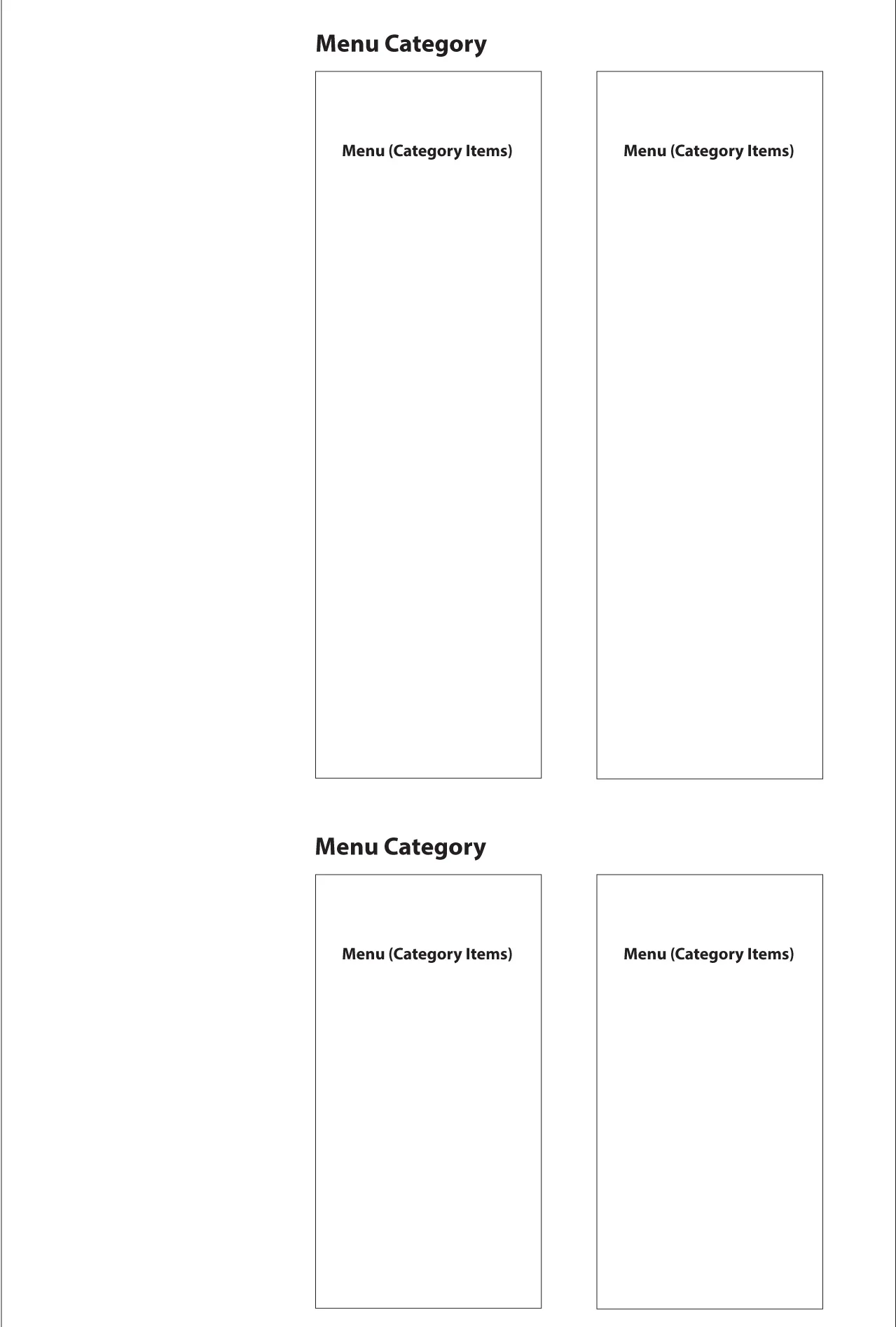
Menu
Menu items are now located directly on the page (instead of having them appear as a PDF on another tab/page). Not only is this more convenient for users, it also allows the restaurant to more easily update their menu.
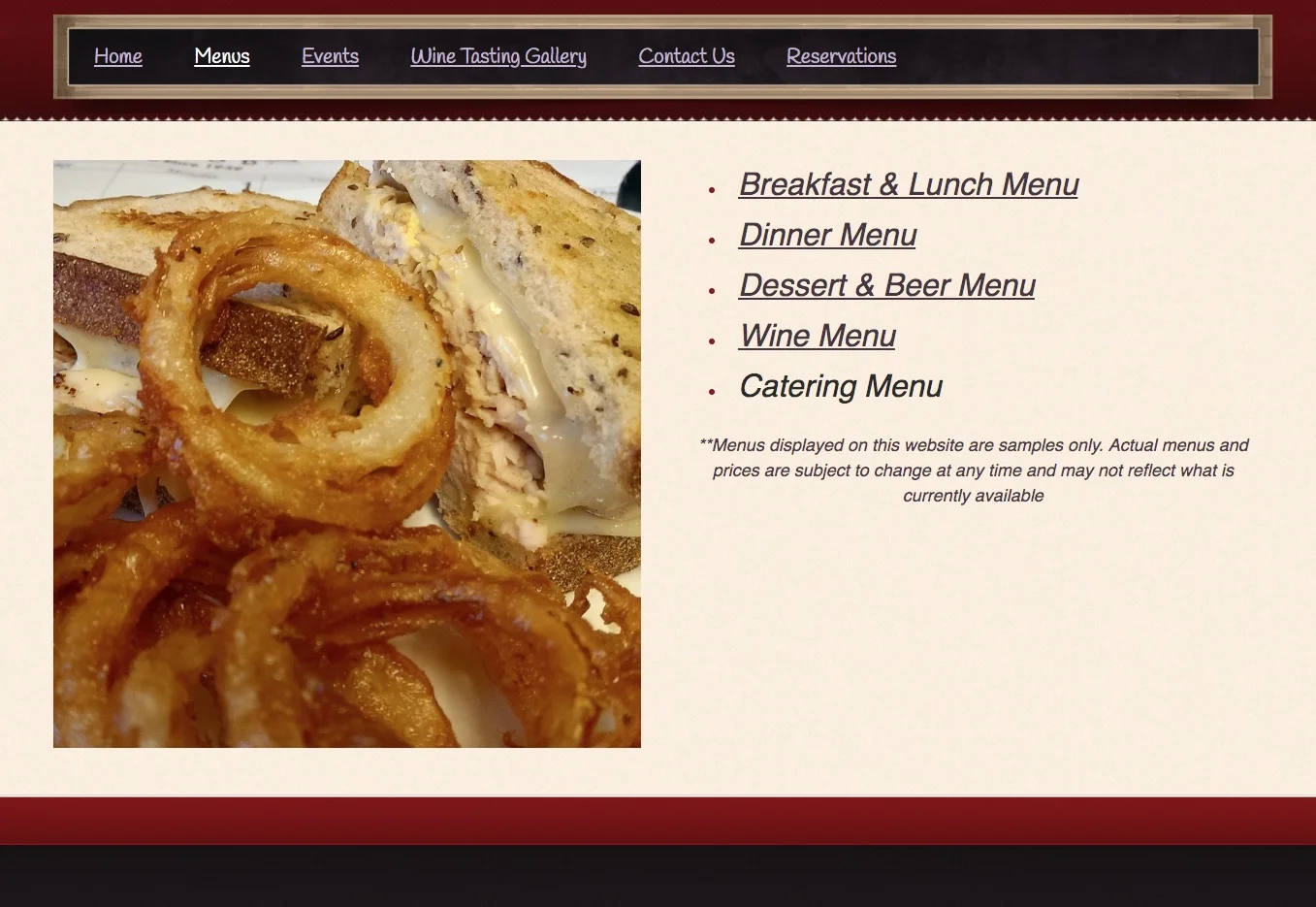
Using simple javascript, navigation was applied to the menu, reducing the amount of real estate the menu section occupied.
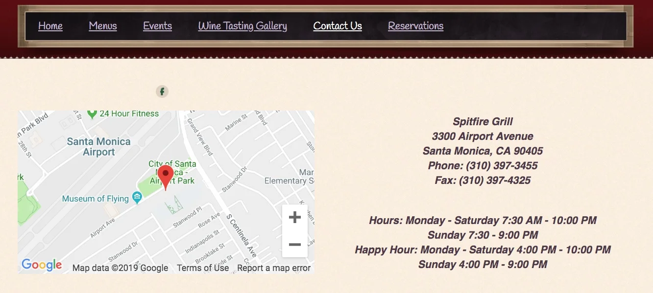
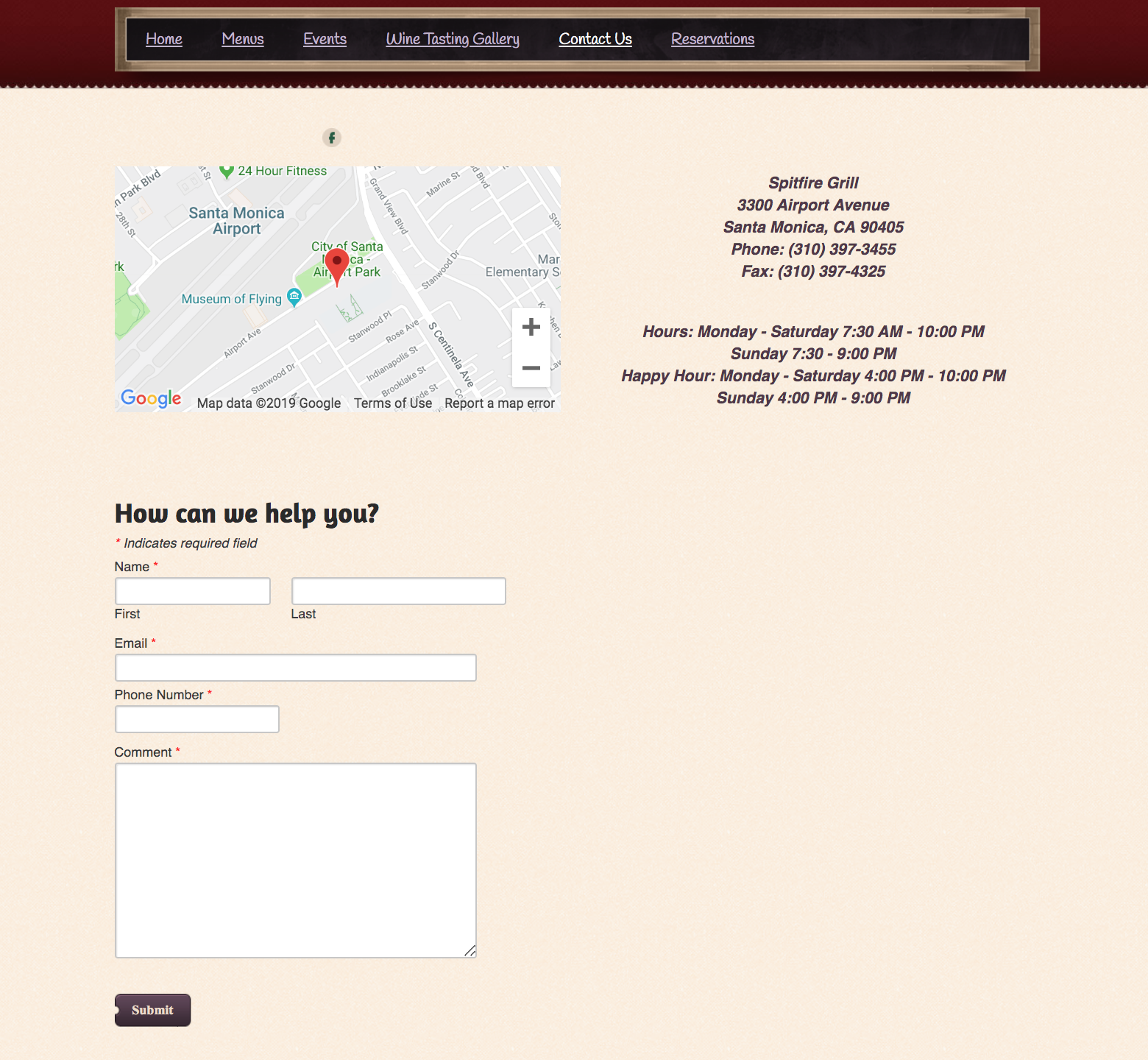
Contact/Hours/Location
The structure remains similar, but social media was added, and a more readable hierarchy for “Location” and “Hours” was employed to help users more easily scan the information.
Behind the Scenes
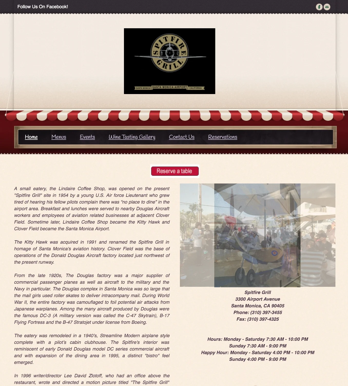
The restaurant was once a popular brunch spot in the 1990s, but that’s no longer the case. Part of the reason for this might stem from the fact that it seems stuck in the past. Nowhere is this more evident than on their website (seen below) which continues to use outdated layouts and tools popular during the 90s.
A few of the things noted during the original website analysis include:
The site isn’t responsive, so the text is difficult to read on mobile devices.
The Home page uses too much text and not enough visual interest.
There is no “call to action” encouraging users to do or explore something.
Hours and contact information is only located at the bottom of the Home page
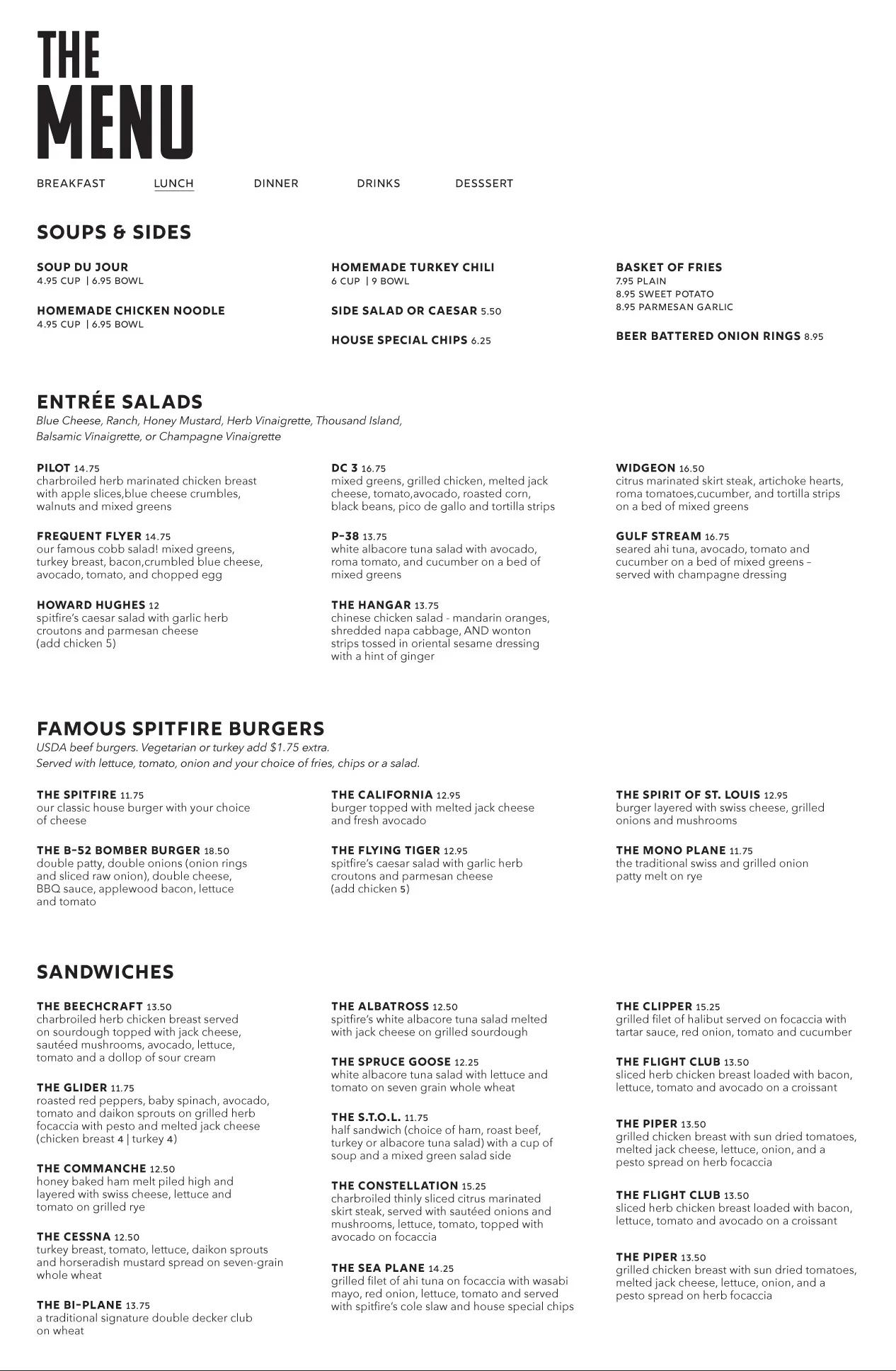
The Menu page offers 4 links, each taking the user to separate PDFs of the printed menu.
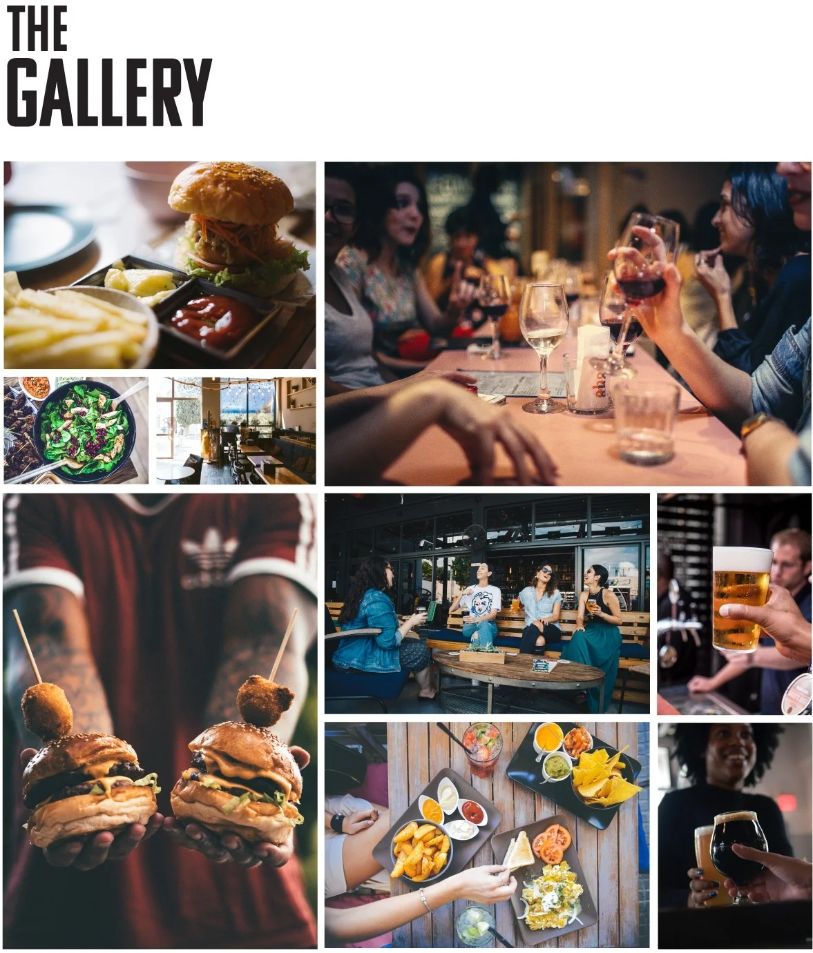
The Gallery doesn’t give a feel of the restaurant. It would benefit more by showing images that highlight the people, food, and atmosphere found within the establishment.
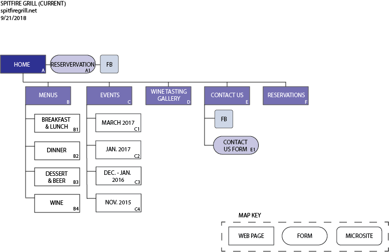
Original Sitemap (above)
The proposed sitemap (below) simplified the current site’s structure (above). It does away with the cumbersome forms and Menu PDFs, and it adds an “About” page that allow the restaurant to develop a story and personality.
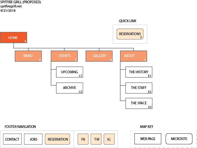
Proposed Sitemap (above)
Attempting to minimize the text as well as add more visual elements and empty spaces, the initial wireframes had a column of negative space on the left side of the page (see below). Testing, however, showed confusion about this negative space; people simply thought the design had unintentionally shifted to the right. Using that negative space also increased the length of the menu section, so later designs eliminated that negative space, utilizing the full width of the screen instead.
Additionally, to make the menu section appear shorter in length, the plan was to use a menu navigation that would allow for only one kind of menu (e.g. Breakfast) to be shown at a time. Still, the amount of text remained quite long. Therefore, the menu section was later pushed to the bottom of the page, allowing the more visually appealing elements (e.g. the images) to take a more prominent role higher up the page.
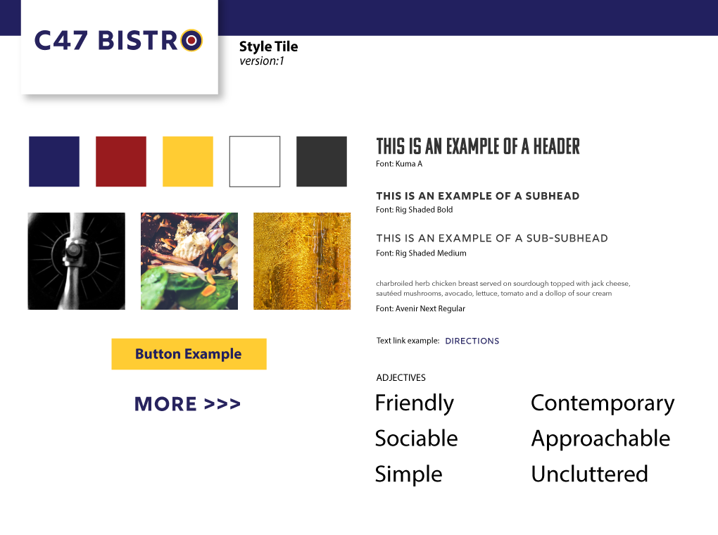
As the wireframes were being modified to reflect these changes, the Style Tile was finalized so color mockups could be built.