— movist —
app research & redesign
duration : 4 weeks | solo project
Movist is an app that helps users manage and organize their digital and physical media. Although visually appealing, my continuing frustrations using the app finally compelled me to address Movist’s poor user experience with an unsolicited redesign.
Problem
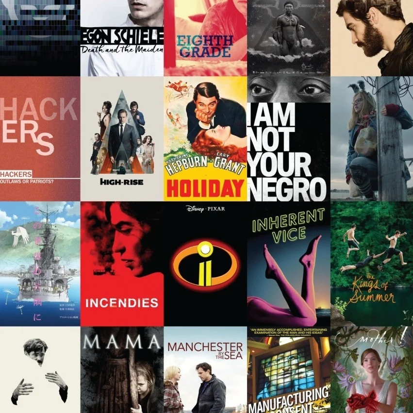
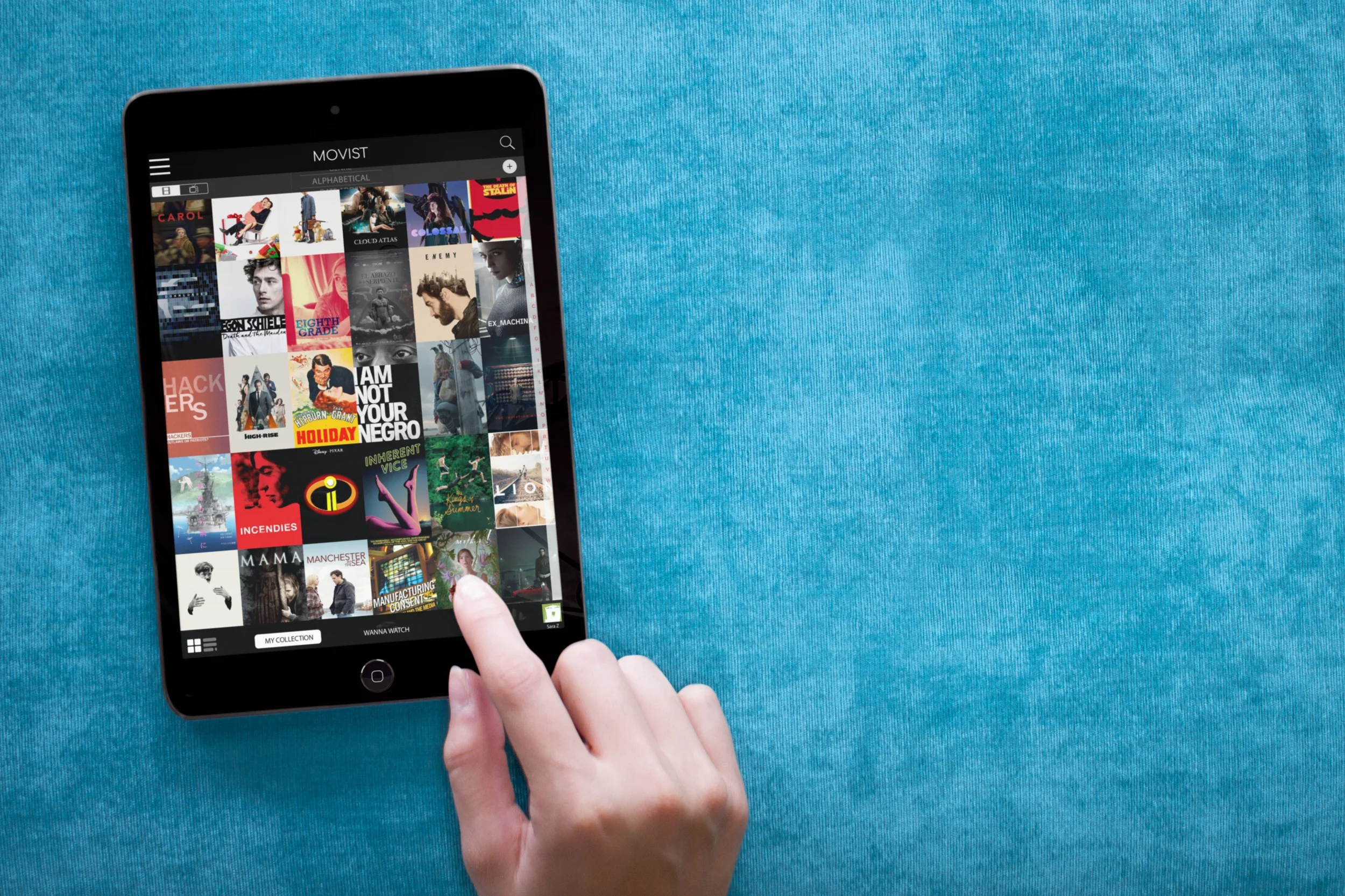
Movist has a lot of potential: it’s attractive, taps into IMDB's database, and...well...did I mention it looks nice? Someone just needed to spend a little less time on the visual design and more on the UX to improve the user experience.
INSIGHT
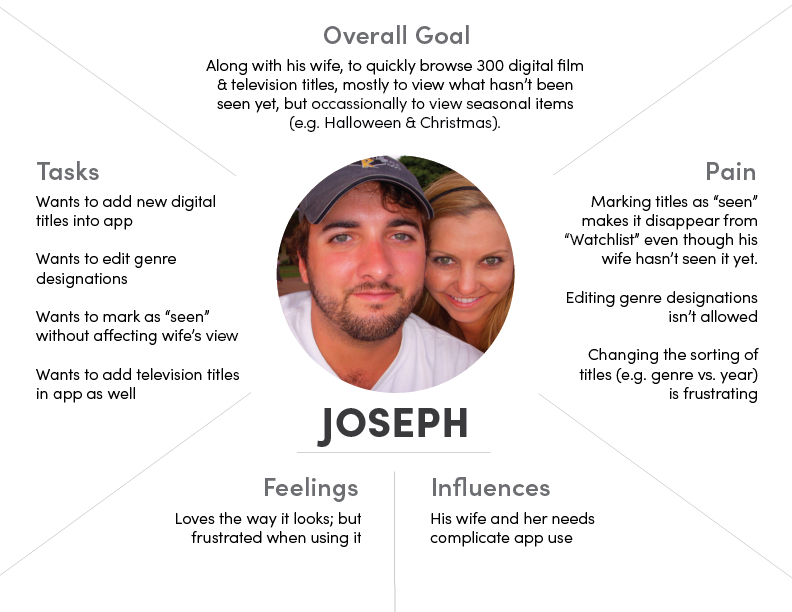
As a user myself, I began this redesign with my own ideas for improvement. Most of my frustrations were mirrored by others who tested the original app. But those tests also revealed an additional problem I hadn’t thought about: the app’s “one size fits all” design alienated some of its potential audience.
Solution
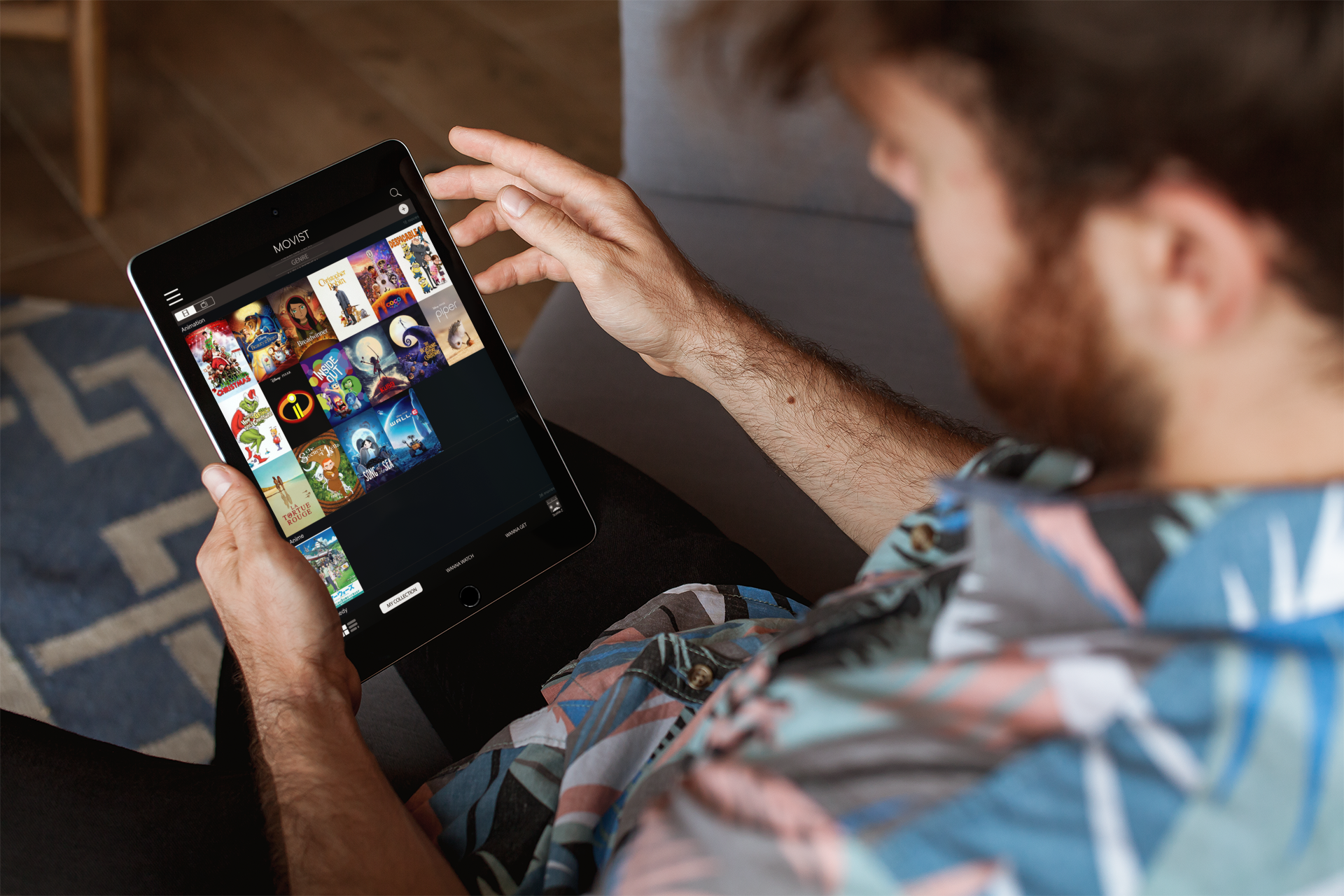
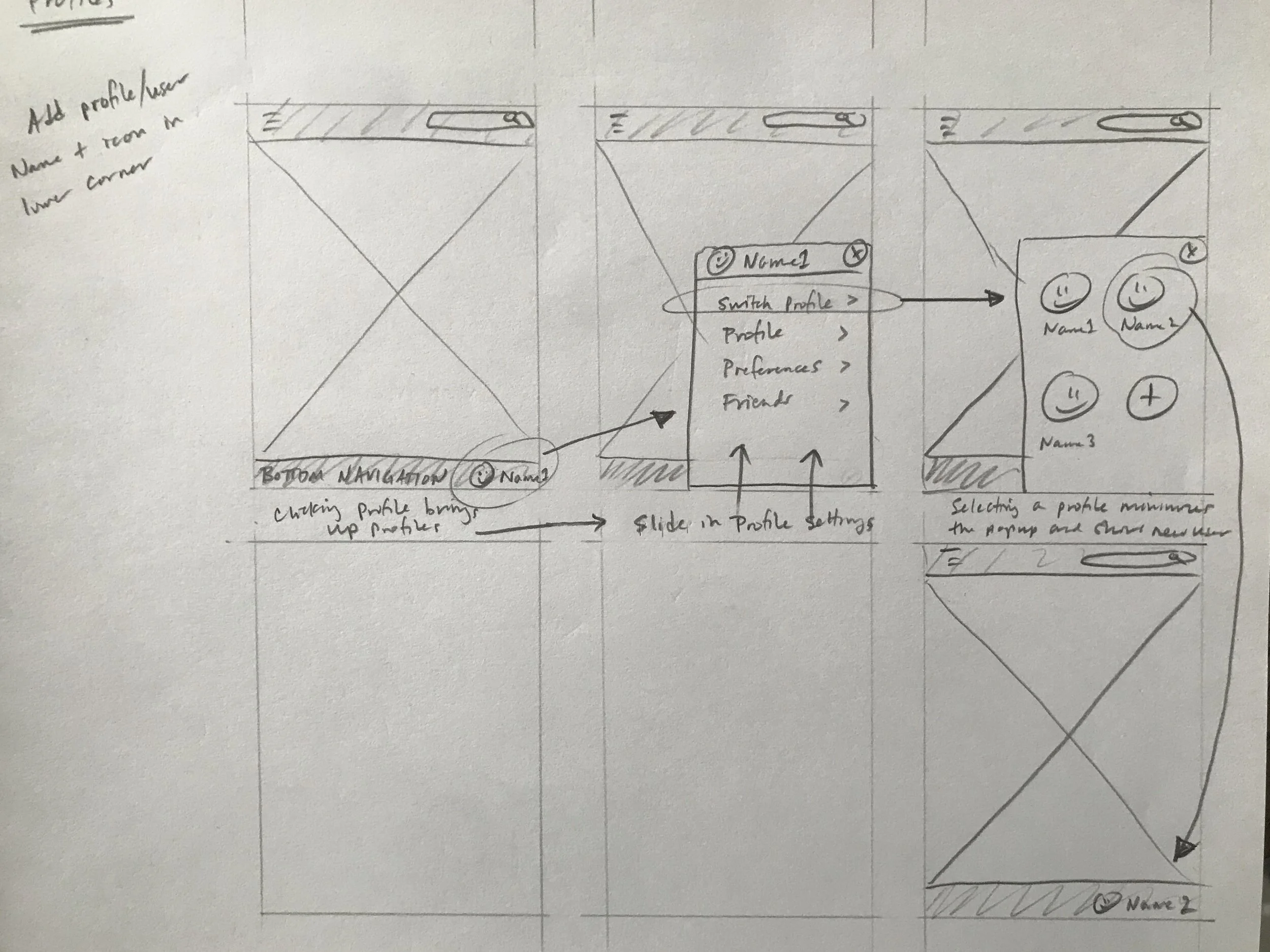
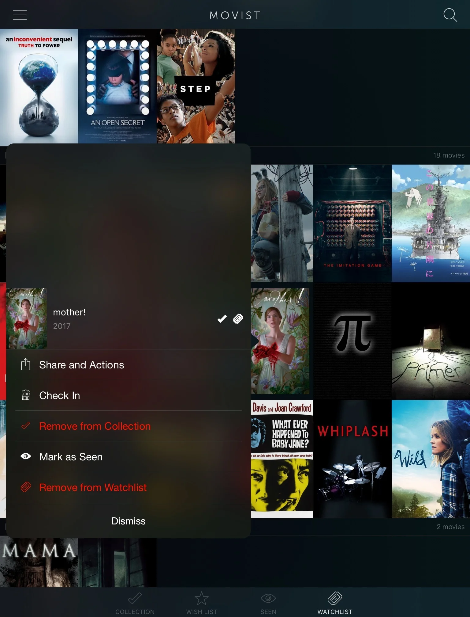
While the general visual design was retained, hidden features were brought forward, affordances were made more obvious, flows were simplified, and most importantly, new features were added so users could tailor for their own unique needs. This included adding multiple user profiles to one database, allowing customization of metadata, and including features specifically for households with children.
As users attempted to complete given tasks with the original app, everyone expressed frustration with their inability to quickly complete them. And while some users were eventually able to find necessary features important to complete a task, a few weren’t able to complete the task at all.
At the end of the interviews and testing, I asked if Movist was something they would use again. Based on their vocal and body cues during testing, I assumed the answer would be “no”. However, every participant answered “yes”. Pointing out their frustration during the tasks, I asked why. The answer from everyone was, “I like the way it looks.”
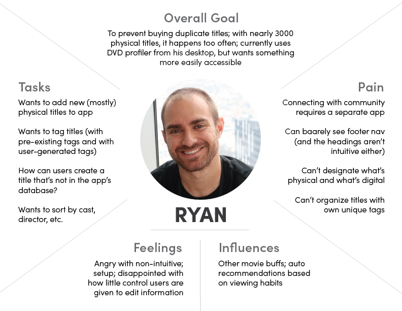
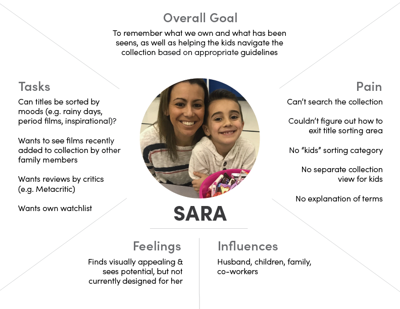
Empathy maps
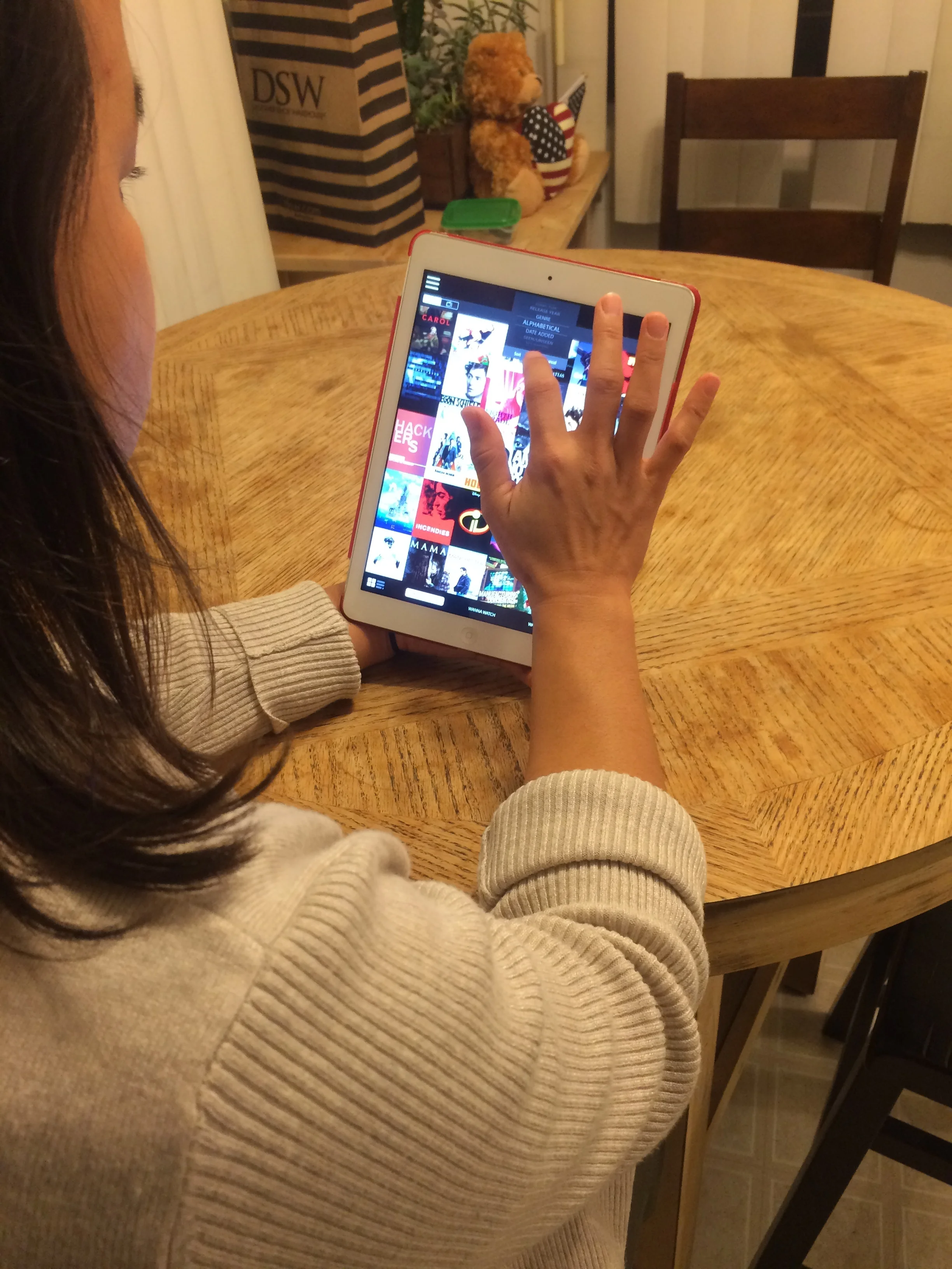
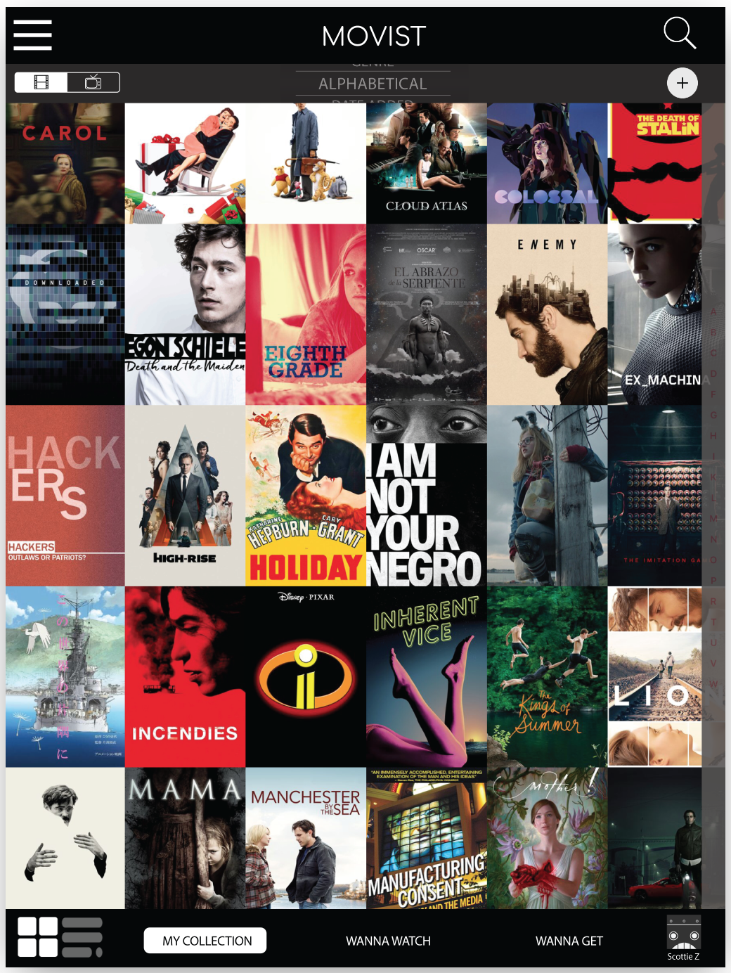
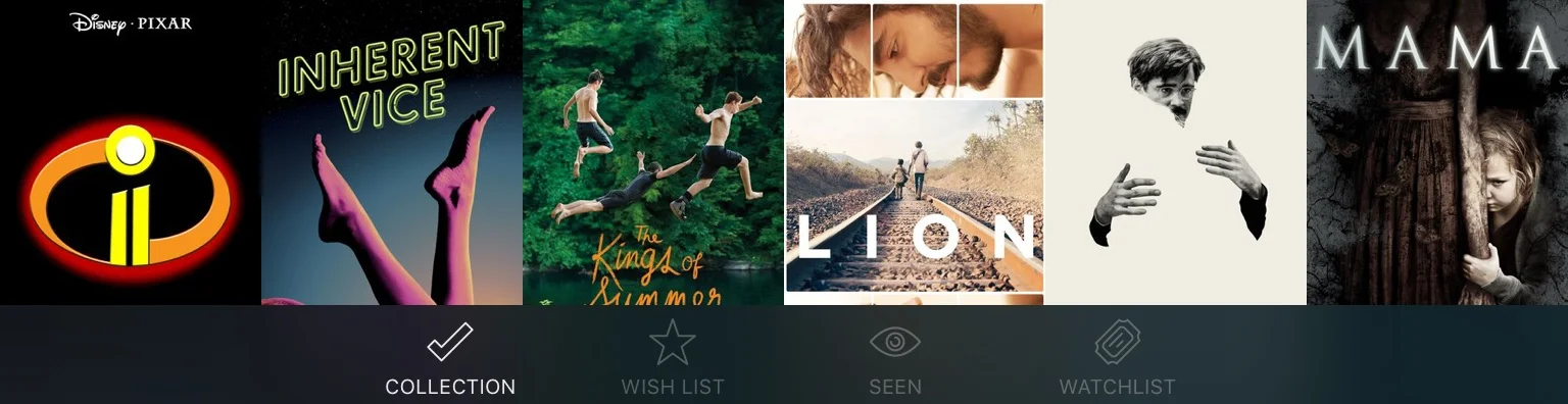
WIREFRAMES
PROTOTYPE 1
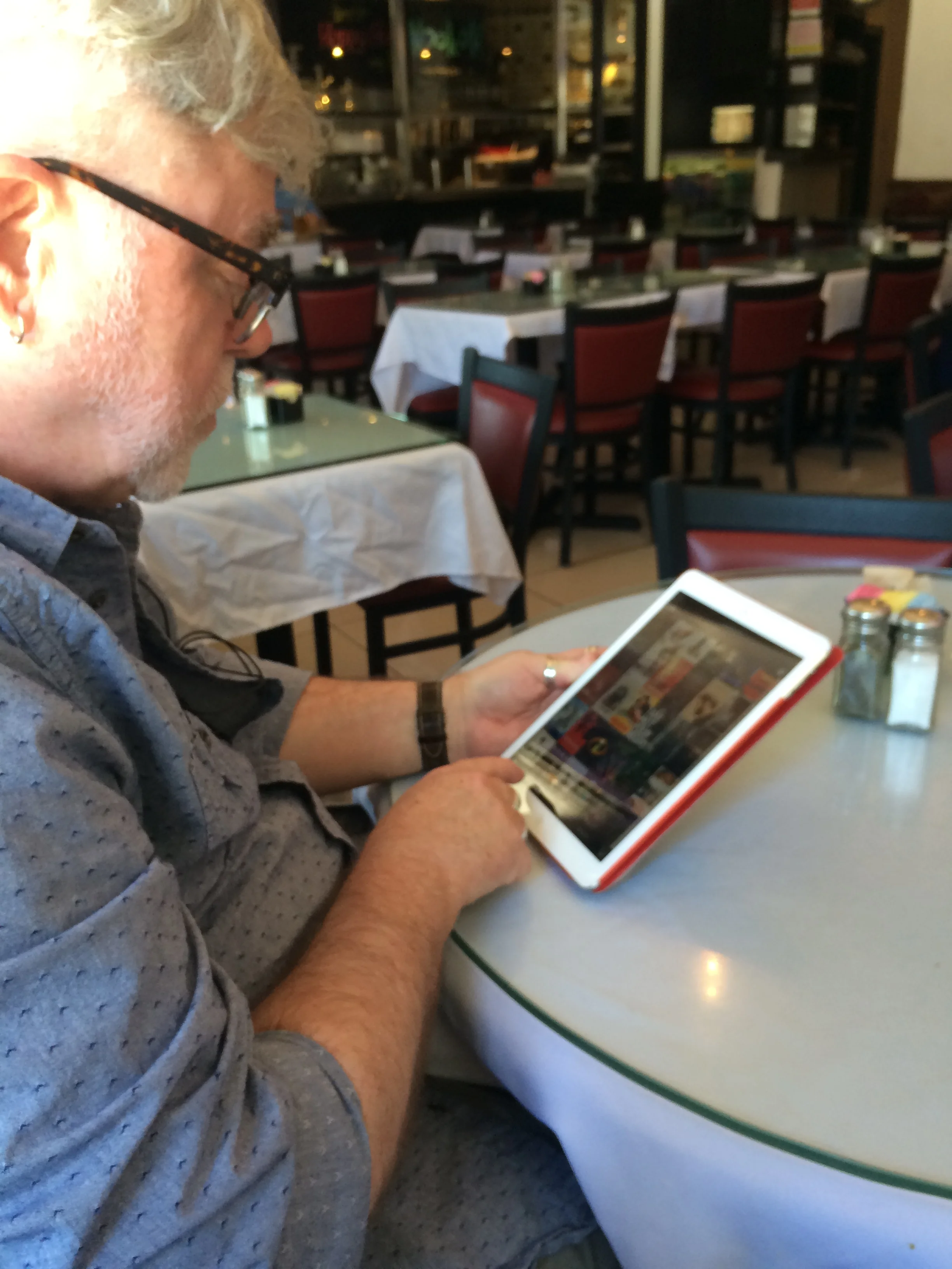
The first prototype was based on the initial interviews and testing feedback, and the prototype was tested by the same users who had tested the original app.
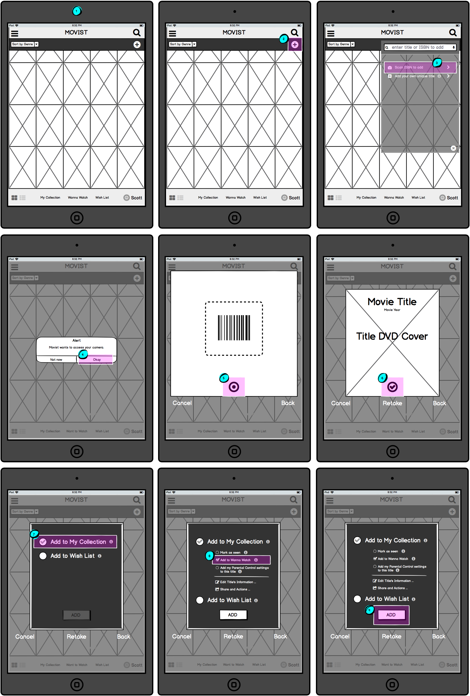
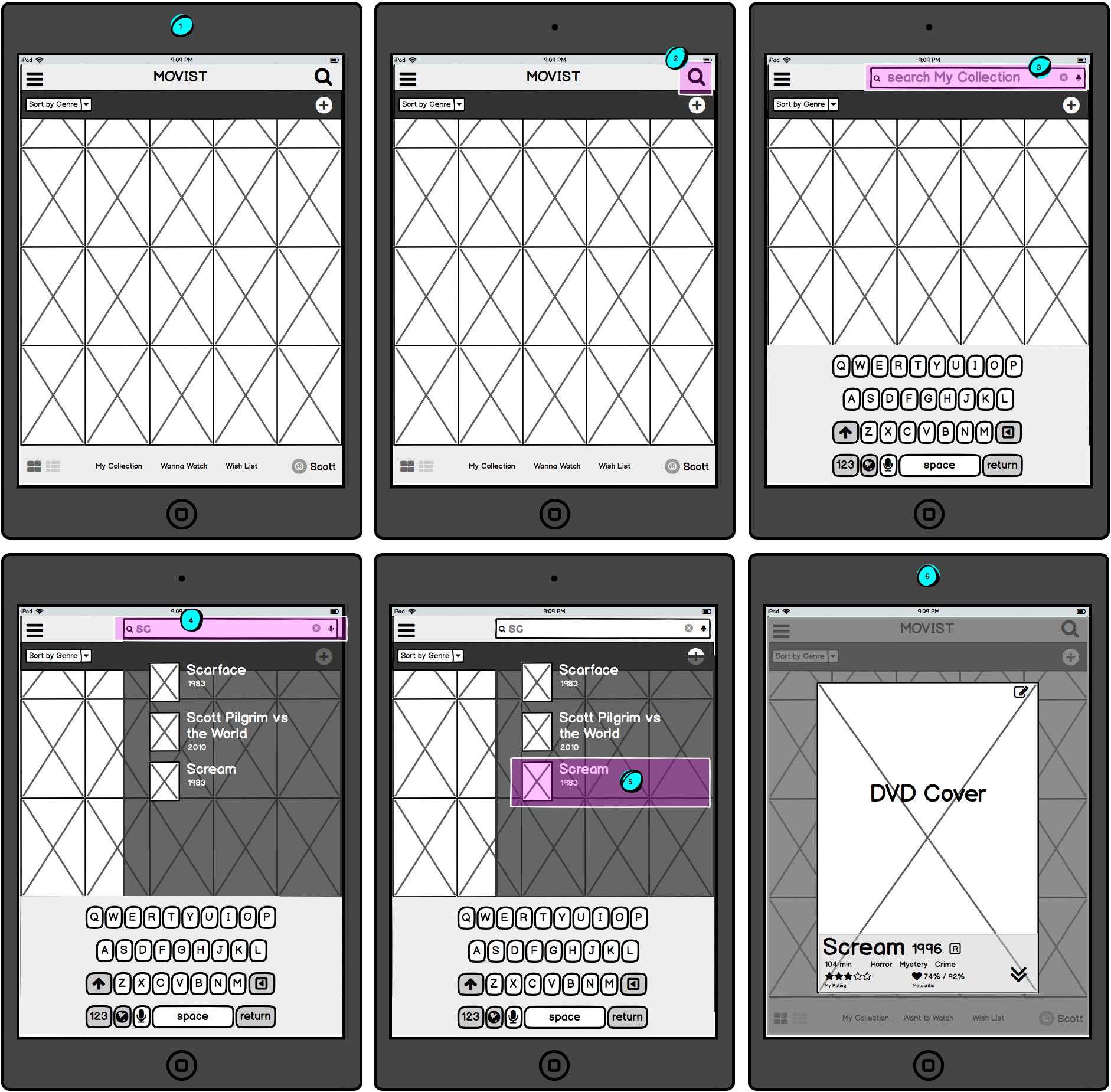
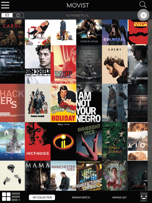
User were tasked to complete three workflows:
Sorting the Collection from alphabetical to genre
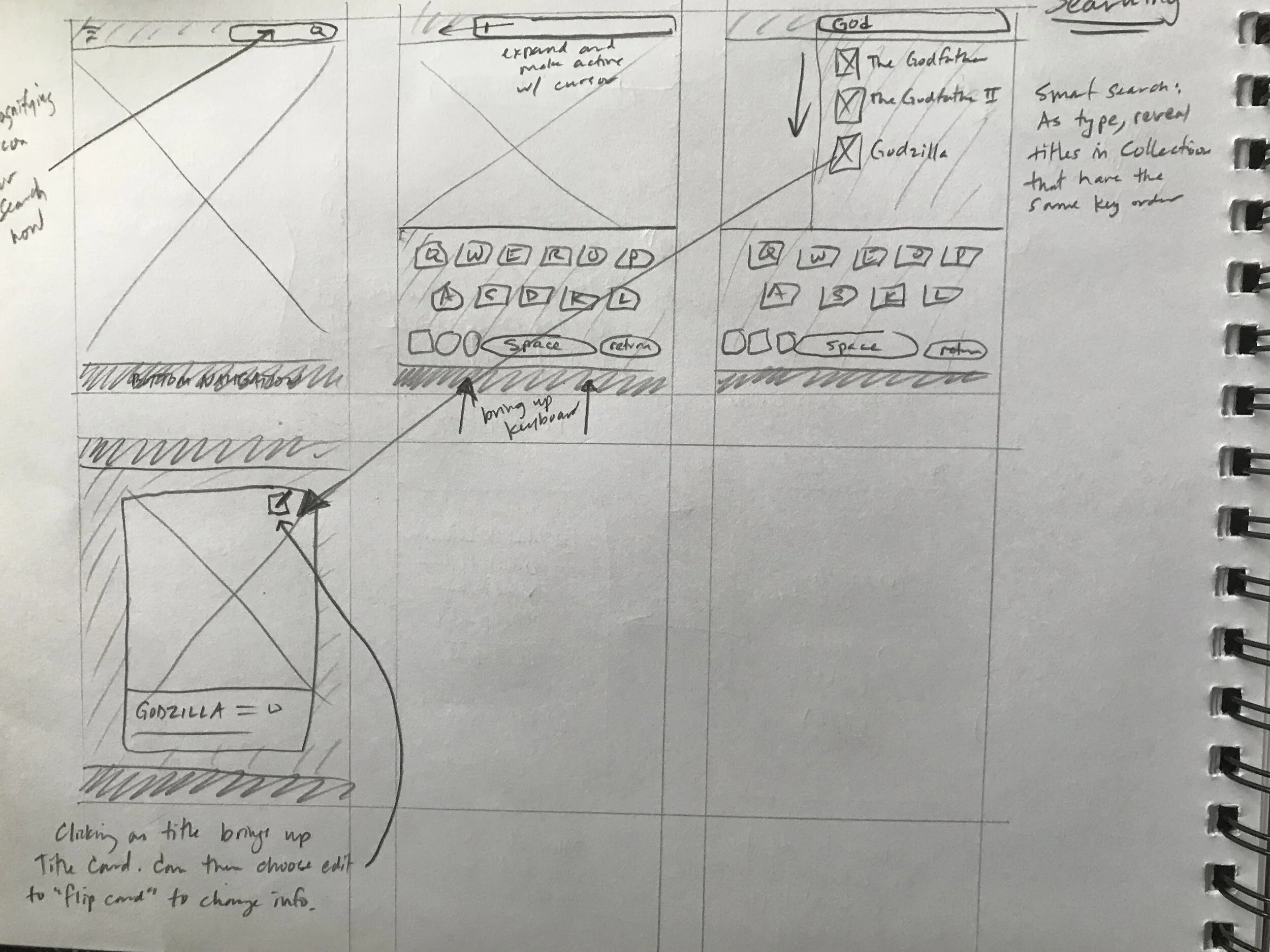
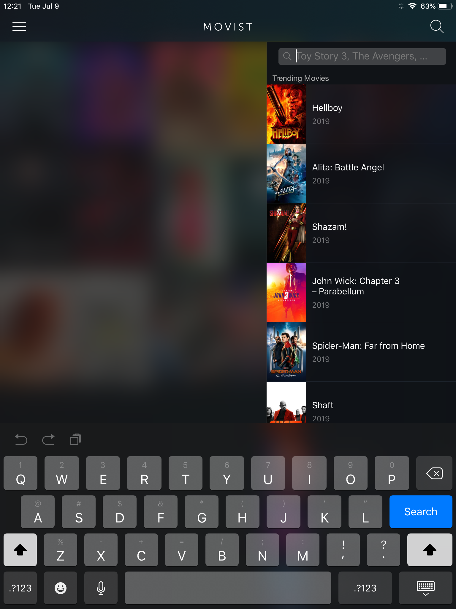
Searching for a title within their Collection
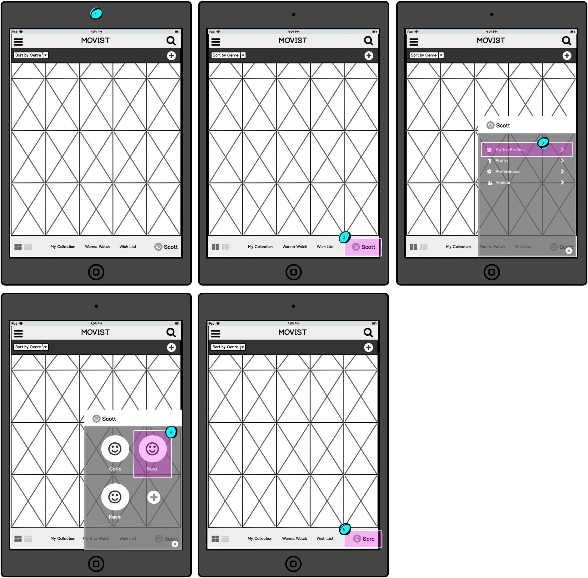
Changing the current user profile to another user profile
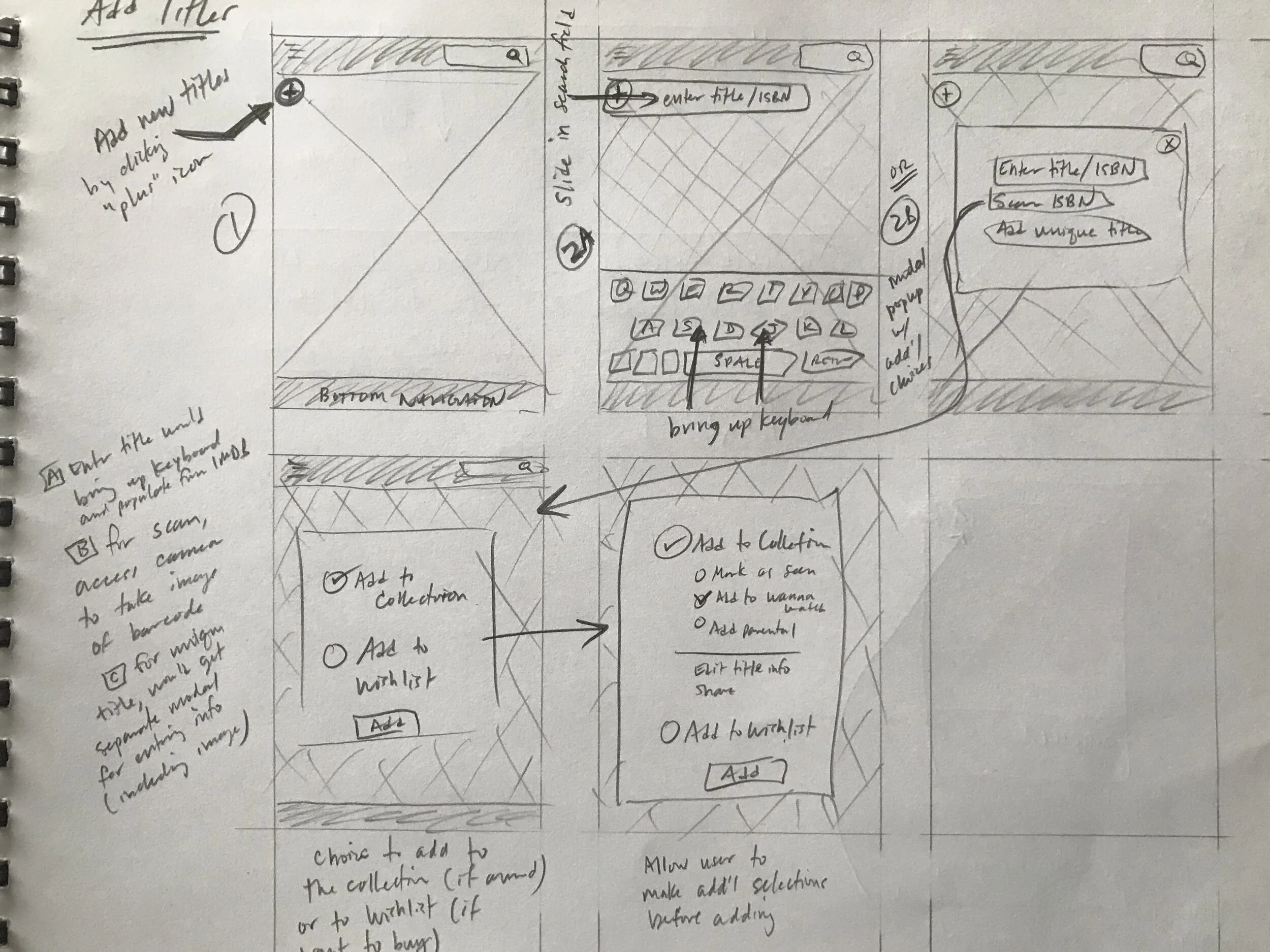
Adding a new film title
Since the look of the original app tested so strongly with users, the first prototype (seen directly below) was created in high fidelity to dissuade users from focusing on the lack of design.
PROTOTYPE 2
Based on feedback, several areas were refined, including:
Terminology & symbols were made clearer;
Changing Profiles was brought forward and made easier;
Popups were increased in size.
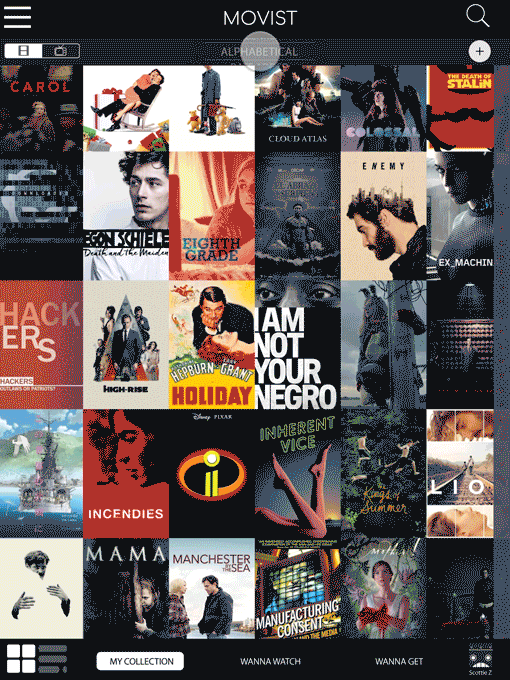
Home Page
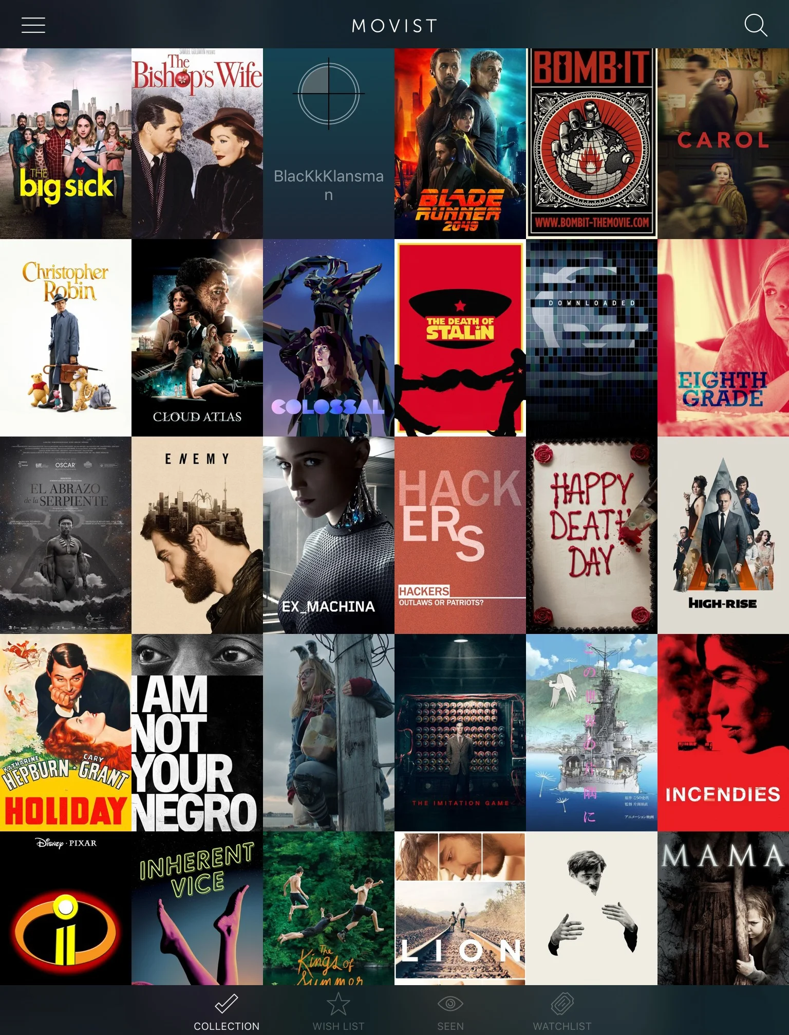
Tab Bar
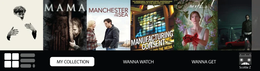
Cards
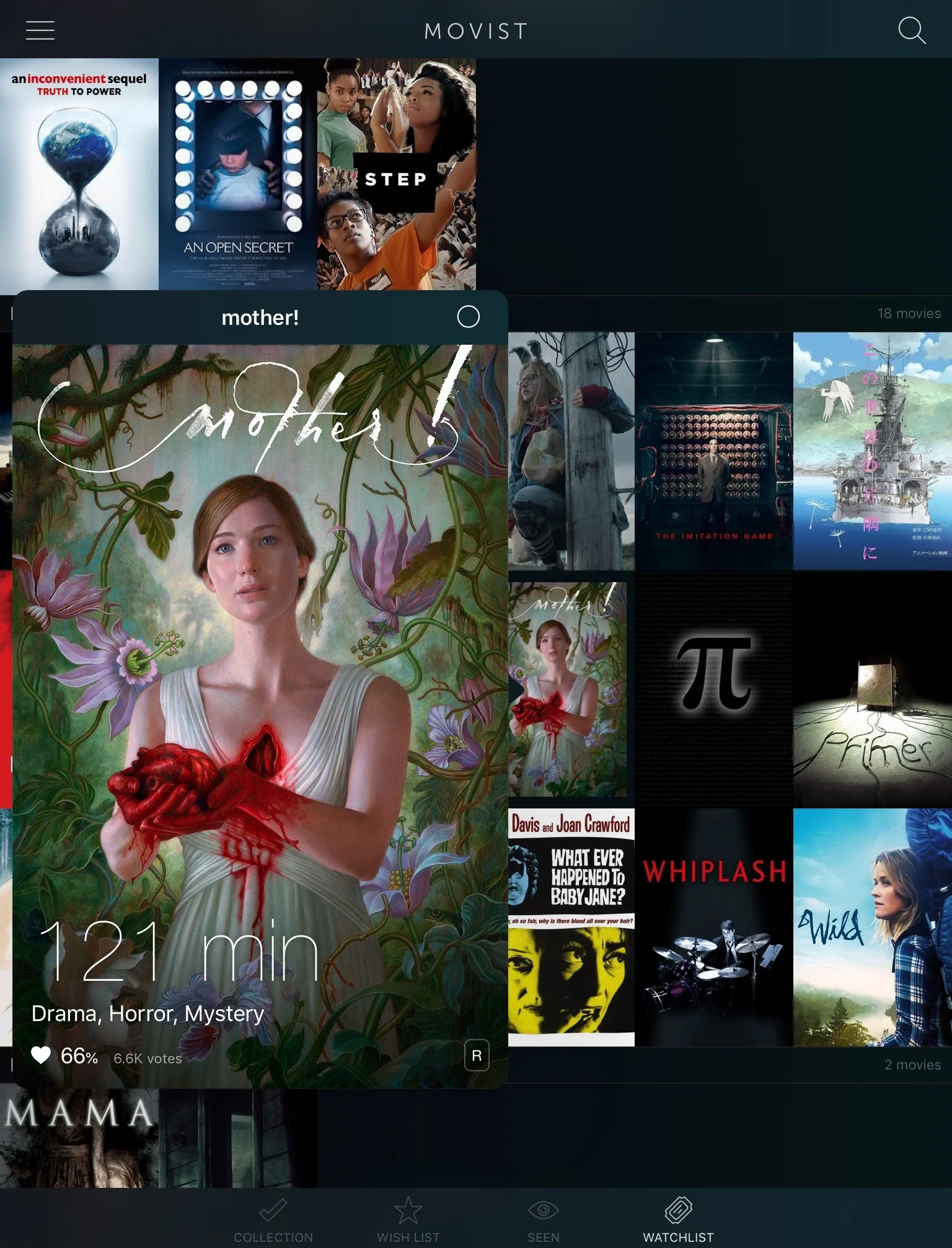
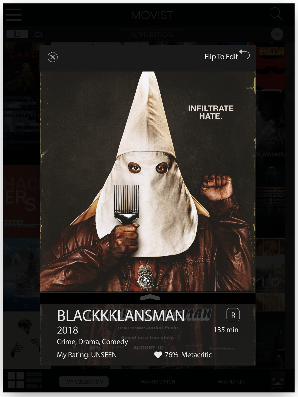
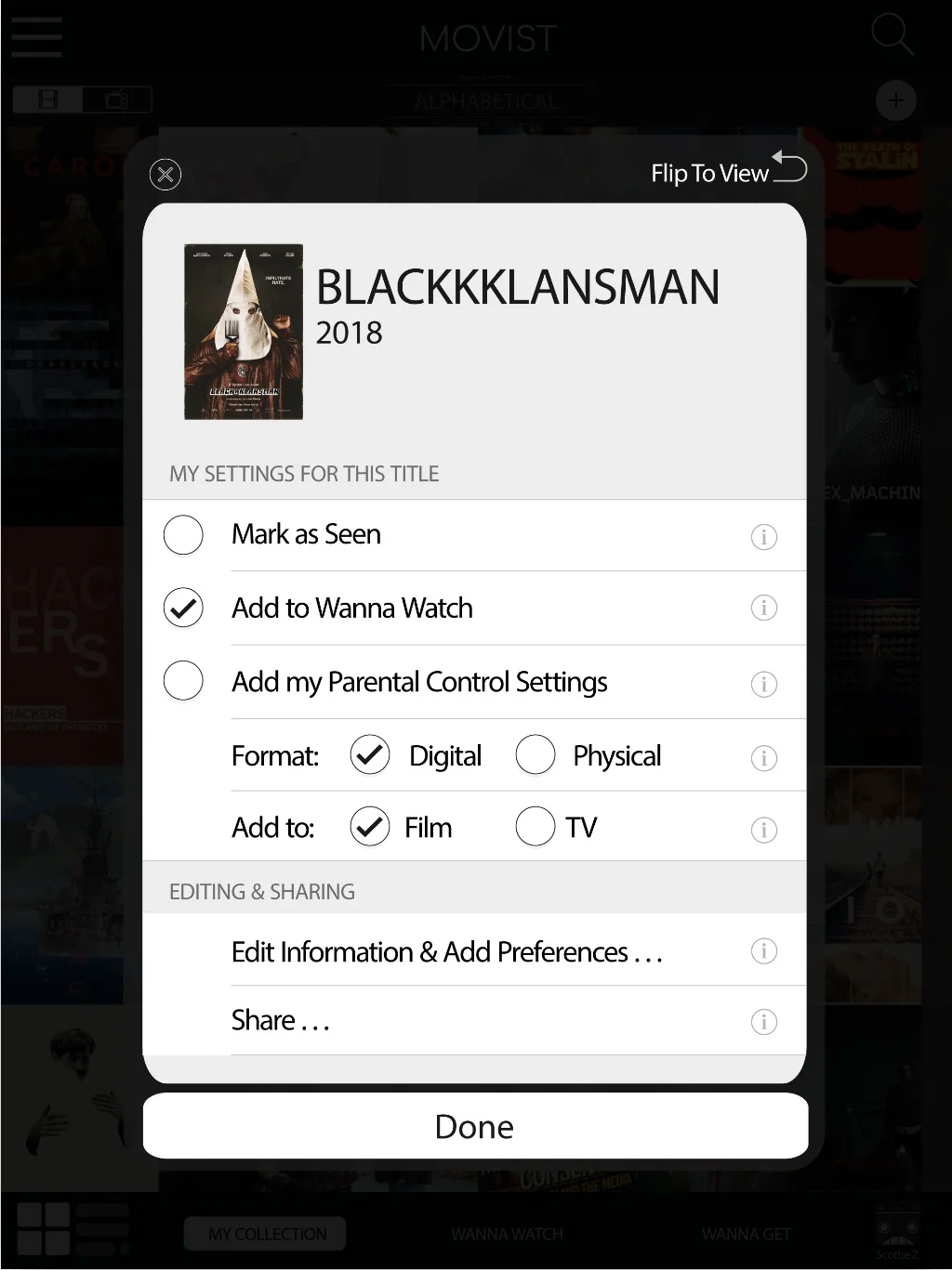
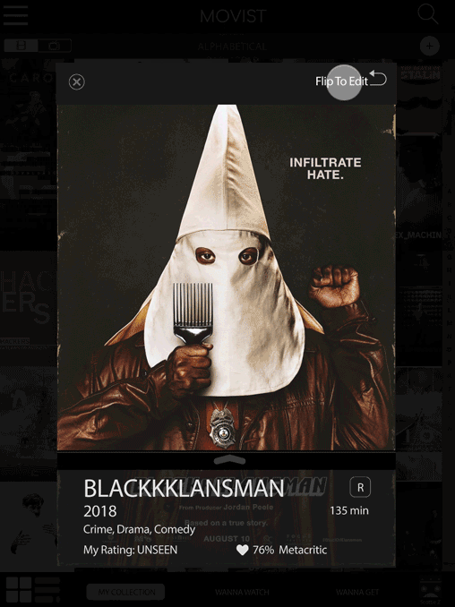
Card Back: Flip (Revised)
Sorting
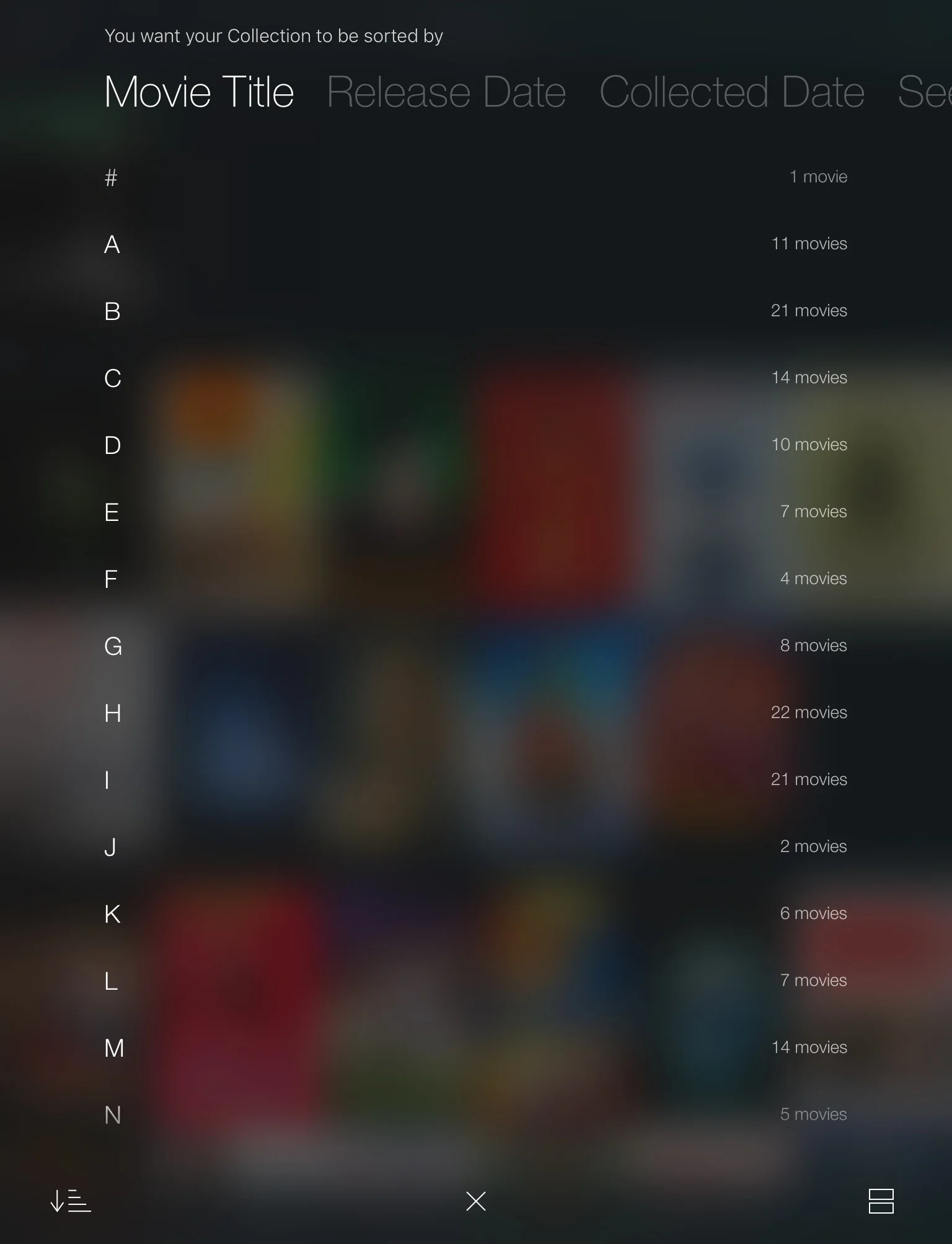
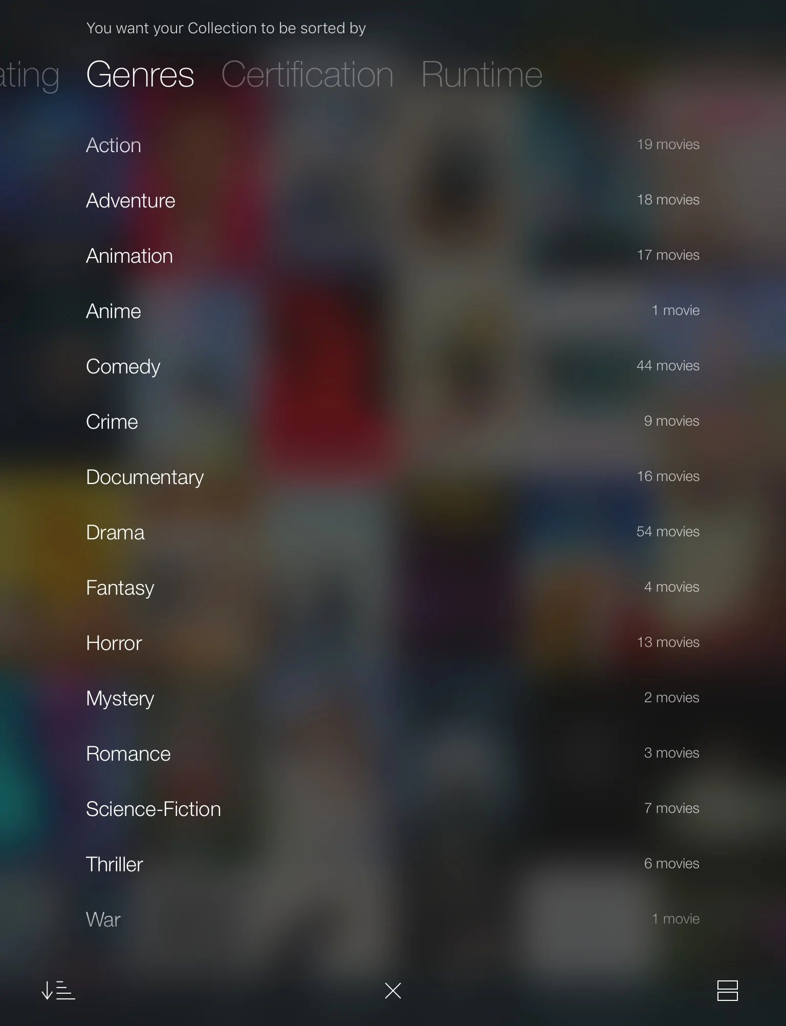
Sorting (Revised)
Adding Titles
Adding Titles (Original)
Adding Titles (Revised)
reflections
Unlike with the original testing, users had no difficulty completing tasks with prototype 2. Even if users couldn’t describe how to do something without the app in front of them, they were all able to perform the necessary steps when they had the app in their hands.
However, because these users already had familiarity with the app over the course of 3 tests, I would like to test with new users to confirm that terminology, icons, and feature placement was intuitive for new users as well.
Currently, the app pulls information from IMDB to populate title information and give user ratings. Given more time, I would begin wireframing and testing for both the “Edit Information & Add Preferences…” and “Share…” features. This would not only involve the ability to create searchable tags, choose alternate title images, and edit title information (e.g. setting dominant genre classifications) but to add and share app user reviews/ratings as well.