— Rebranding —
Heal the bay
Founded in 1985, Santa Monica-based Heal the Bay came into existence as a response to constant beach closures from pollution dumped into the Santa Monica Bay.
After interacting with Heal the Bay, it was clear that the organization needed a rebranding to better align with both the changing attitudes around environmentalism as well as their acquisition of the Santa Monica Pier Aquarium.

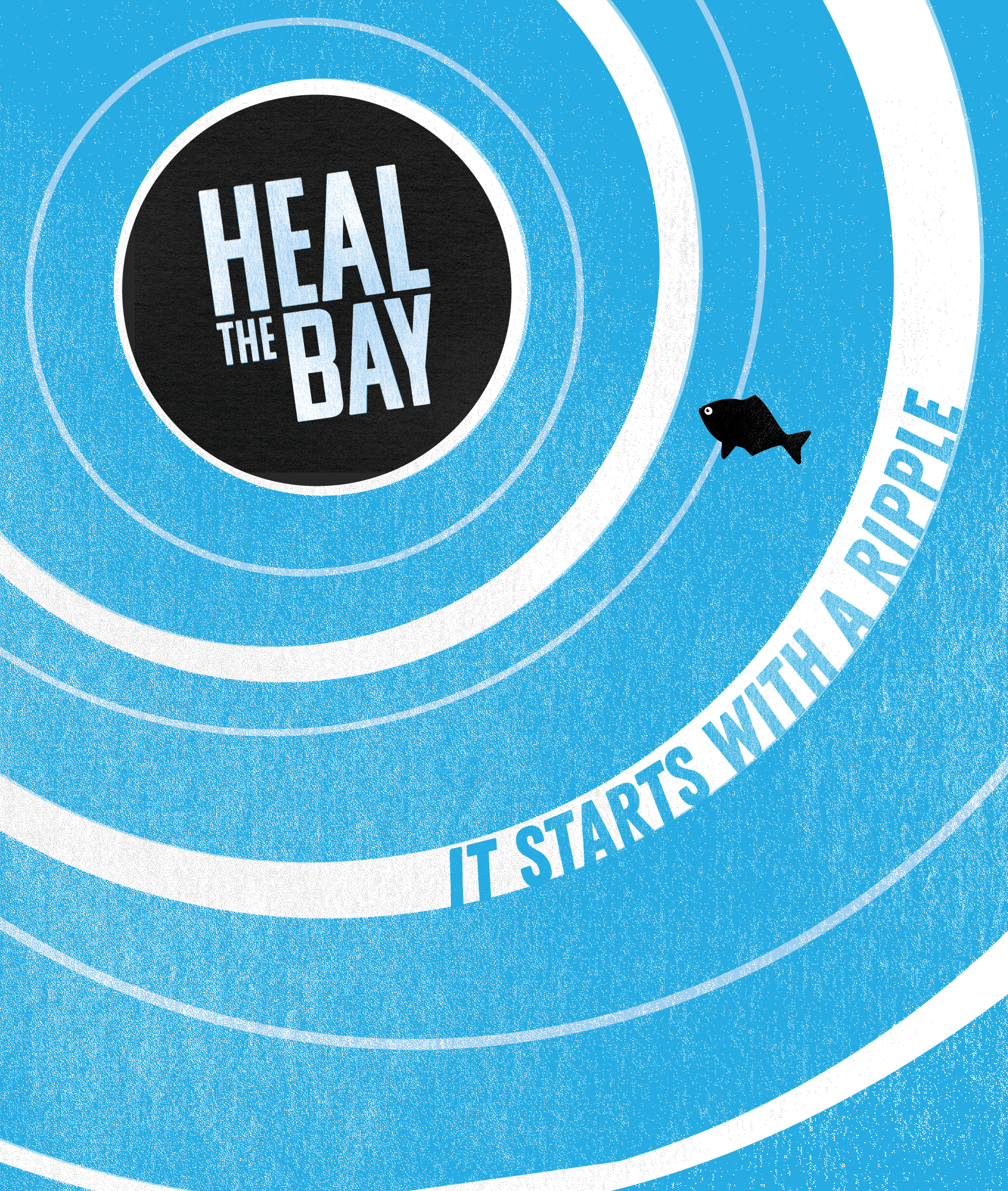
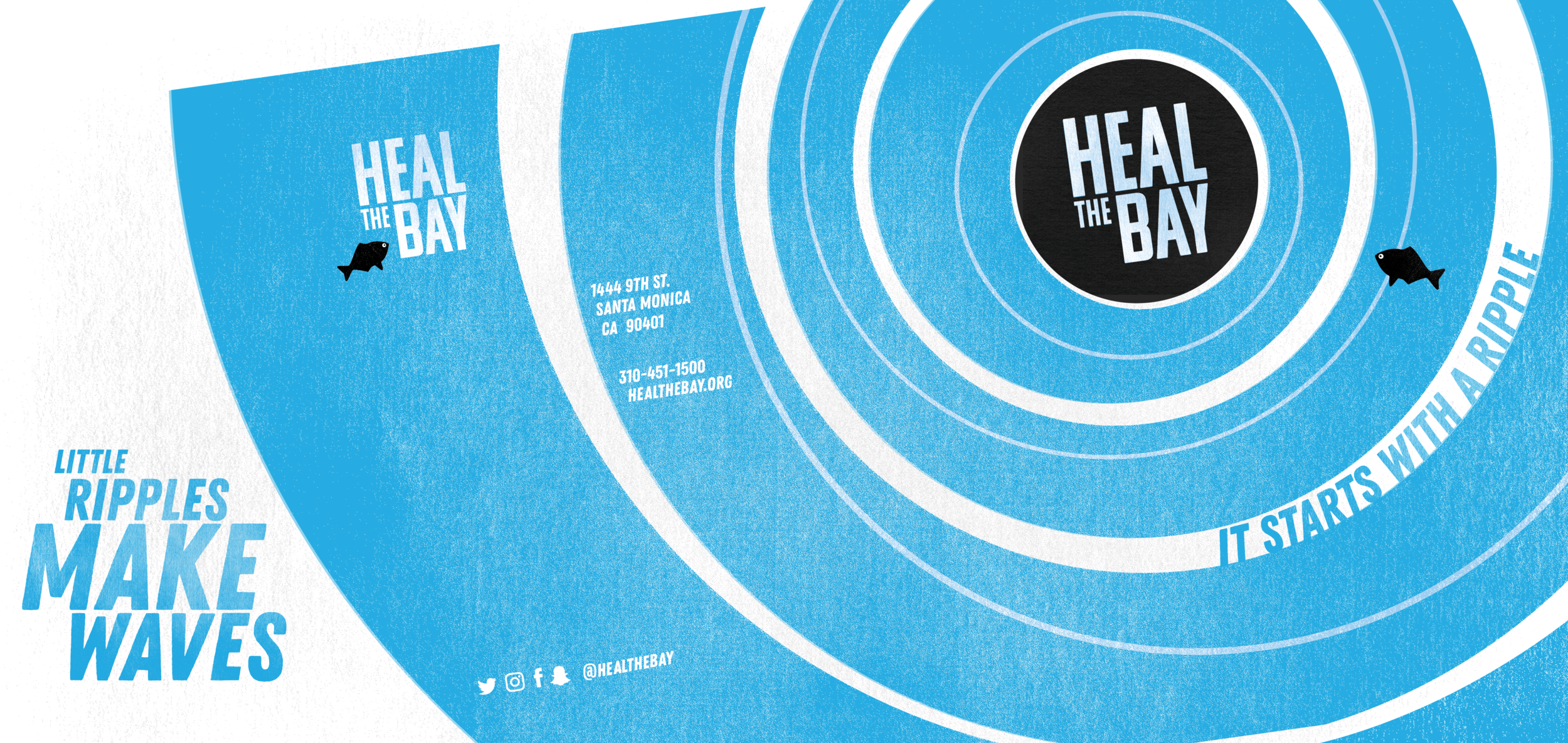
Logo
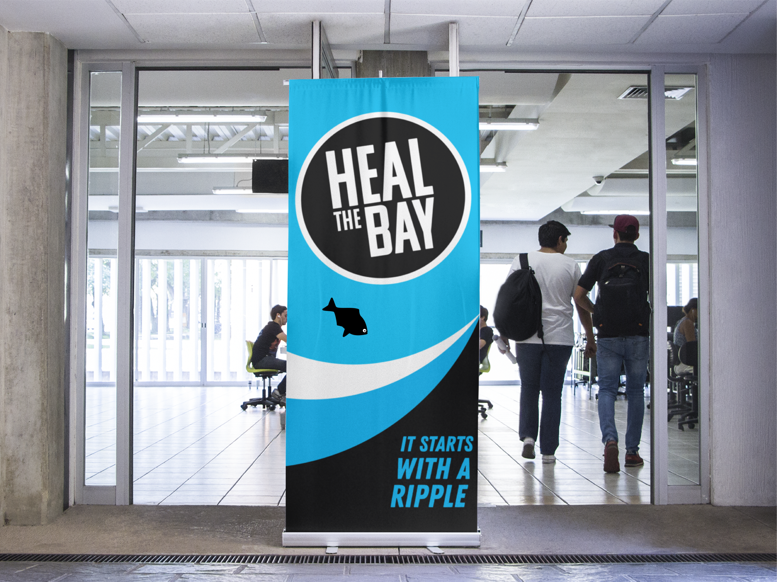
Heal the Bay’s existing logo had gained some recognition within the Greater Los Angeles area. However, even after the logo was softened in 2019 (see below), the image of a skeletal fish no longer suited the type of positive, community-building organization Heal the Bay has become.

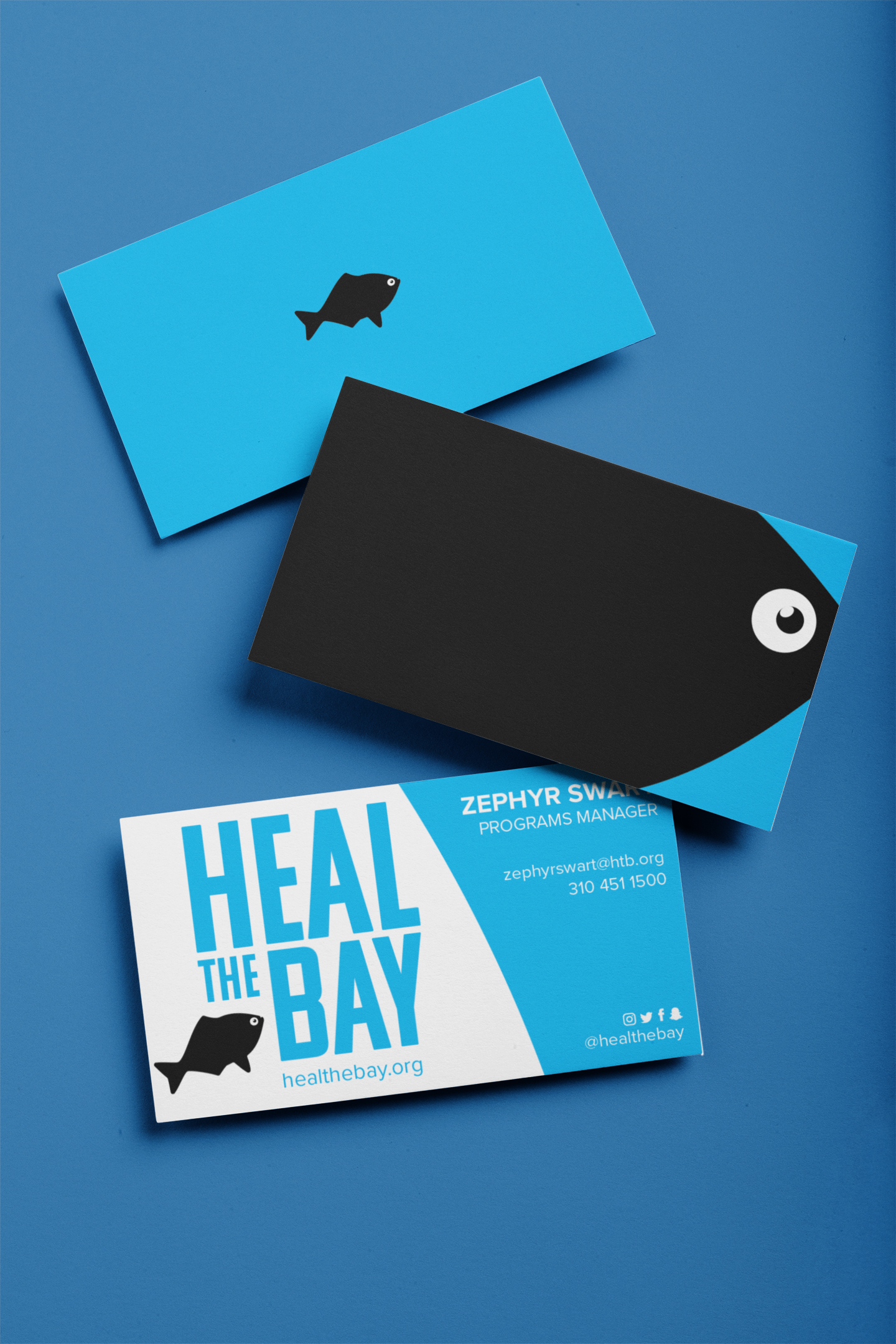
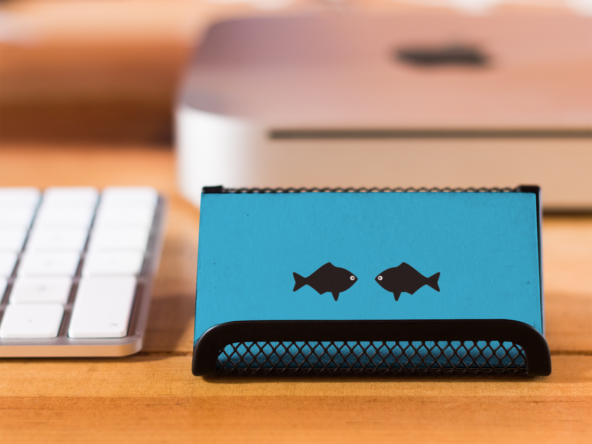
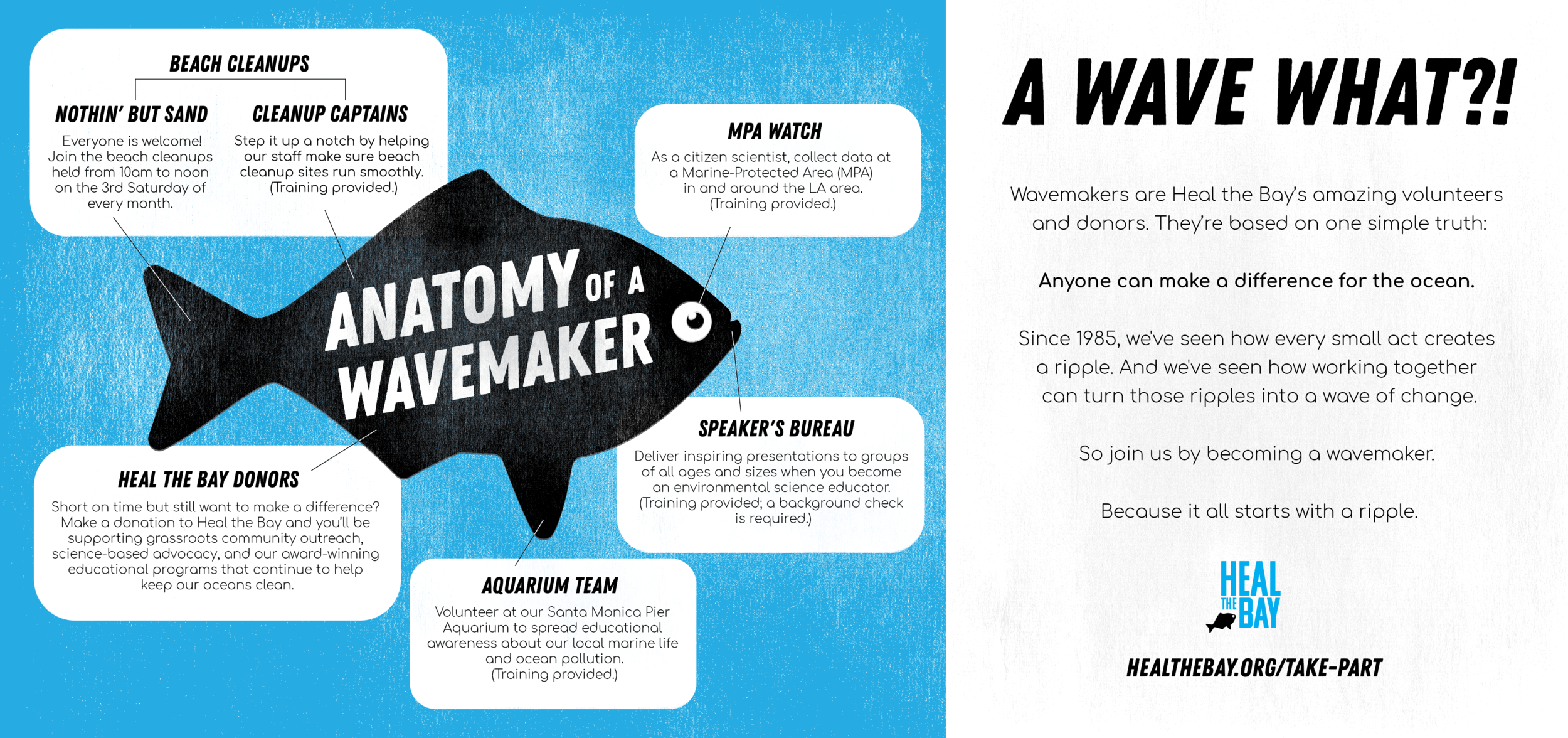
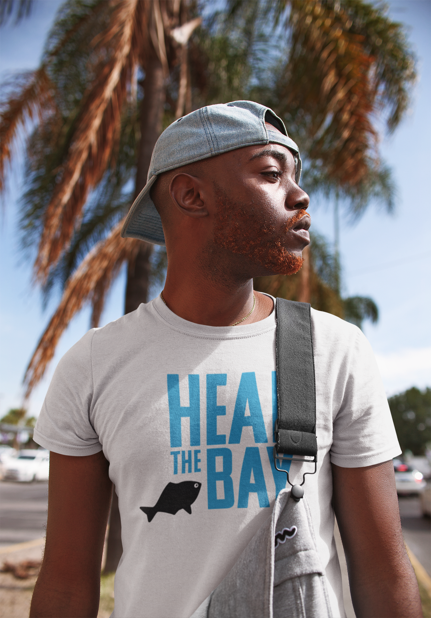
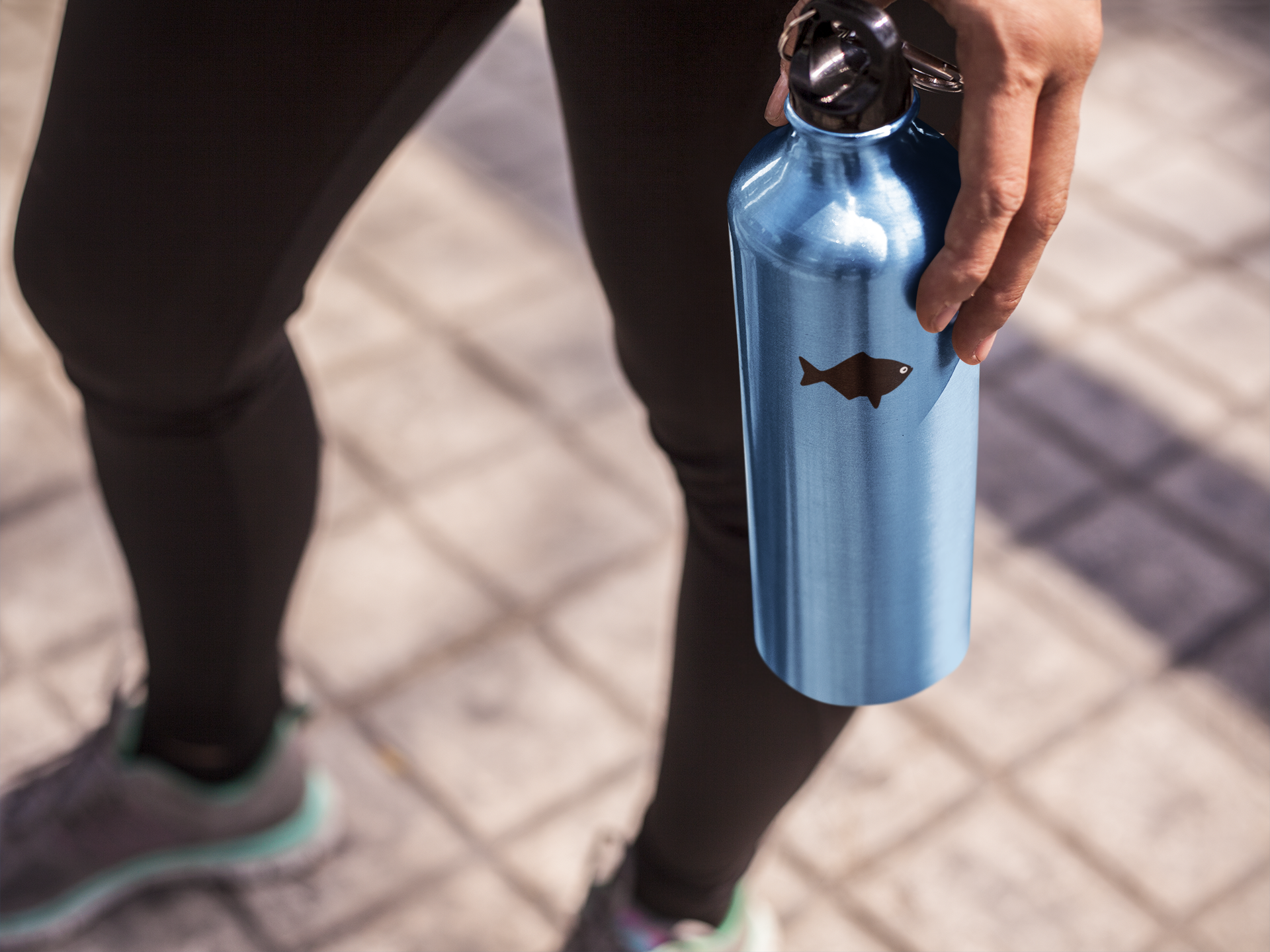
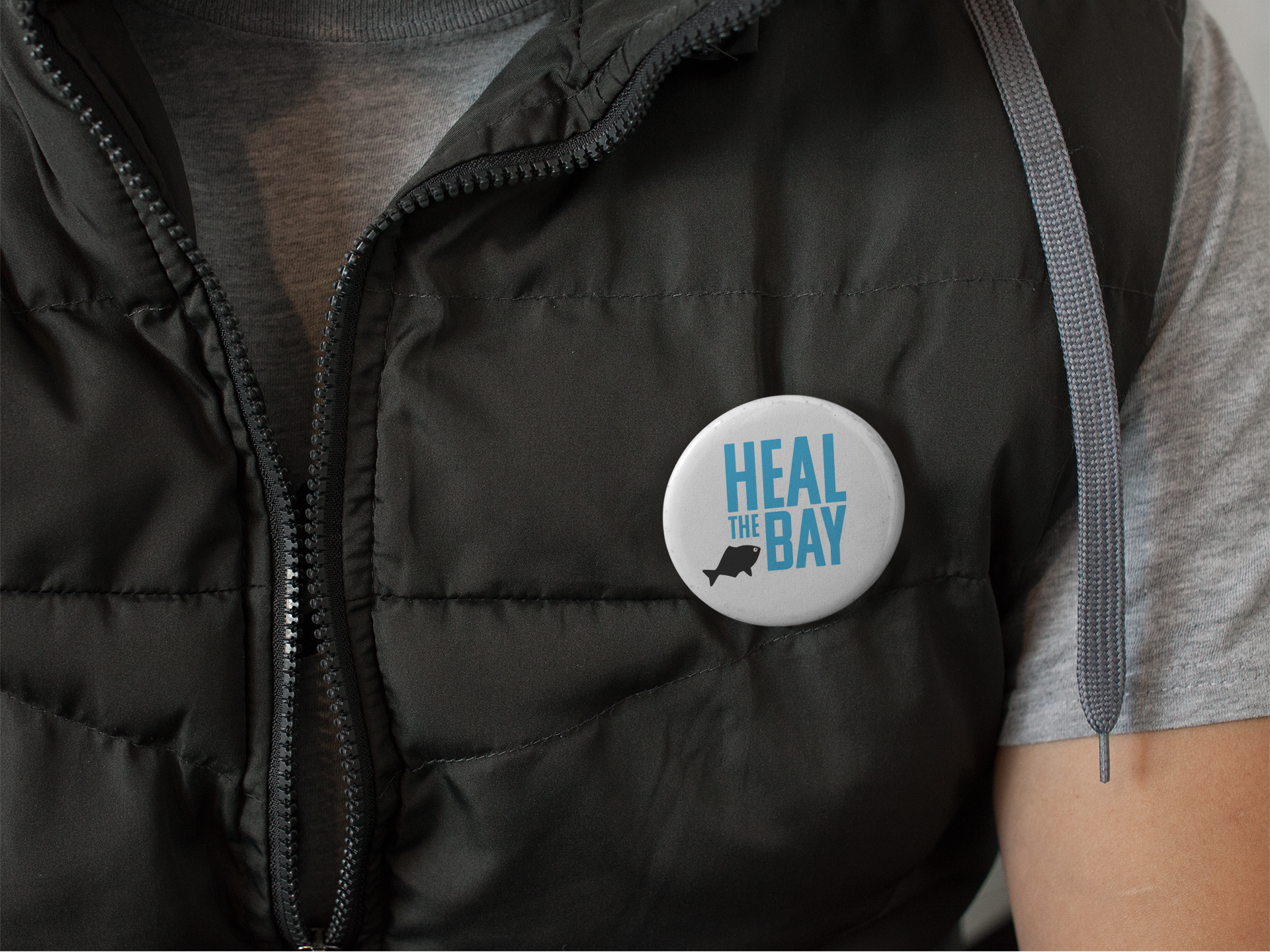
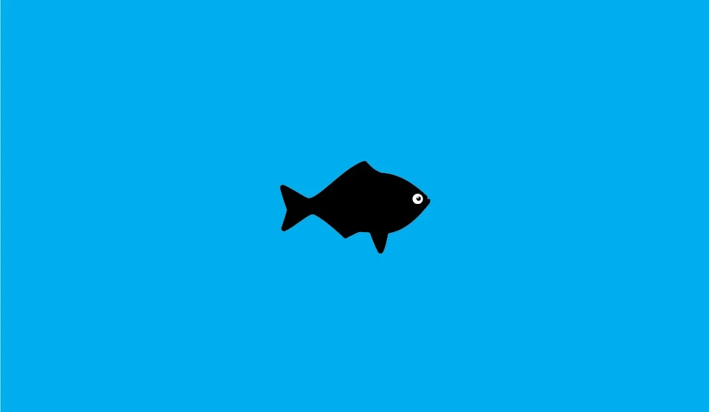
The solution (below) was to retain their iconic flat-design fish silhouette (now represented by the Silver Surfperch), but lose the negativity for a more positive and playful feel.
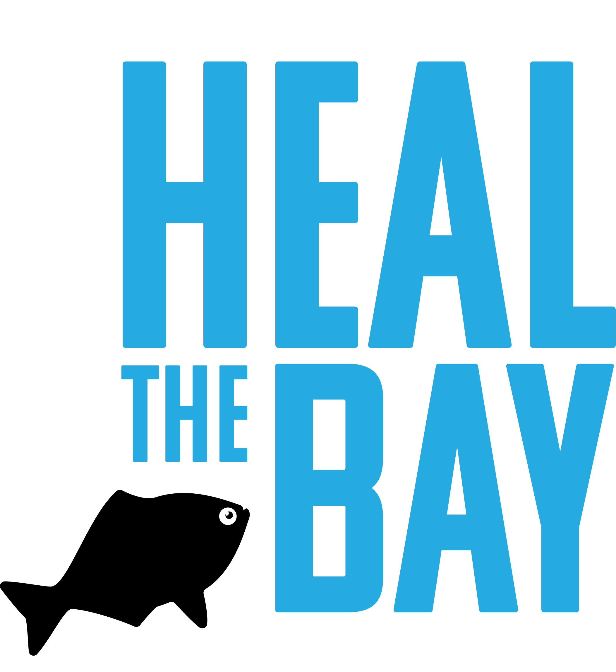
Although the icon and wordmark combine into a complete logo, the logo itself is a “kit of parts”: the wordmark and the fish icon can appear together or separately; and the fish can change position, orientation, scale, and number. This infuses character and movement into the once-static fish icon, allowing for more playfulness in print and online media.

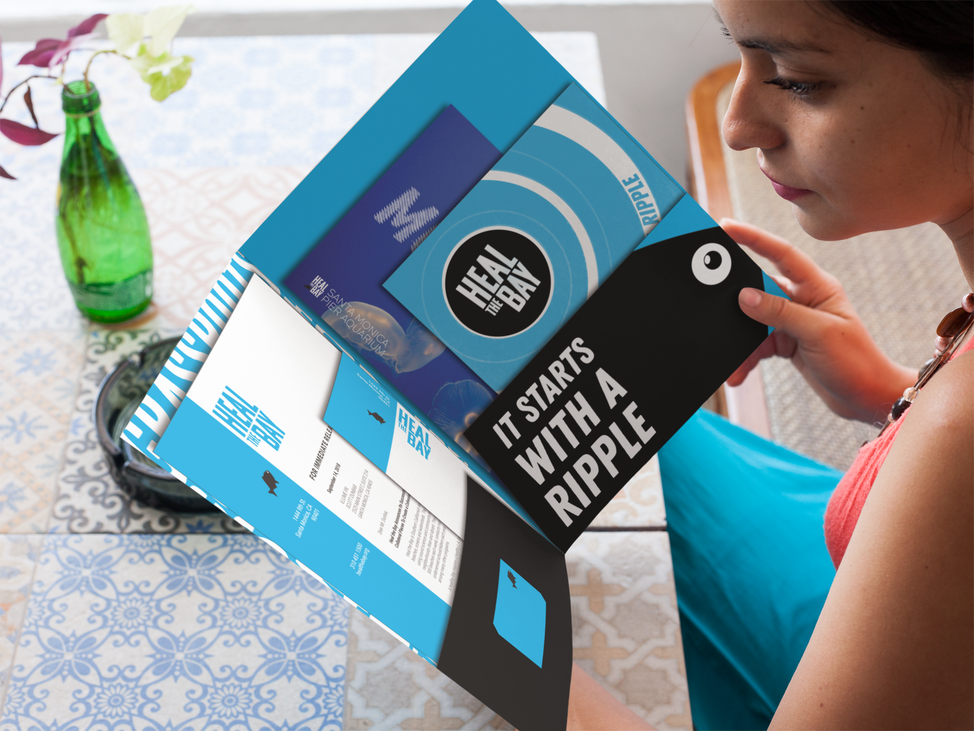
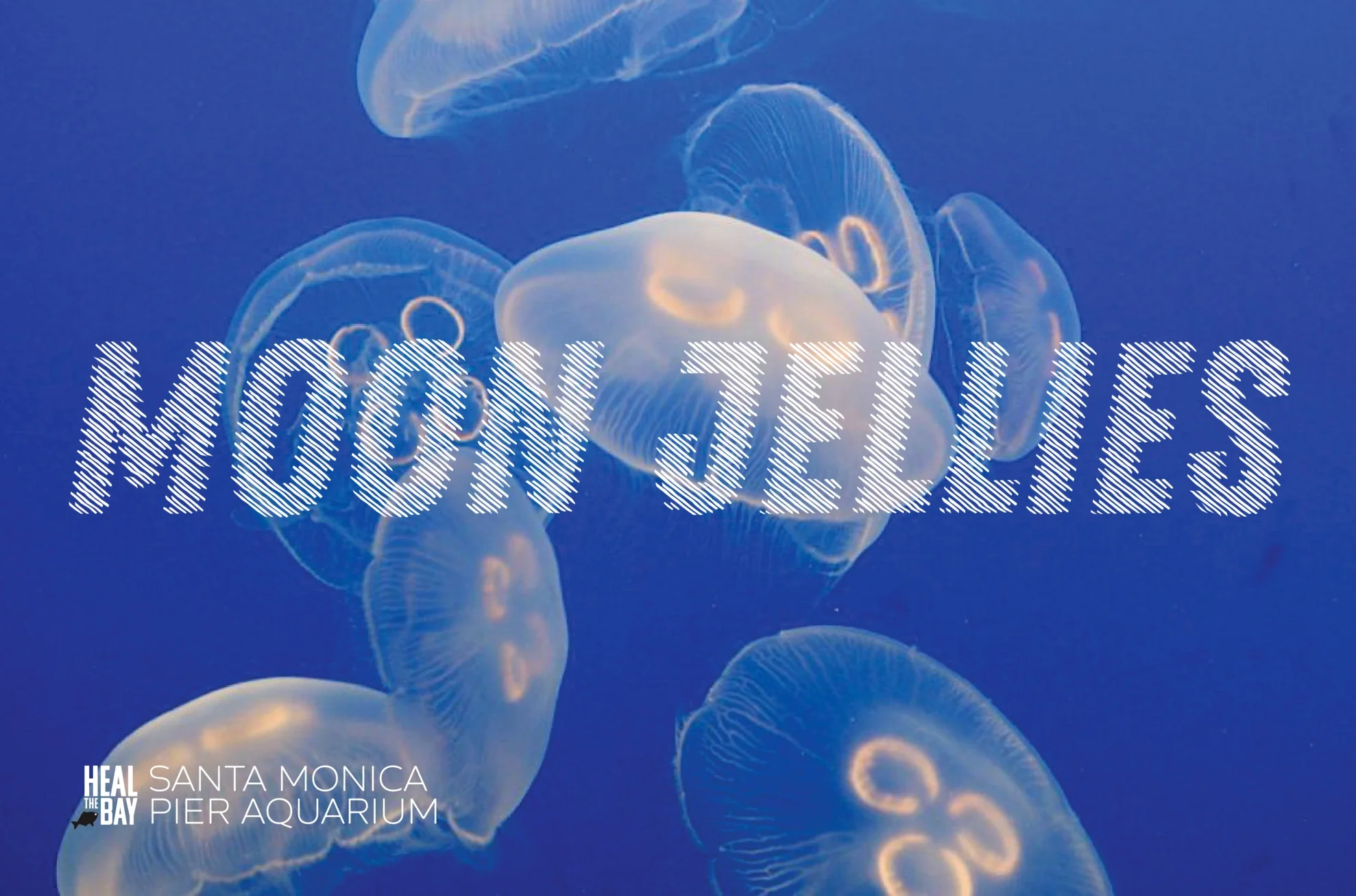
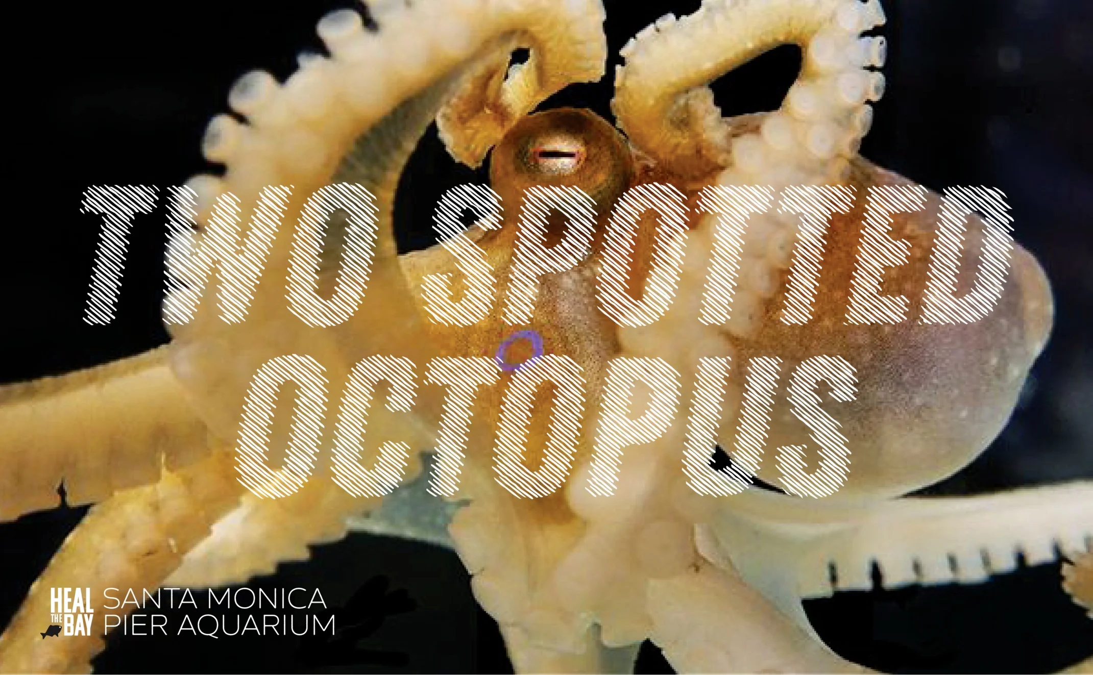
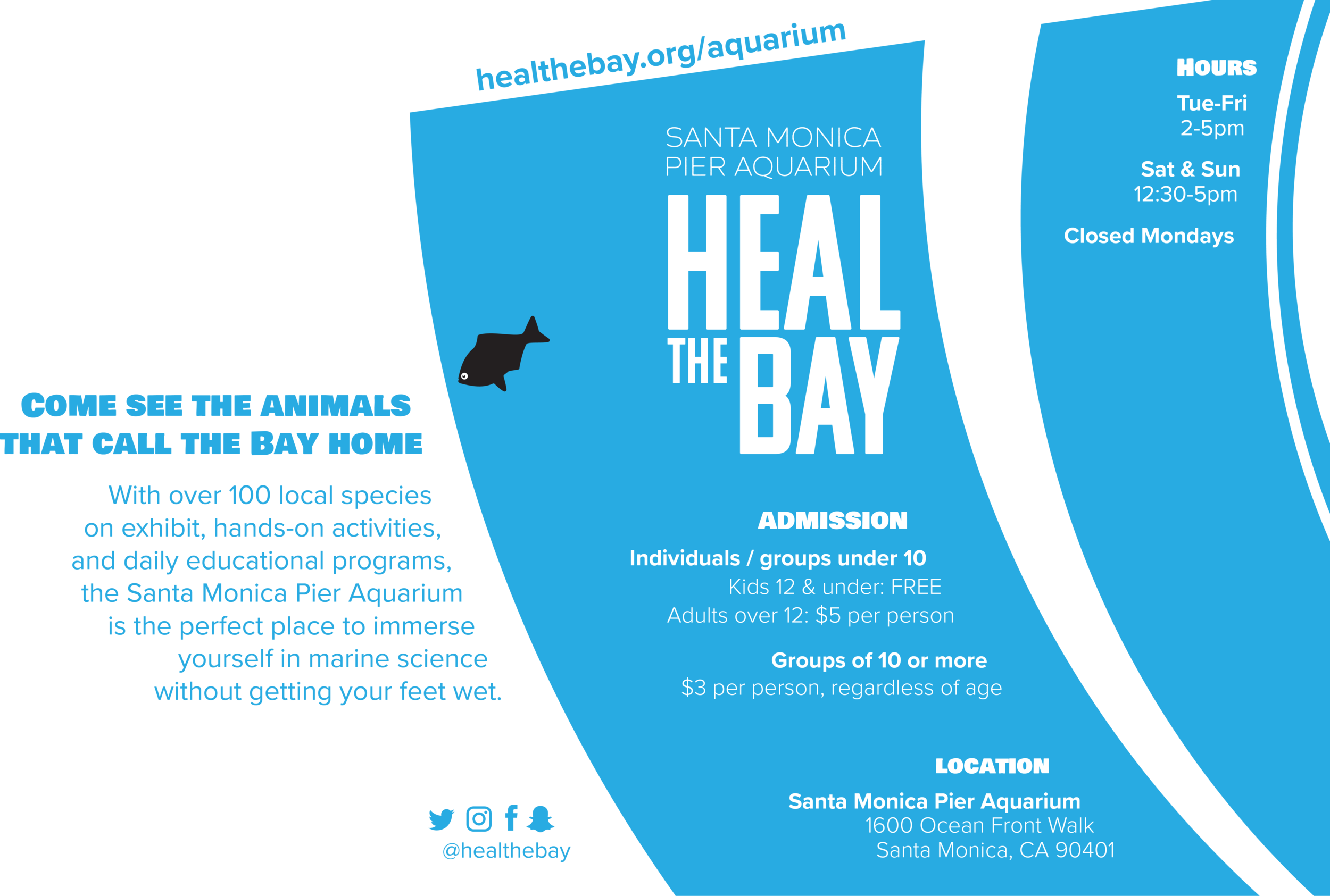
Santa Monica Pier Aquarium
The redesign also allows Heal the Bay to freely add their logo to Santa Monica Bay Aquarium collateral items, which for obvious reasons was something they rarely did in the past. This helps create a stronger, more cohesively unified branding across all of their programs.
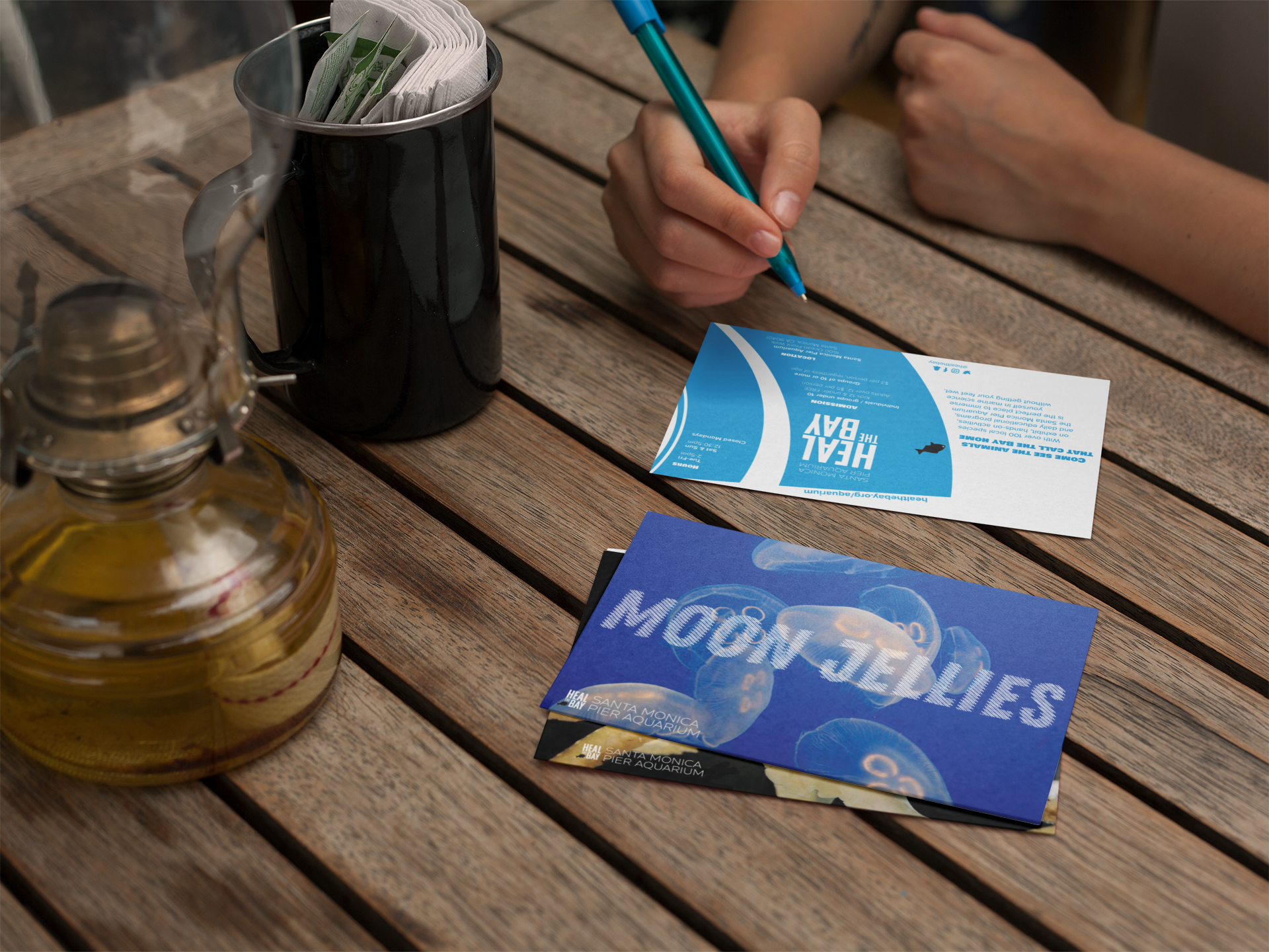
Business Cards