— App Redesign —
Movist
An Attractive App Made Usable
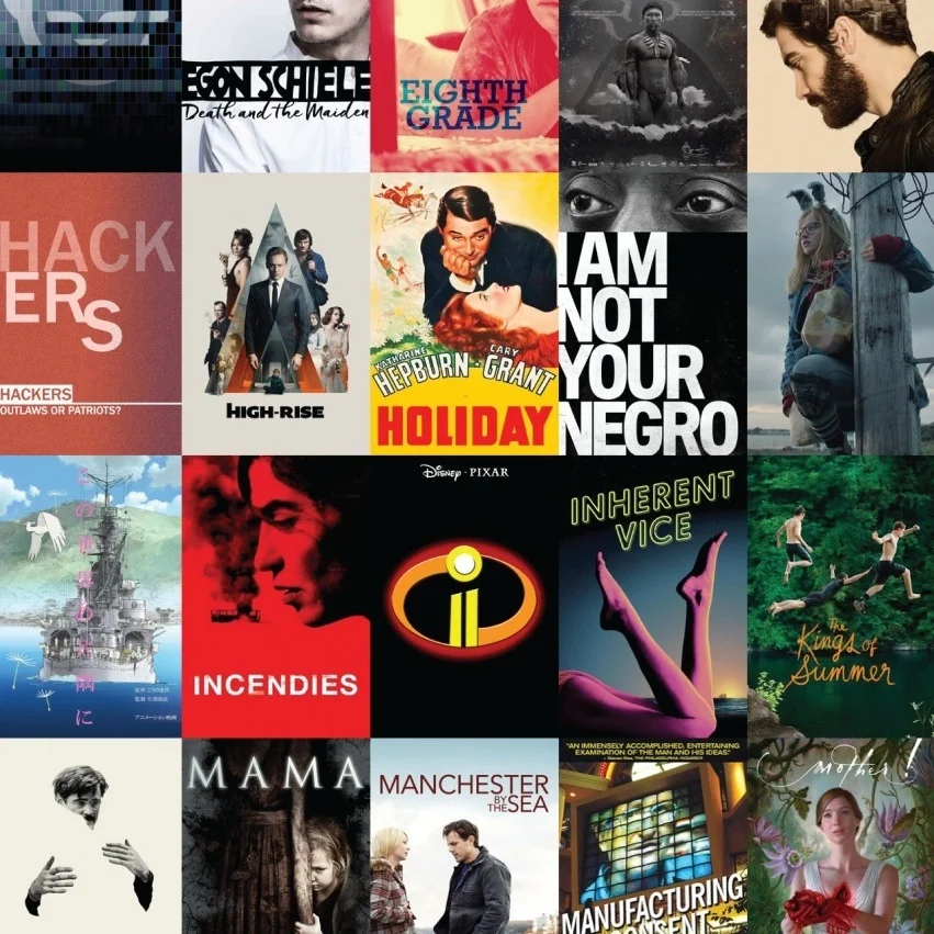
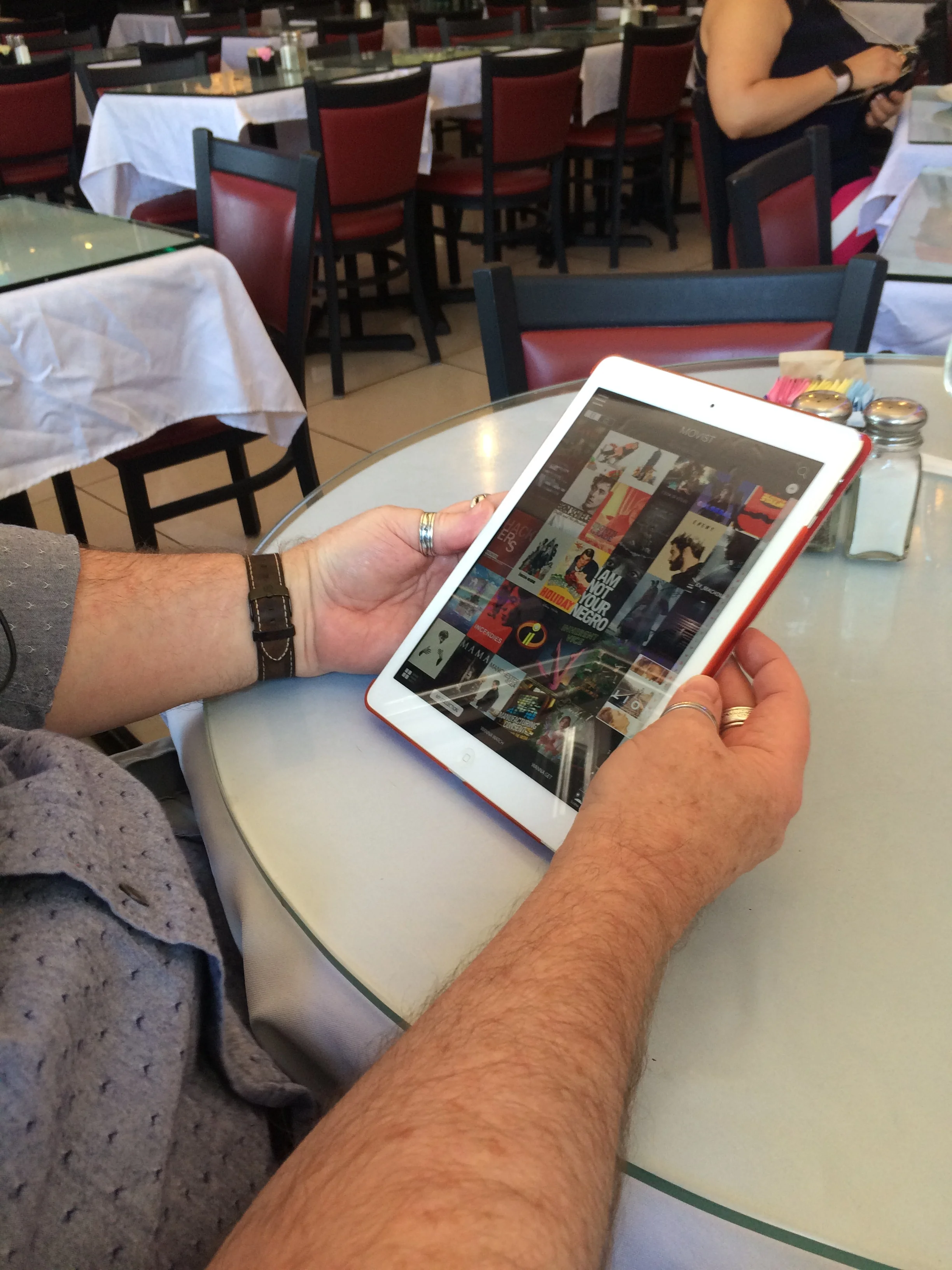
Movist is for users who own digital and/or physical copies of film and TV shows. The app helps manage and organize those titles, keeping track of what's owned and what's wanted while also allowing users to catalog what they've already seen and what they want to watch next.
The Problem
Although visually-appealing, Movist makes it difficult to access important features and fails to provide intuitive markers. Furthermore, it neither considers other ways users may want to use the app nor how many users may want to access the same app on one device.
The Solution
Keep the overall look of the app, but bring hidden features forward and reconfigure the app to allow users to tailor the app for their own needs. (A side-by-side comparison of the original and revised app can be seen near the bottom of this page.)
The following video presents a full run-through of the changes made to the app (or you can read about the changes in the side-by-side comparison below).
ORIGINAL VS REDESIGN: A COMPARISON
The following side-by-side comparisons explicitly show how the redesign has changed from the original app.
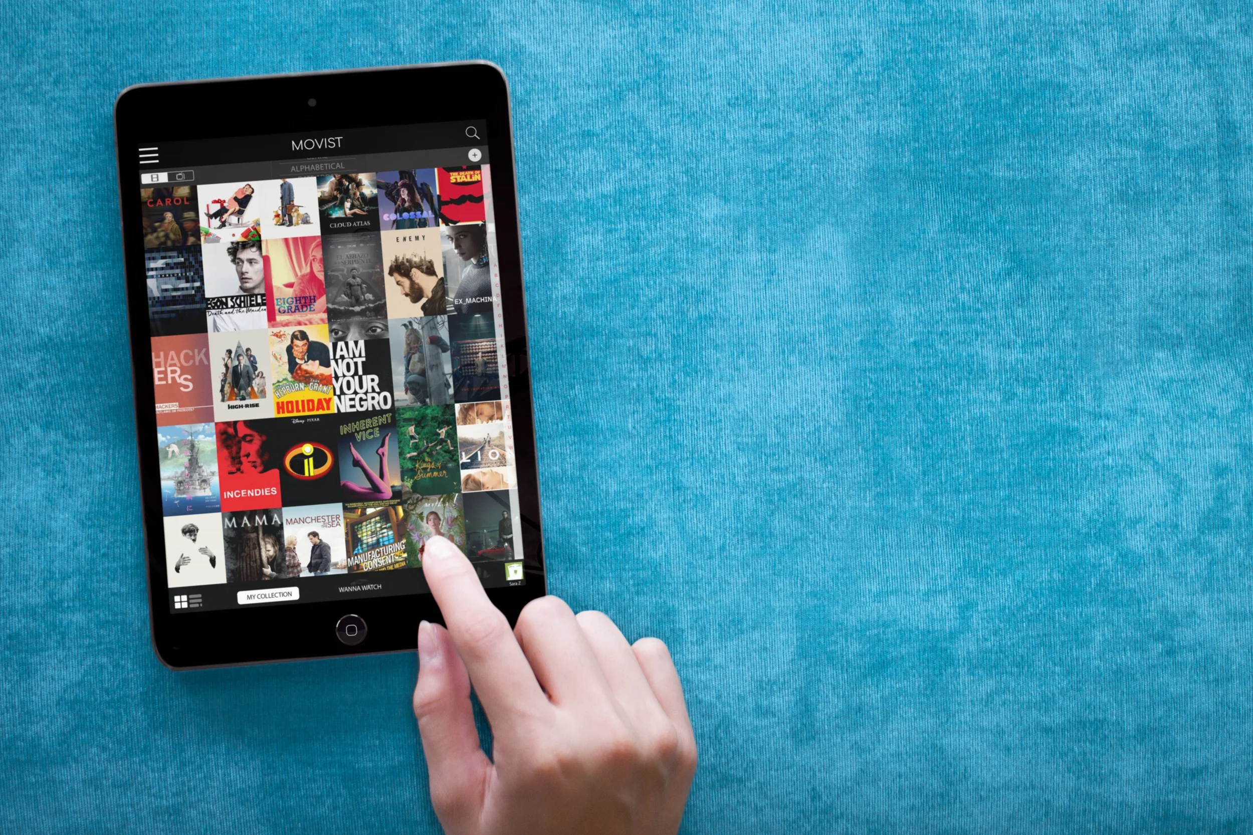
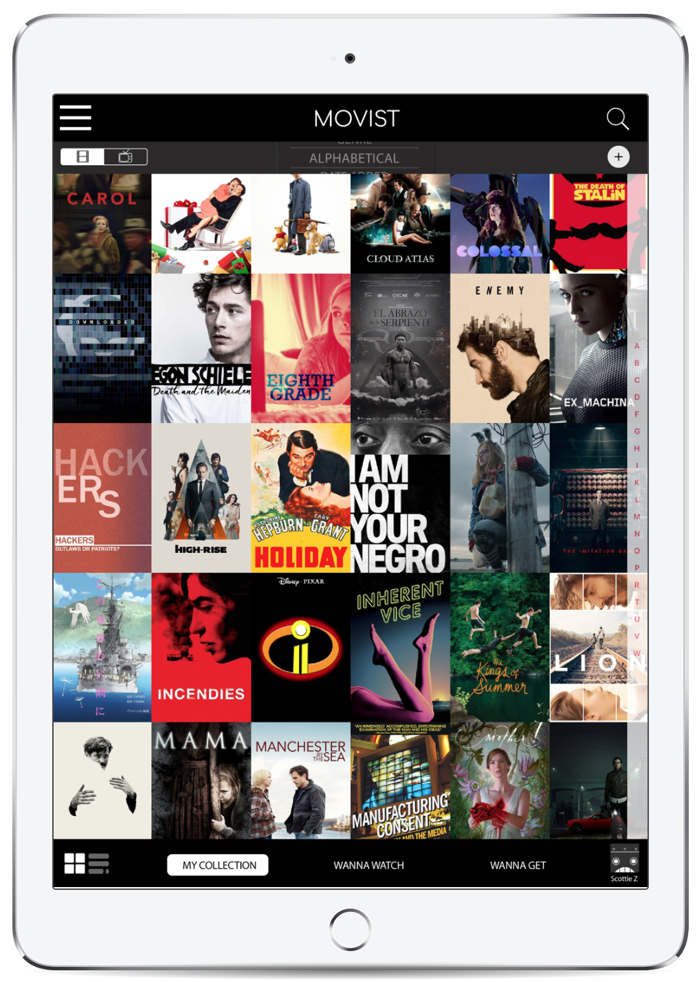
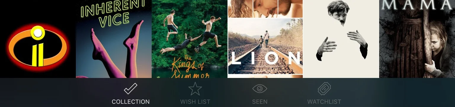
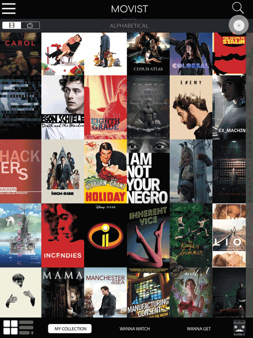
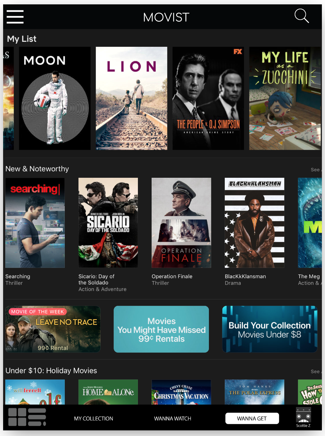
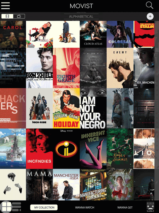
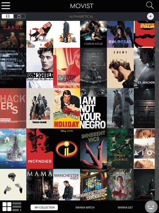
Home Screen
The Home screen retains the overall look, but makes helpful tools more accessible while also adding new features for customization and ease-of-use:
Users can now toggle both between the default “Tile View” and the “List View” as well as between film and TV titles.
The magnifying glass has been given its common function of searching (in this case, searching the existing Collection). And a separate “+” icon is now included for adding titles to the Collection.
The sorting feature is now on the home screen, utilizing an easier selector tool. (See “Sorting” description below for more details.)
Because the redesign allows for multiple users, a profile icon has been added as well. (See “Profiles” description below for more details.)
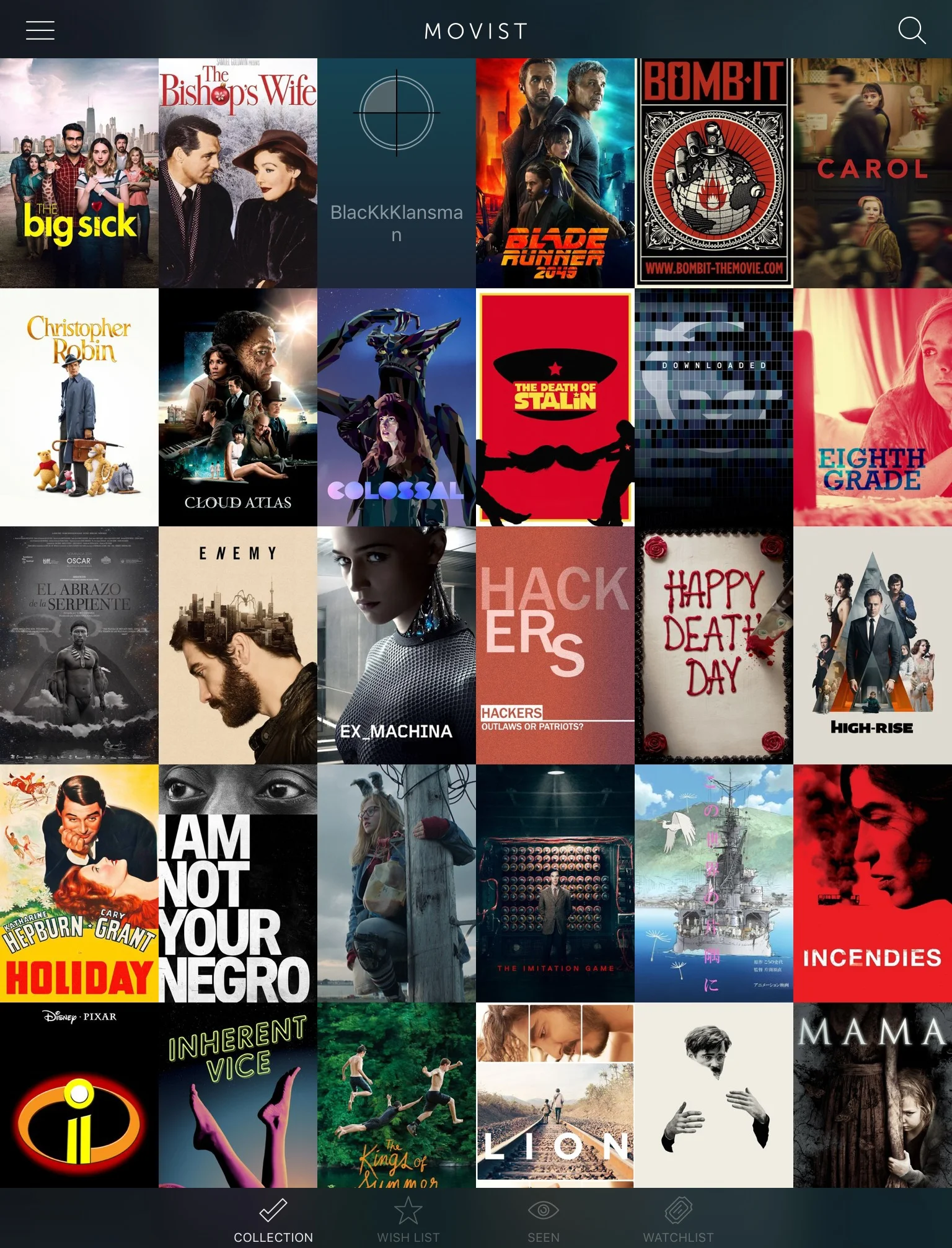
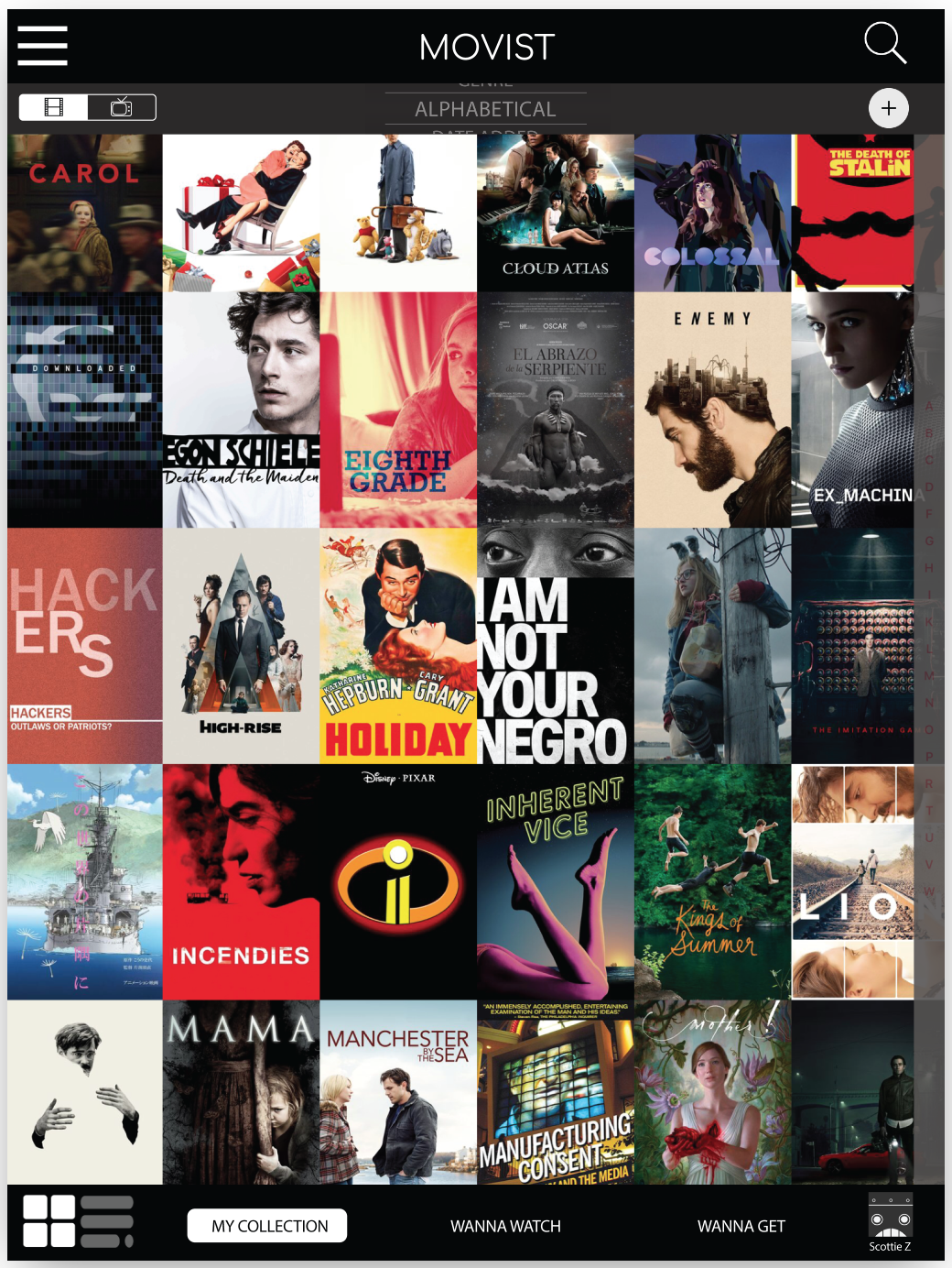
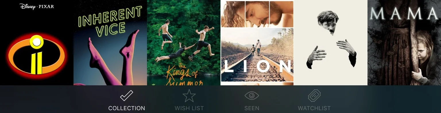
The muted style for the names in the bottom navigation (aka tab bar) rendered those names invisible to several users. Additionally, the wording for the navigation items caused some confusion (e.g. “Watchlist” is used differently on other sites/apps—like eBay). So the names were modified for more visibility and clarity.
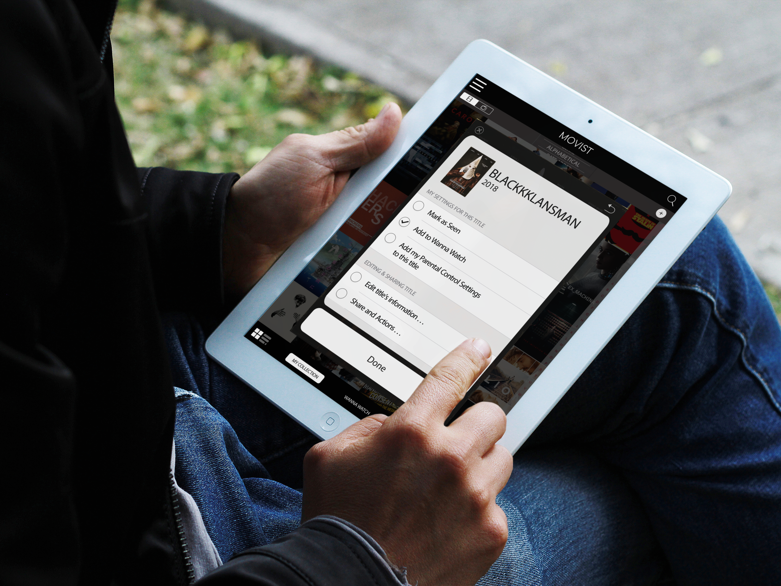
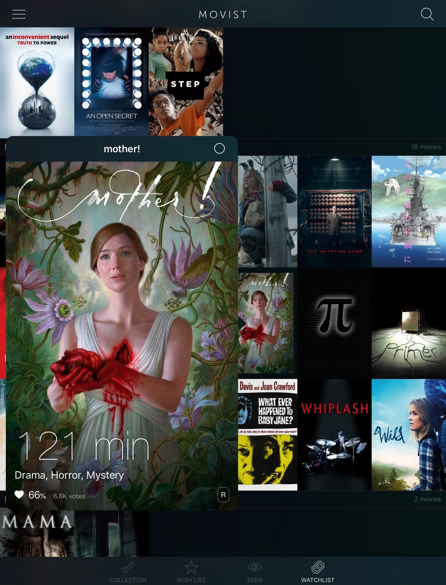
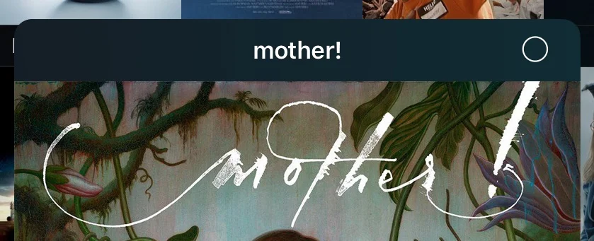
Title Cards
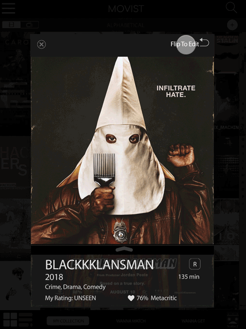
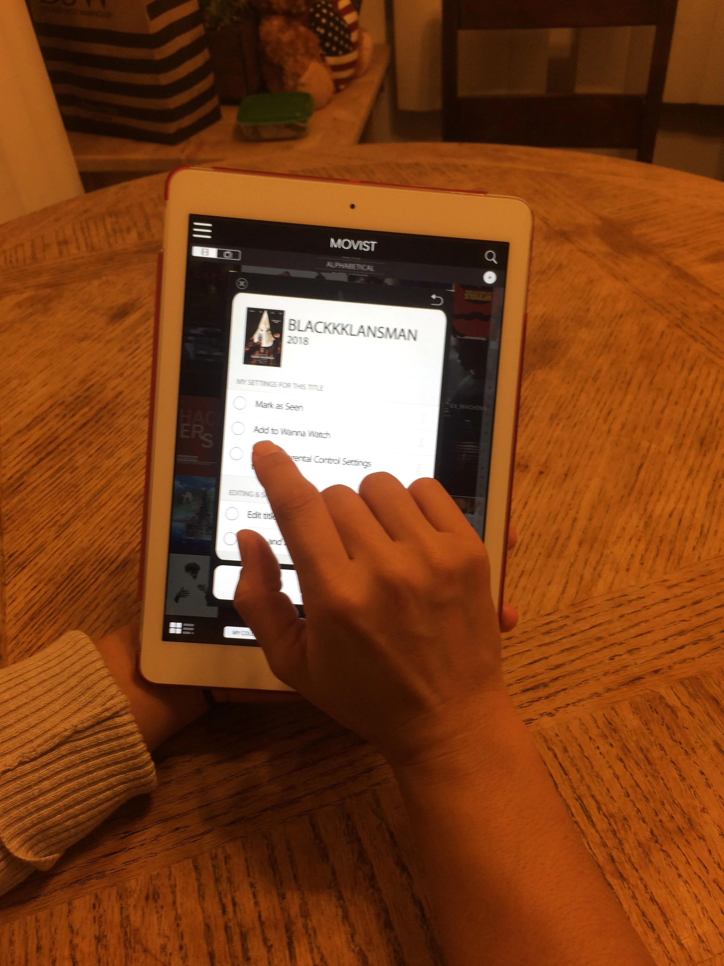
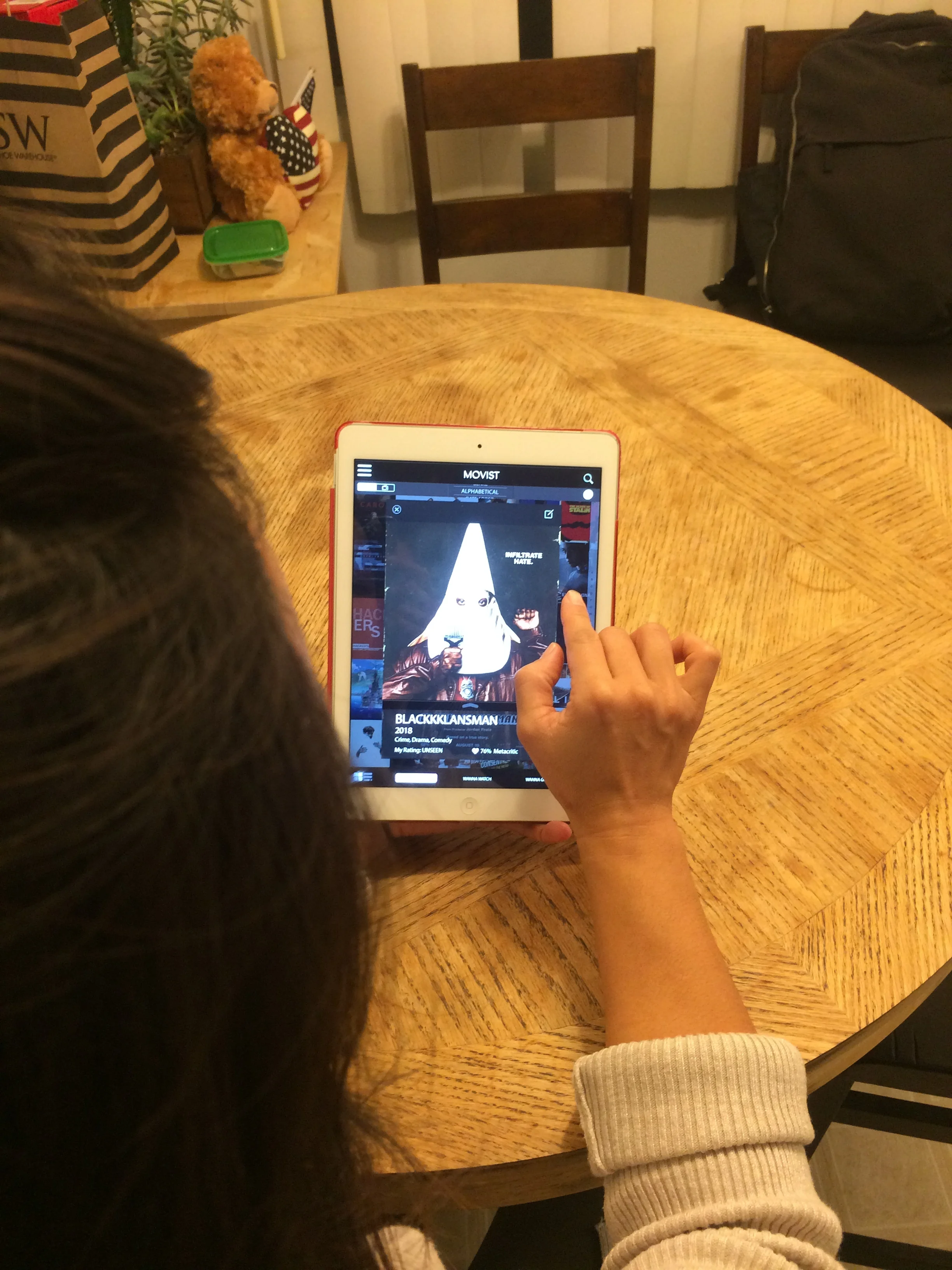
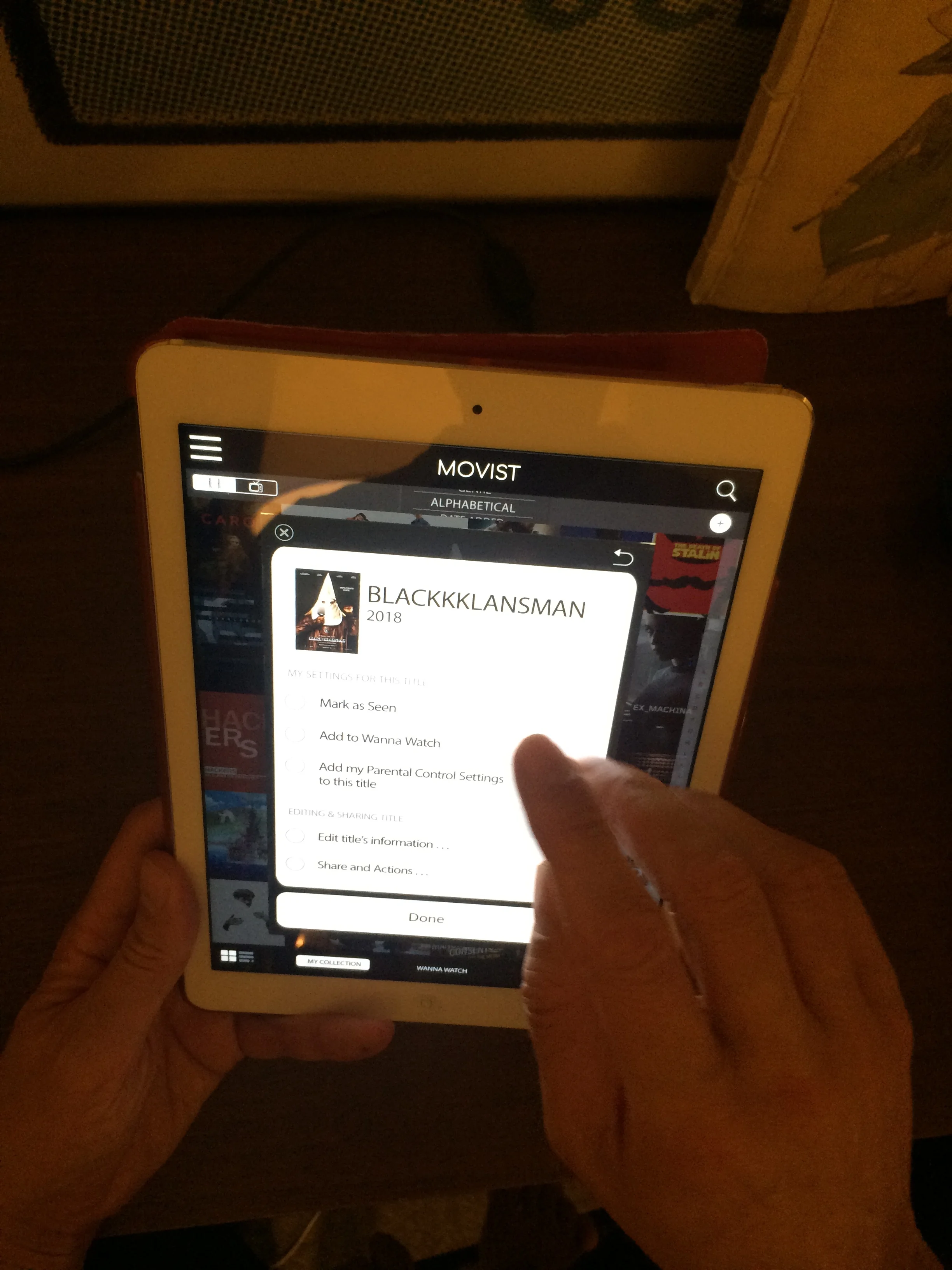
The front of the title cards show information about the film (e.g. summary, cast, etc) taken from a database. The redesign (bottom right) keeps this information and general look, but addresses the problems that had been revealed during testing.
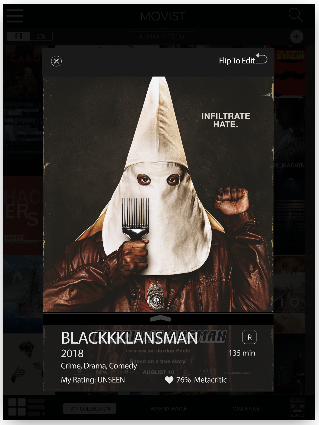
In the original app, users can close the title cards by tapping outside the title card area, but it took a lot of time for users to understand this. Additionally, the circle icon is designed to bring up the settings for this title, but that also wasn’t clear to users.
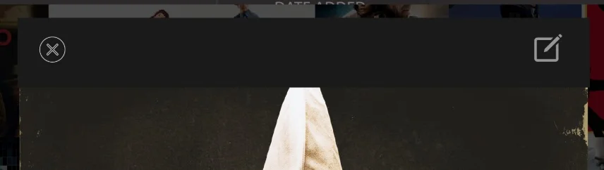
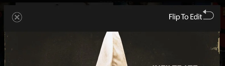
The first iteration added an “x” for closing the title cards as well as an icon that was meant to represent “edit”. While the “x” was clearly understood, most users didn’t understand that the “edit” icon would allow them to change information regarding the title.
The second iteration changed the edit icon and added text to explicitly state what the icon did. While that choice eliminated confusion, future testing should include other options, like the “cog” icon that represents “settings”.
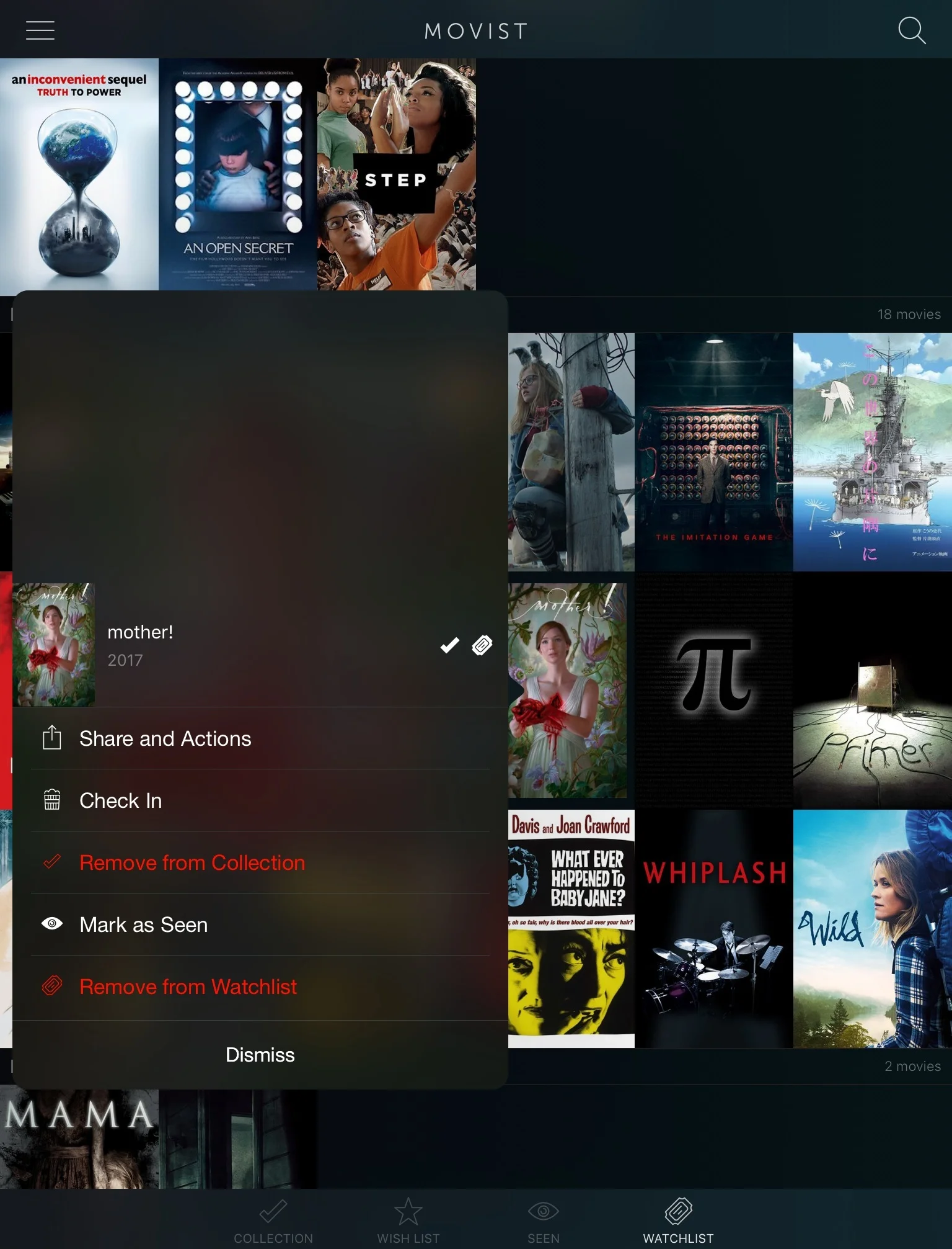
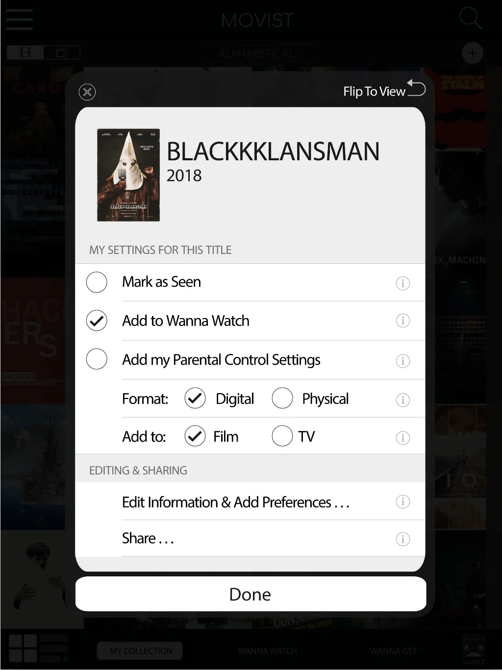
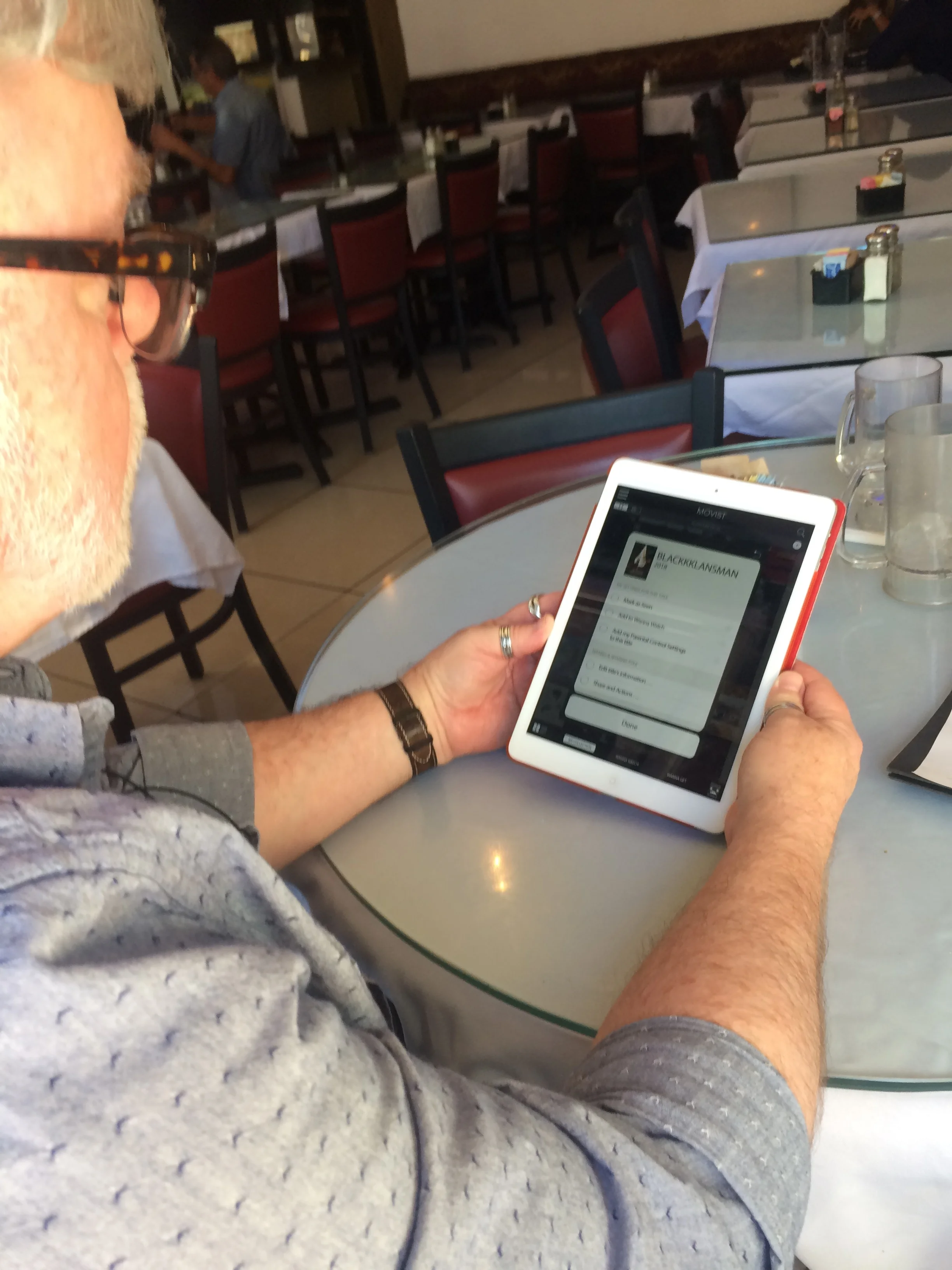
Unlike the original, the back of the revised title cards offers a “Done” button. This allows for selecting more than one option without having the title card close automatically. The new design also offers more options, allowing users to customize their collection more.
Microinteraction (Revised)
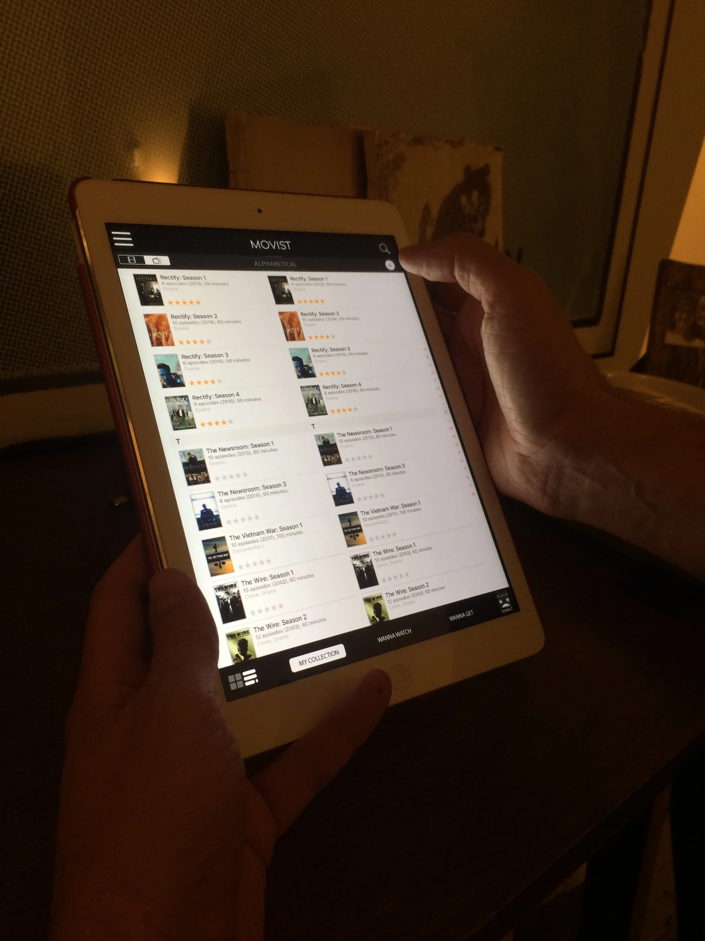
Sorting
One of the biggest frustrations for users was figuring out how to sort their Collection, whether alphabetically, by genre, or by some other classification.
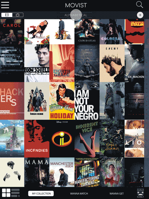
For the original (below), users needed to long press on one of the links in the bottom navigation (tab bar), though most users didn’t figure that out. When users did access the sorting feature, sliding through the categories was problematic because the app didn’t always respond to the user’s swipe.
Sorting 1: Tab Bar (Original)
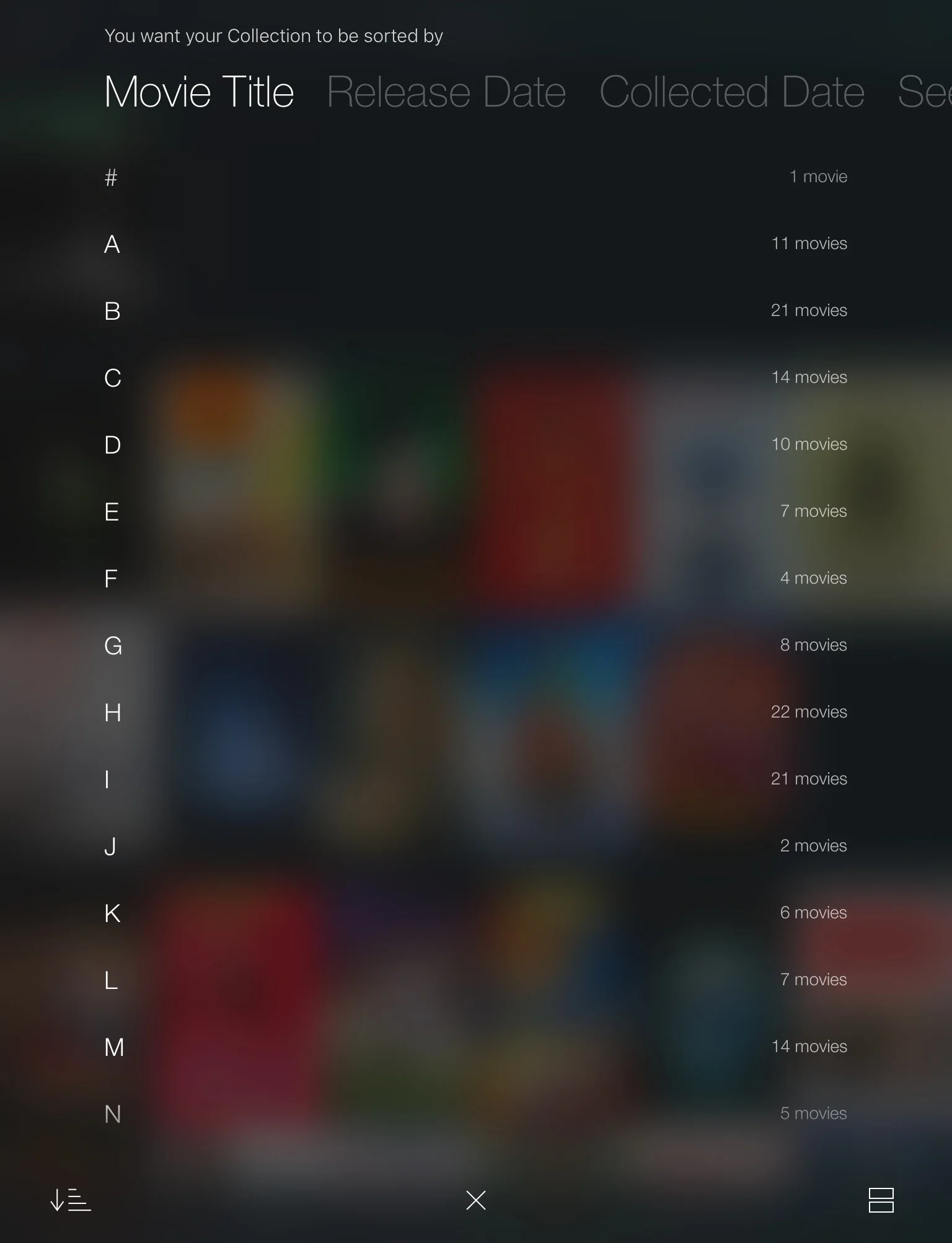
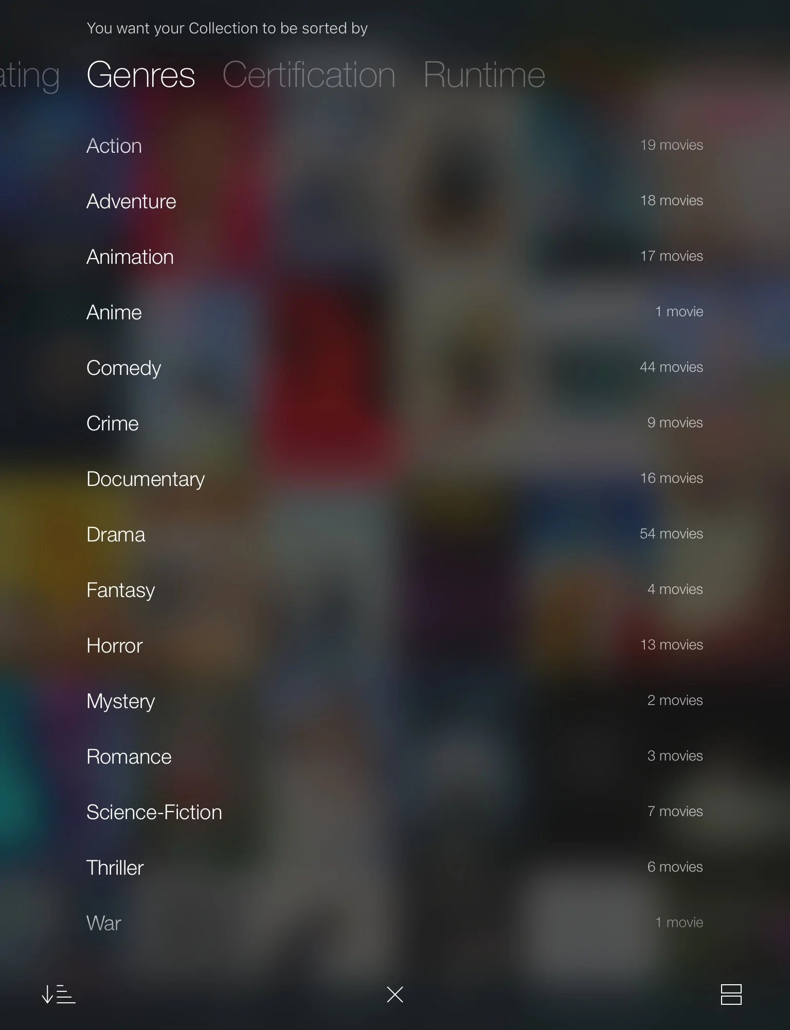
The redesign (below) brings the sorting option to the main screen. Tapping on the sorting category brings up the full selector. From there, users can sort or cancel.
Sorting (Revised)
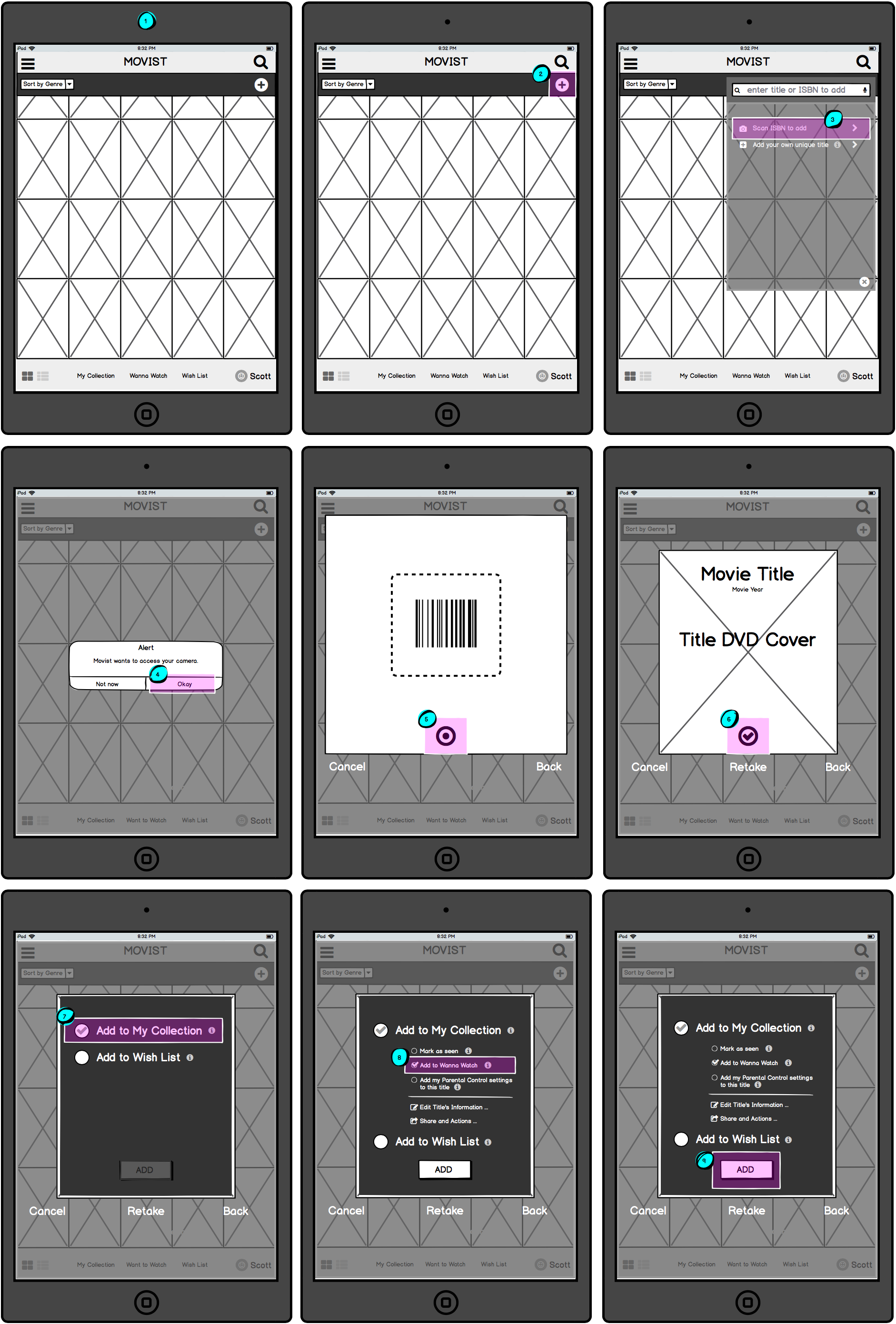
Adding Titles
The original app uses the magnifying icon to add titles to the Collection. The reason for this is users must search the (IMDB) database for the titles available to add.
Unfortunately, this wasn’t intuitive for most users who assumed the magnifying icon was for searching their Collection, not adding new titles to it.
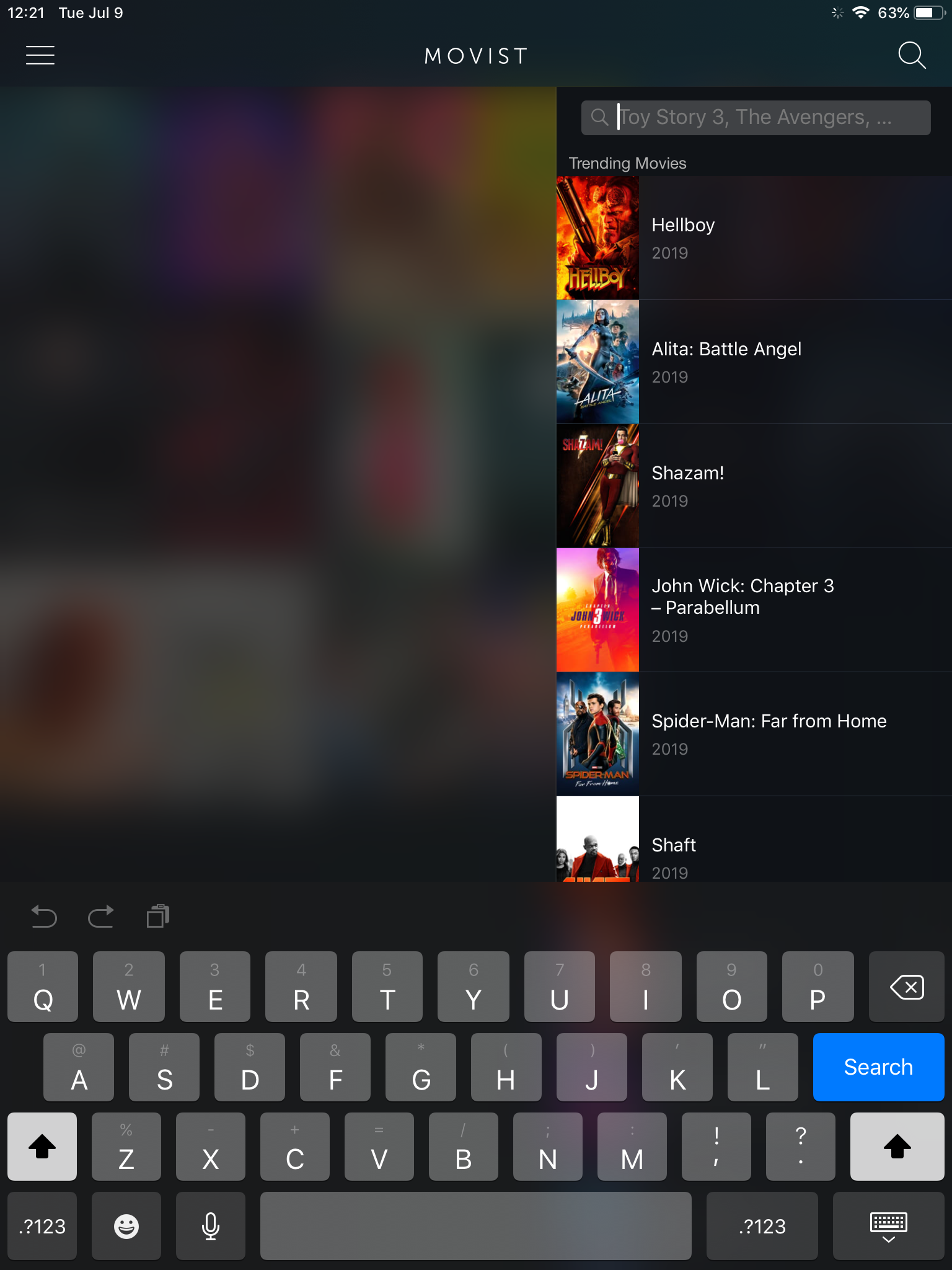
Adding Titles (Original)
So the prototypes reassigned the magnifying icon to searching the Collection (see “New Features” below) and included an new “+” icon for users to add new titles.
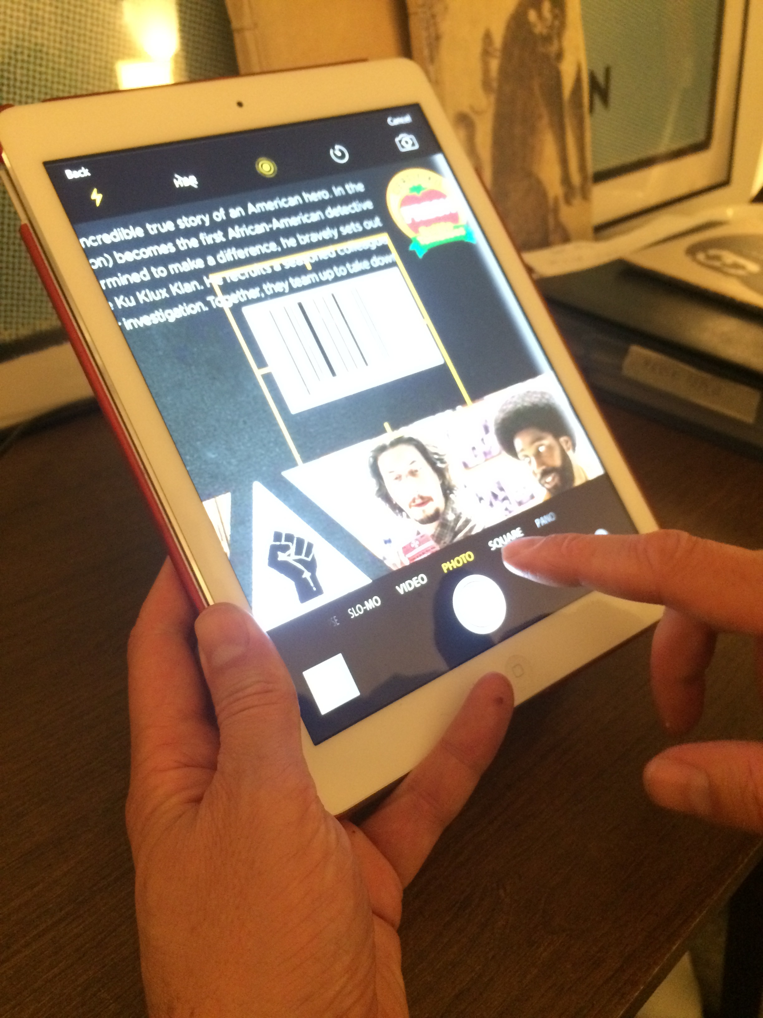
Additionally, that feature was expanded to include multiple ways of adding titles: searching the (IMDB) database via title or ISBN, taking a picture of a physical ISBN, or manually adding the title with the user’s own inputs.
Adding Titles (Revised)
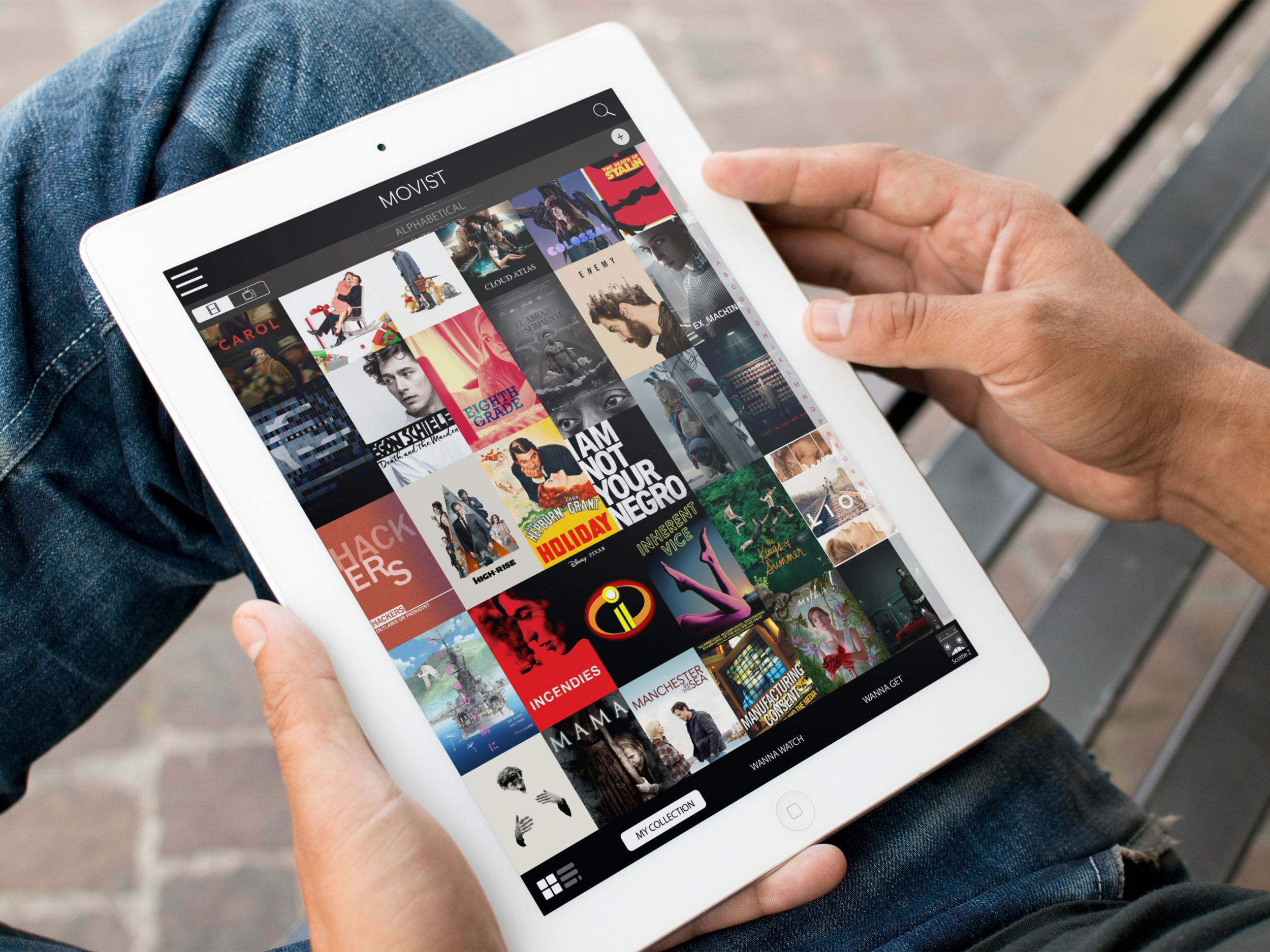
Wanted Titles
The function for keeping track of future titles users wanted to acquire has been altered from two separate screens to just one screen.
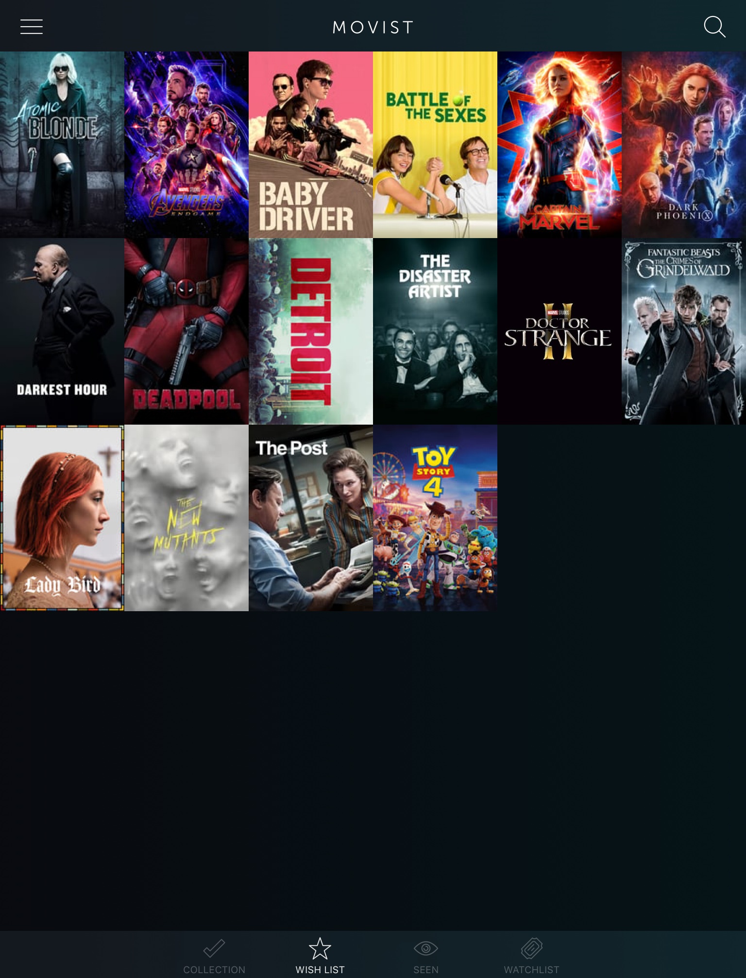
For the original (above), users searched or browsed for items, then added them to a separate “Wishlist” (later called “Wanna Get”). The “Wishlist” and browse screens were separate from one-another. Some users who had Netflix and Amazon Prime were disappointed by this decision.
For the redesign (below), the browse and “Wishlist” screens have been combined into the “Wanna Get” area. Just like Netflix and Amazon Prime, there’s a section called “My List” that keeps track of titles the user is interested in obtaining. And similar to streaming sites, there are suggestions for other titles based on the users collection, trends, and new releases.
Wanted Titles (Revised)
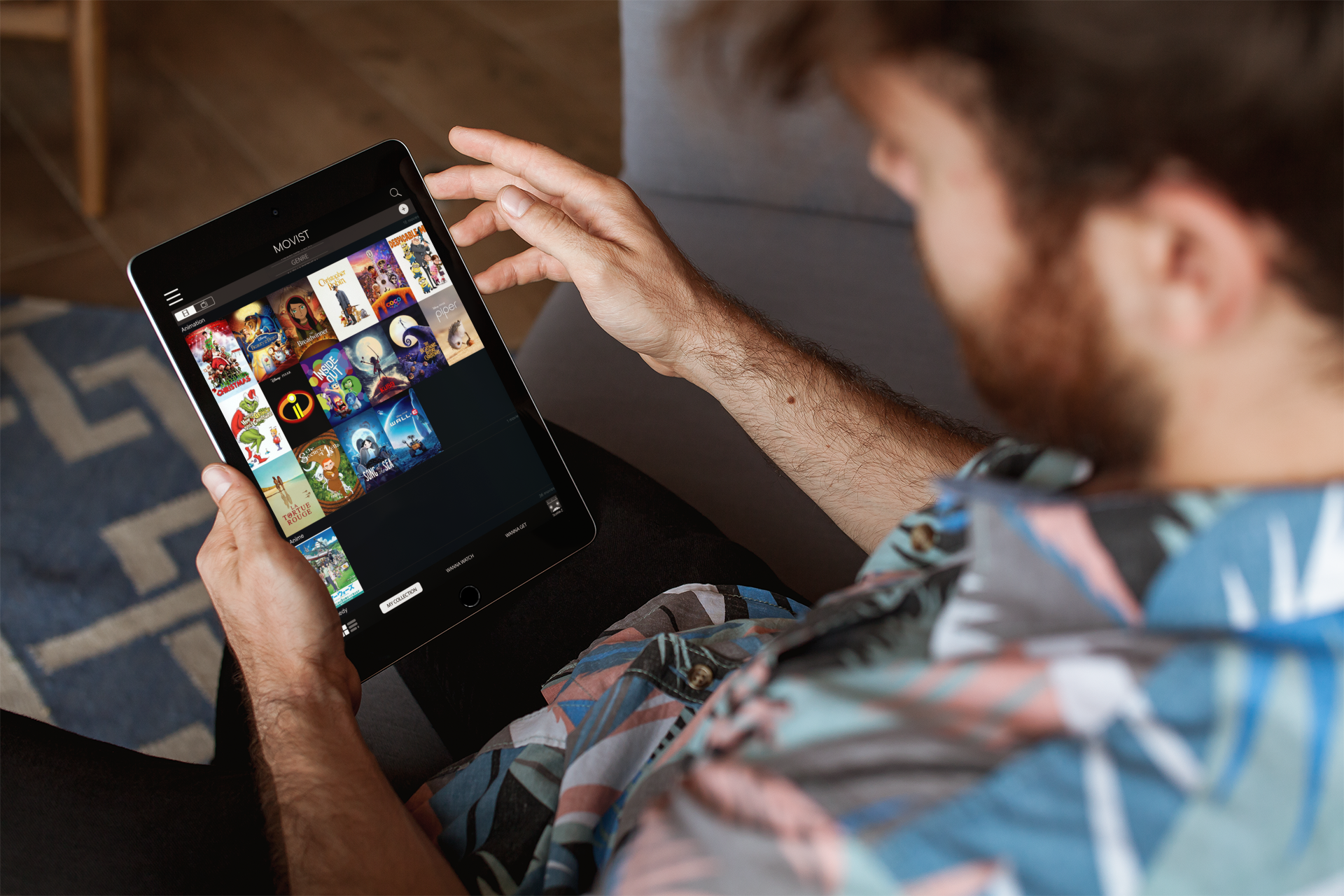
New Features
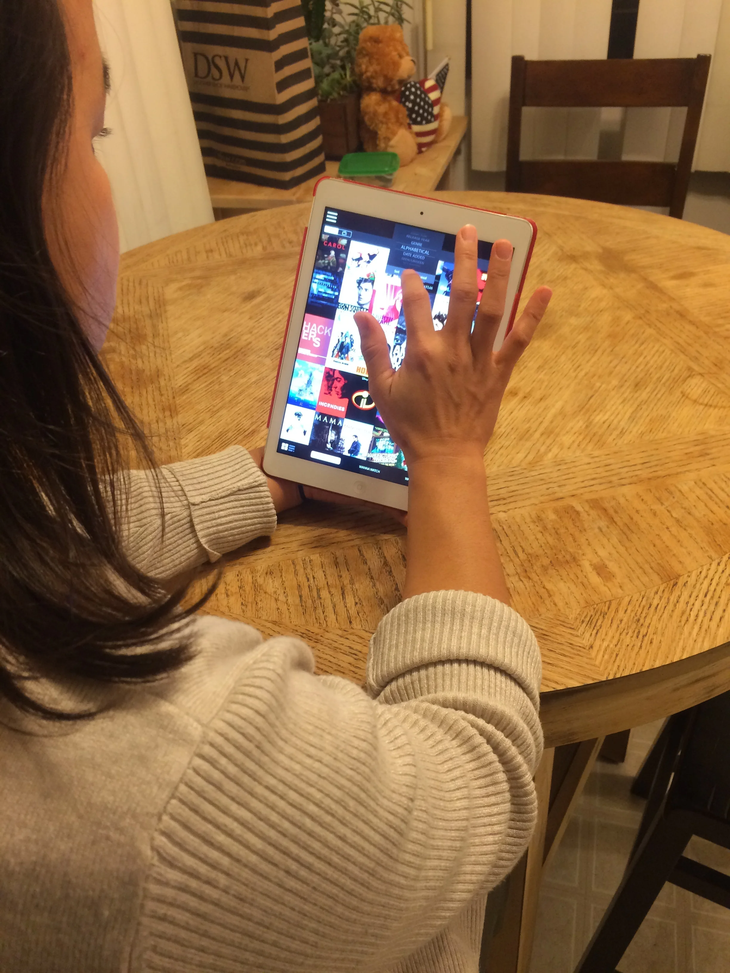
Switching Views (New Feature)
While the Home screen’s tile view was very popular with most users, many also wanted the option to see their Collection in list view. And everyone had difficulty identifying at least one of the titles based on the tile image alone.
With that in mind, a tile/list toggle was added to the Home screen so viewers could quickly change views when needed/desired.
Switching Views
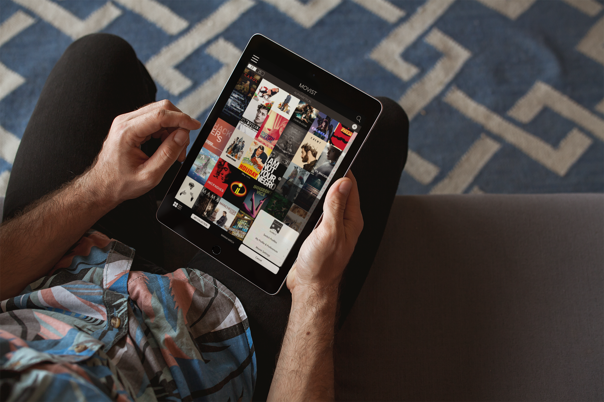
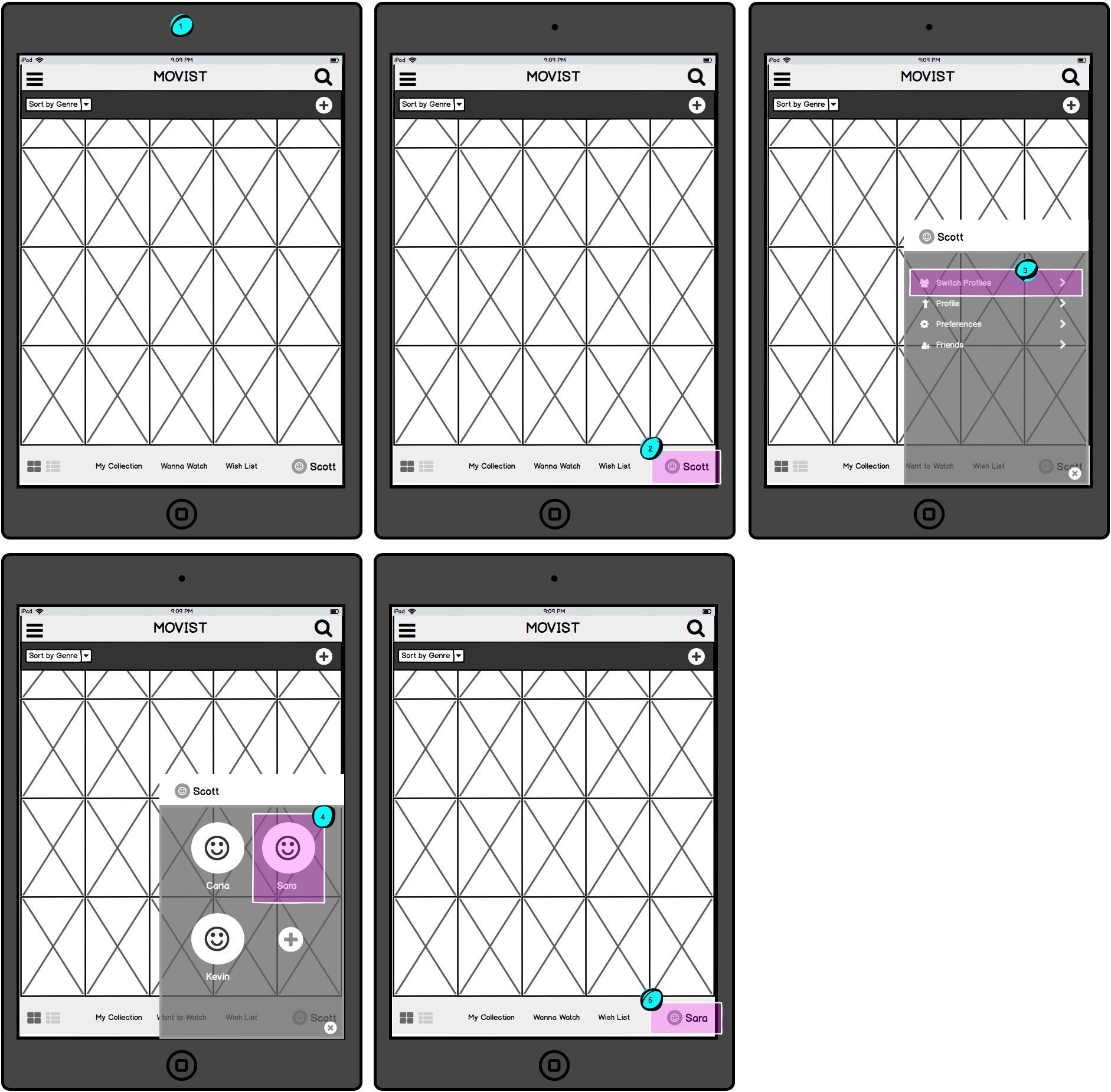
Changing Profiles (New Feature)
The original app didn’t allow for multiple profiles, something that was a problem for many of the users who live with others accessing the same app. Those users wanted a way to share the primary Collection, but with the ability to tailor the Collection to their own needs (e.g. marking what they had seen, what they wanted to watch next, and limiting the access of young children).
Because a high-definition prototype had to be created in a very limited amount of time, Netflix user icons were used during testing.
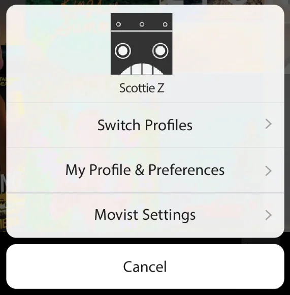
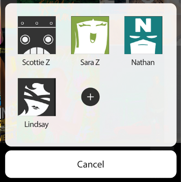
The first iteration (above) made changing profiles a 2-click process. For those who would share the app with at least one other person, there was vocal disappointment with this process. So, the next iteration prioritized the profiles and relegated less-used options to the lower right corner.
Profiles
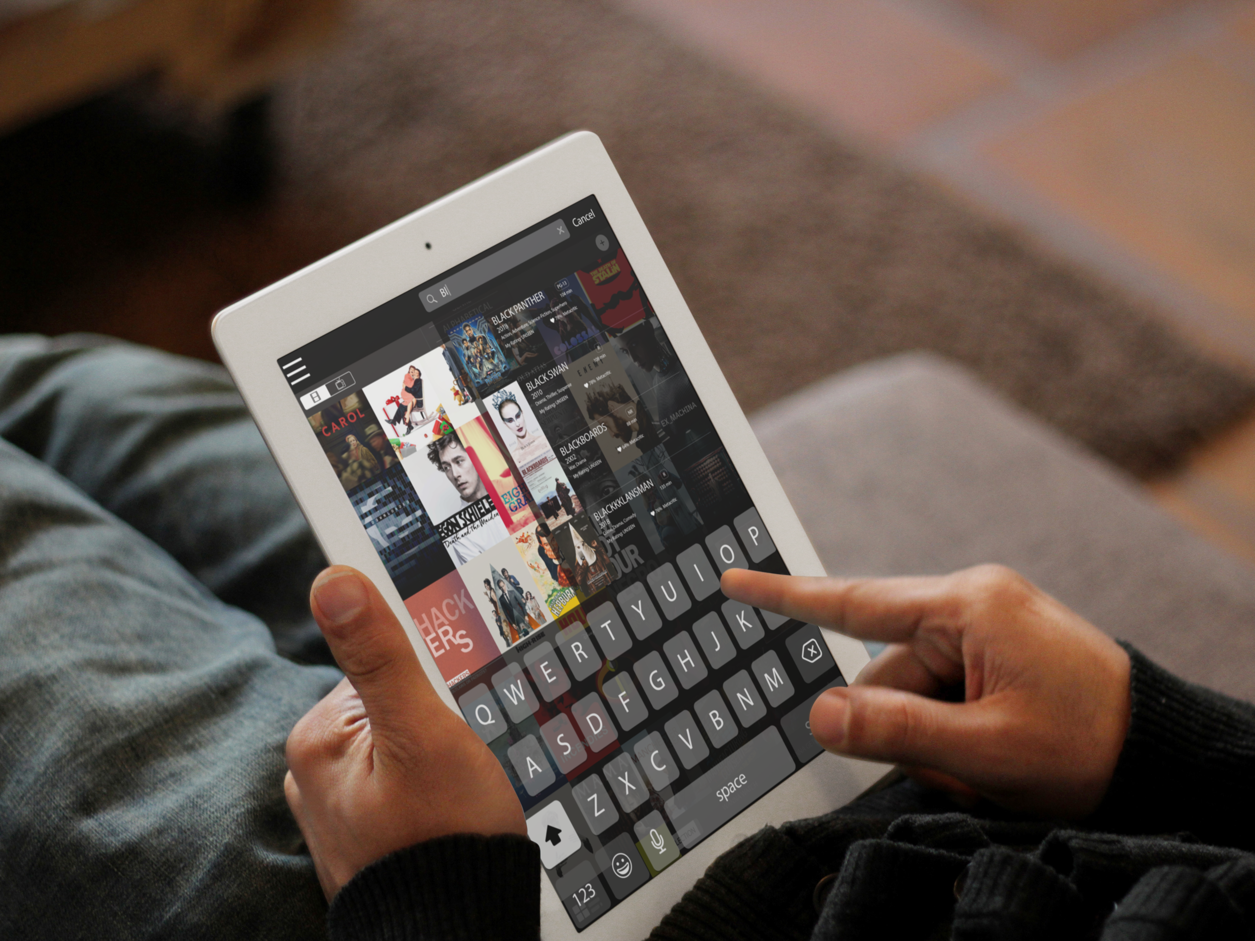
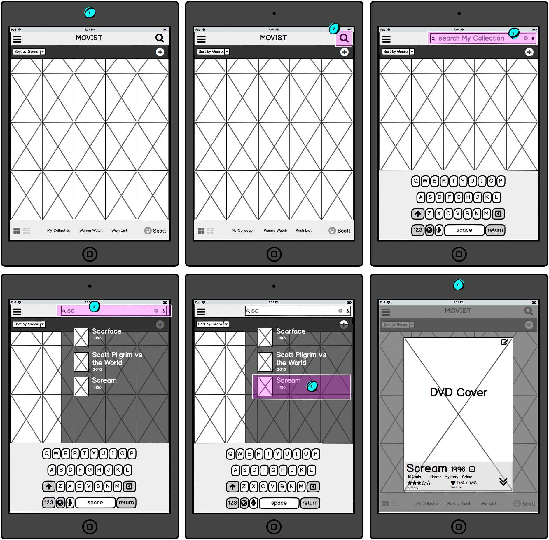
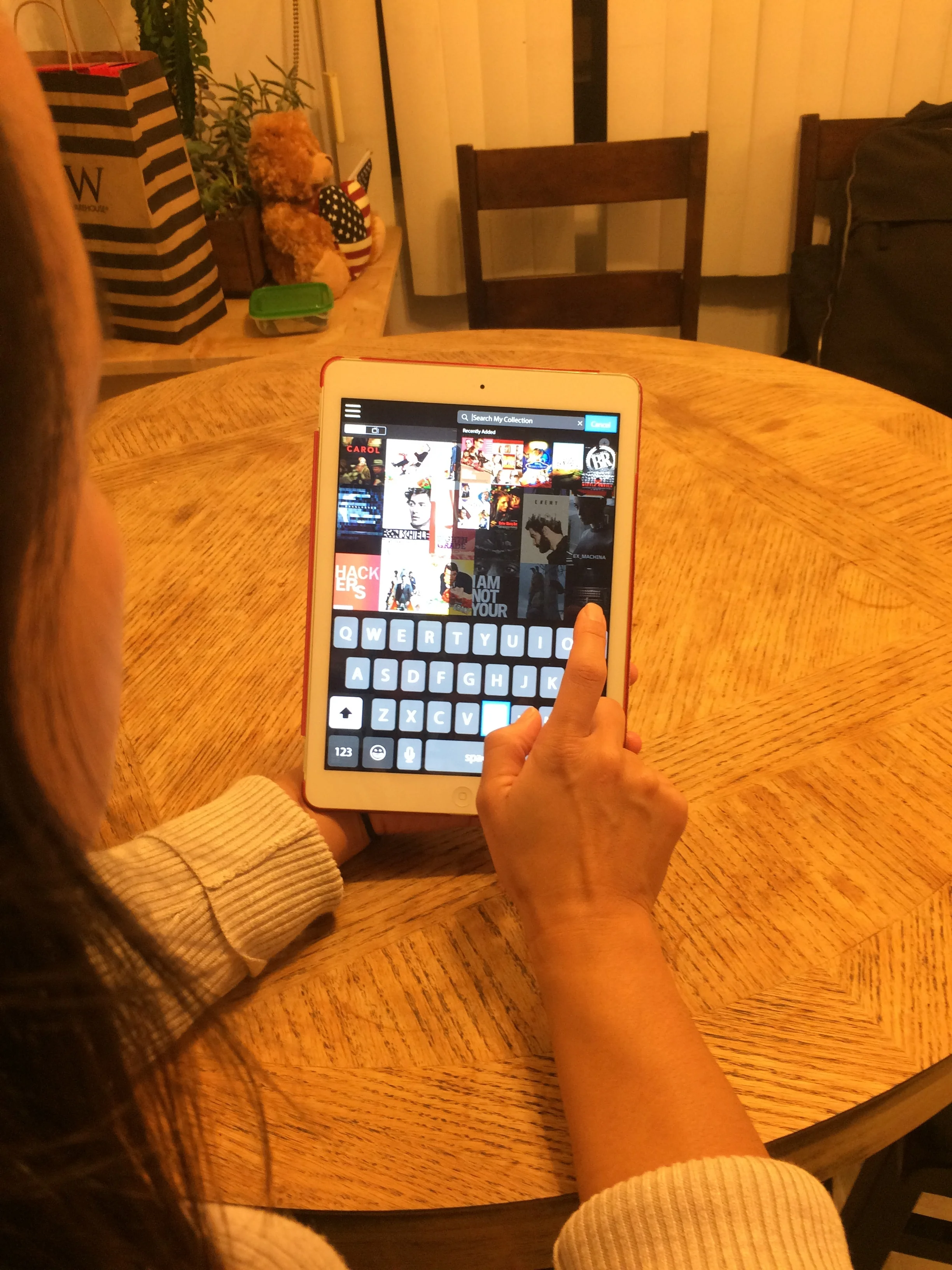
Searching The Collection (New Feature)
The original app doesn’t include a way for users to search their existing Collection. Instead, it uses the search feature for searching the extensive IDMB database so users can add new titles to their Collection.
The redesign separates the “Search” and “Adding Titles” functions into two distinct tools.
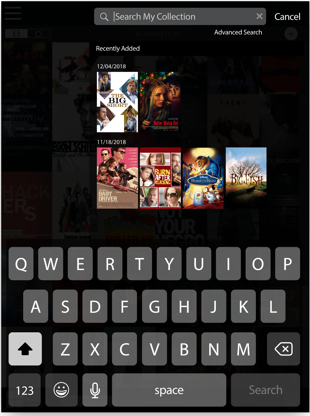
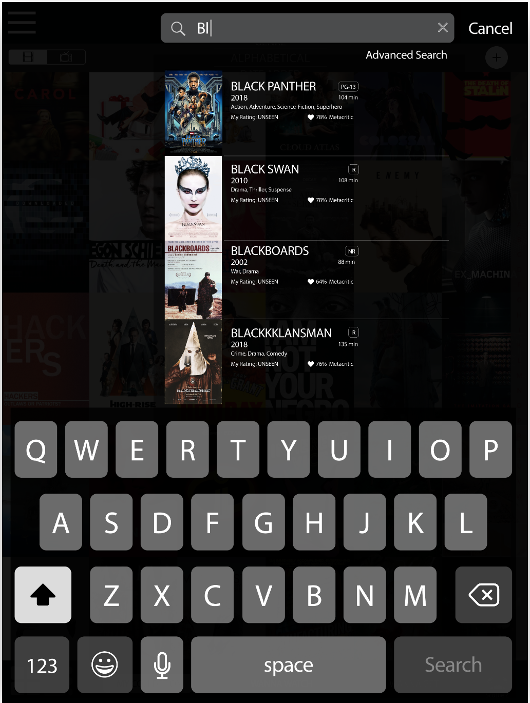
For searching the Collection, users can now tap the magnifying glass which brings up both the keypad as well as the titles that have been recently added to the user’s Collection. As users type, titles in their collection begin to appear so users don’t have to enter the entire title name. An “Advanced Search” is also planned for future iterations so that users can search by other (or multiple) criteria.
Search
Behind the Scenes
Initial data was collected through interviews that also asked users to complete several tasks within the actual (original) app. While all of the participants owned film and tv shows, none of them had ever used Movist before.
As they attempted to complete the given tasks, all participants were vocal with their frustration and bewilderment. Some users eventually stumbled upon a necessary feature, while others couldn’t complete the task at all.
At the end of the interview, I asked if Movist was something they would use again. I thought I knew the answer but, to my surprise, everyone said yes. Pointing out their frustration during the tasks, I asked why. The answer from everyone was, “I like the way it looks.”

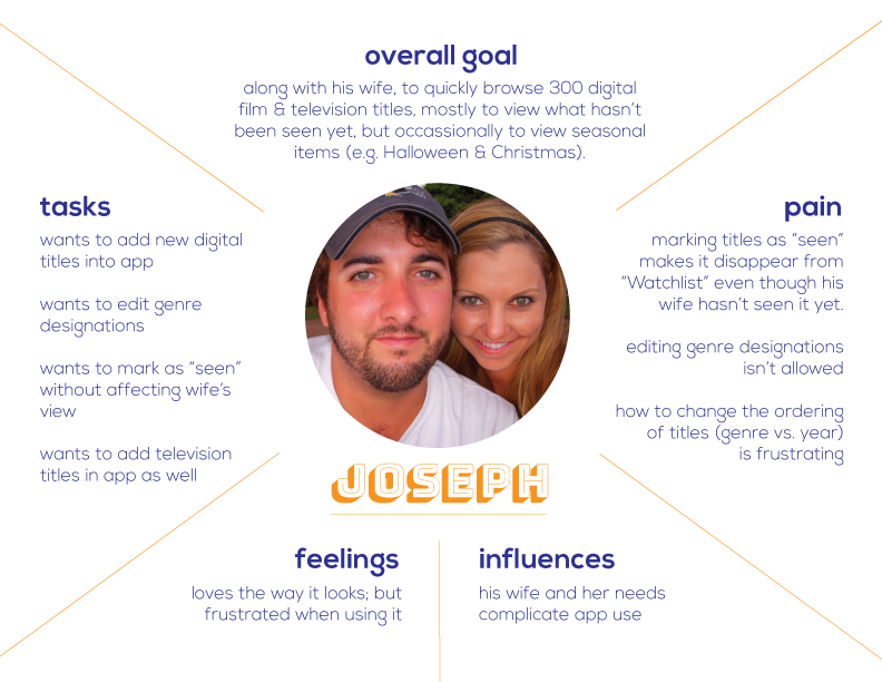
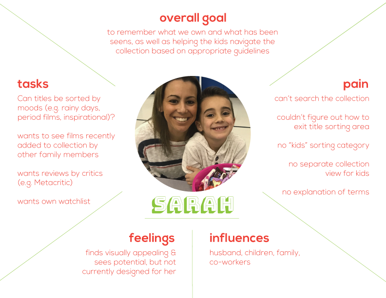
Those interviews resulted in empathy maps (above) for three different types of users:
The couple that wants to share the app on a single device,
The person with a very large collection
The family with small children.
Since the look of the app tested so strongly with users, little was changed aesthetically. Instead, wireframes (below) were created in an attempt to reduce the amount of frustration users had felt during the initial interviews. Some of those issues included:
The magnifying glass causes confusion. It isn’t being used for searching the Collection but, instead, for adding titles to the Collection.
On the title cards, users can only make one single selection at a time. After making any selection (e.g. “Mark As Seen”), the title card window closes. This forces users who want to make multiple selections to open the title card window multiple times.
It’s difficult to figure out how to sort the Collection. Even after users figure it out, they still have problems accessing the “sort” screen again.
There is only one single Collection. Therefore, changing the status of a title (e.g. “Mark As Seen”) changes it for all users regardless of whether everyone using the app has seen that title.
The navigation names caused confusion and the style applied to the navigation rendered it invisible to several users.
Based on the initial interviews and empathy maps, a working prototype was created in Marvel to be used with user tests. Because users seemed to find the original app visually appealing, the prototype was created in high fidelity to dissuade users from focussing on the lack of design.
User were tasked to complete three workflows. While the prototype generated mostly favorable responses, it also revealed some overlooked aspects and areas that needed to be refined, including:
Some terminology & symbols were still unclear (mostly on title cards);
Some users wanted the camera-access popup to include “Always Allow”;
Users wanted the changing profiles option to be more accessible;
Popups were too small in appearance;
When searching the Collection, the “Recently Added” thumbnails weren’t easily seen because the background wasn’t muted enough;
For editing title cards, The “Actions” part of “Share & Actions…” wasn’t understood by most people;
Everyone took “Edit Title’s Information” literally; the option is supposed to be for more than just editing the name of the actual title.
These issues were incorporated into the next iteration of the Movist prototype.