— Rebranding —
Sustainability Center

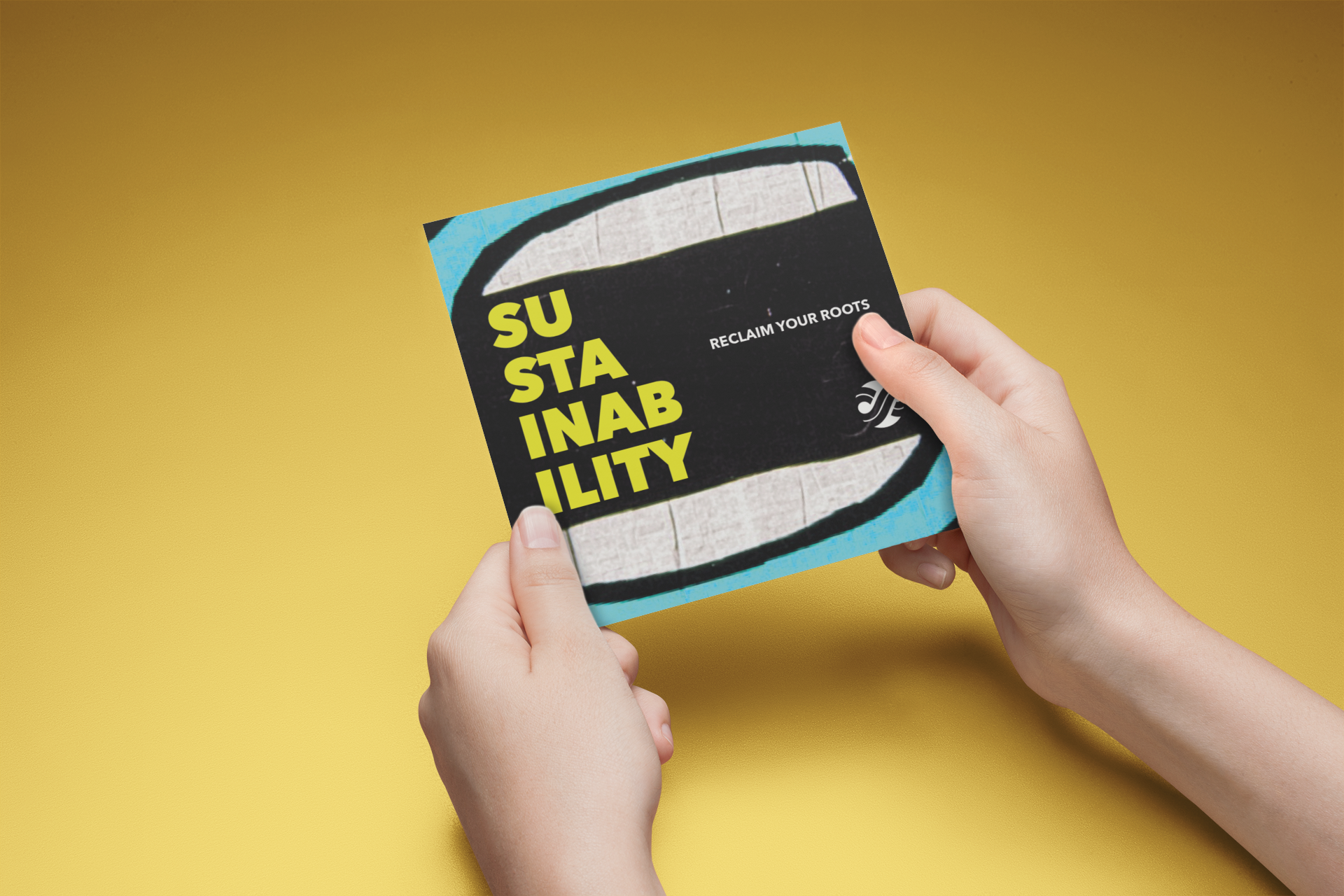
Reclaim Your Roots
The Sustainability Center presented an interesting challenge: How do you rebrand a Center that, while defined as an environmental entity, wants to break from the clichéd imagery of the environmental movement?
Project Manager for Sustainability, Ferris Kawar, had given both a brief and an interview, but I wanted to find out more about why the Center was so hesitant to use images of leaves or the color green.
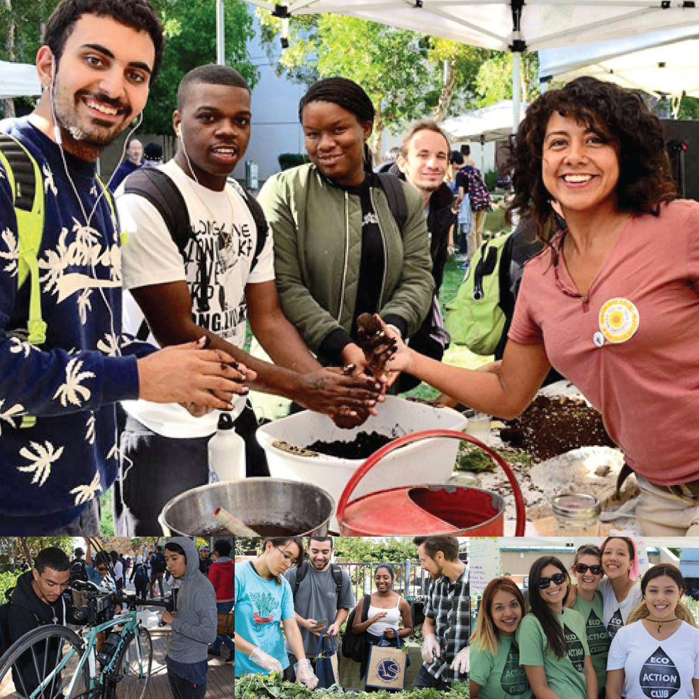
Visiting the Center again, I asked Kawar to tell me stories: about their various programs and partnerships, about their staff and volunteers, and about the people who visited the Center. As he spoke, eventually lamenting that the Center continued to “preach to the choir” instead of reaching students who didn’t even know they might be interested in sustainability, something clicked: their audience wasn’t “green”; it was college students.


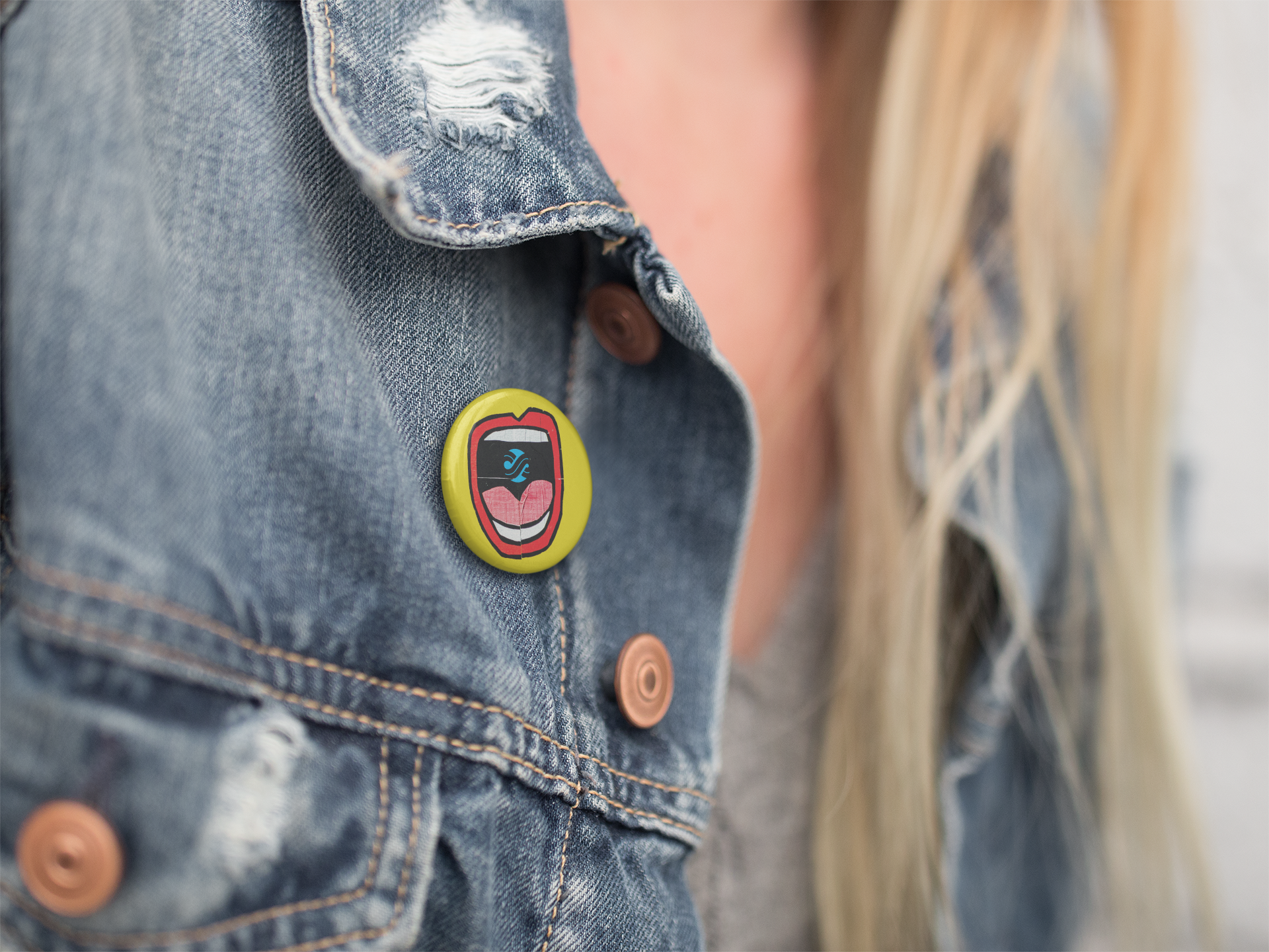


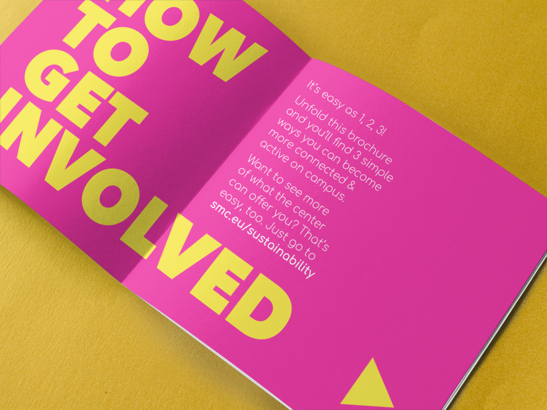
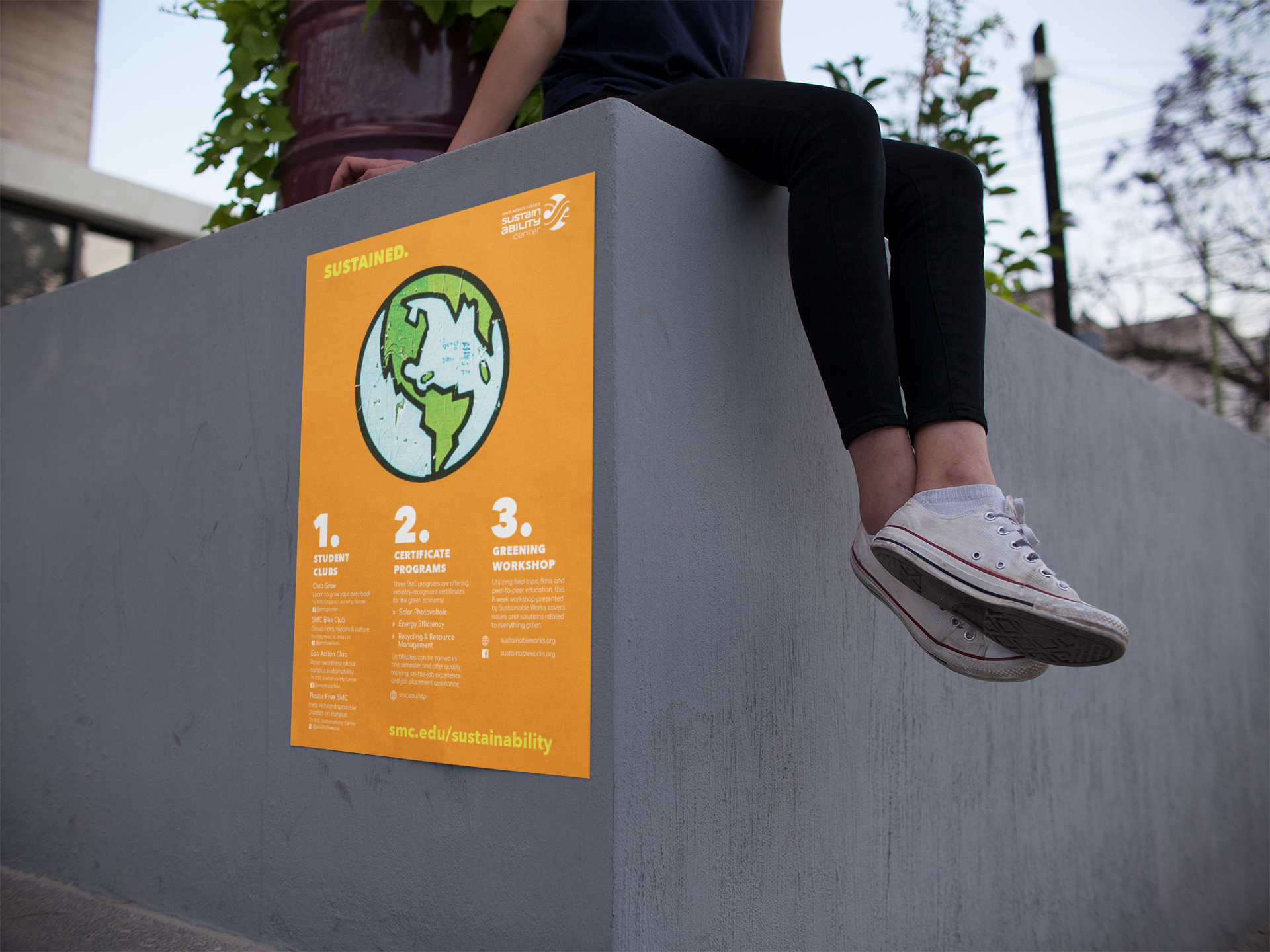
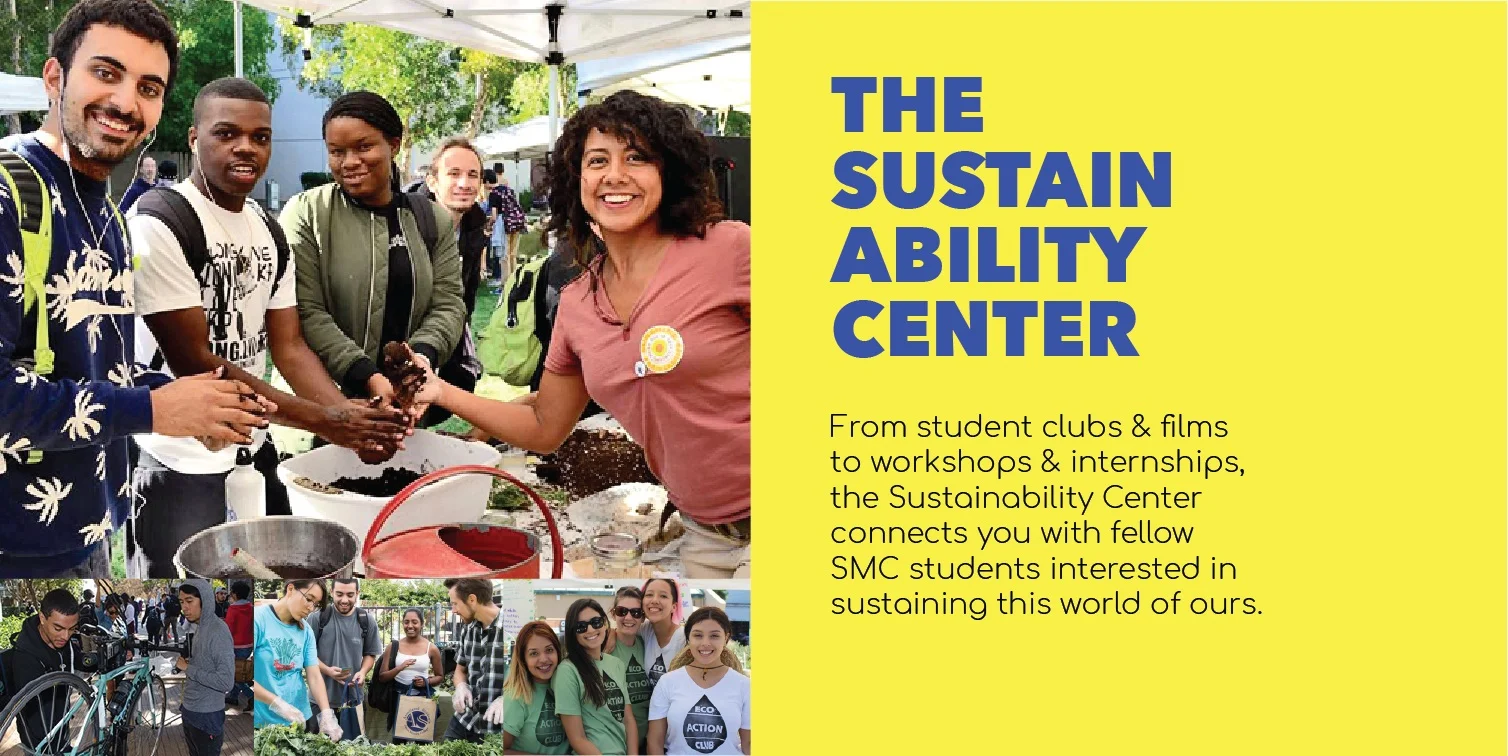
That mental switch made all the difference. Keeping a student demographic in mind, the rebranding experimented with bright colors, gritty textures, and an urban aesthetic. It also emphasized images that showed participation, connections, and socializing. This direction influenced the design for all collateral pieces, from brochures and posters to postcards and promotional items.
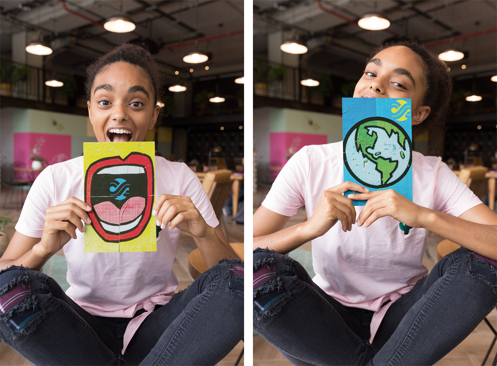

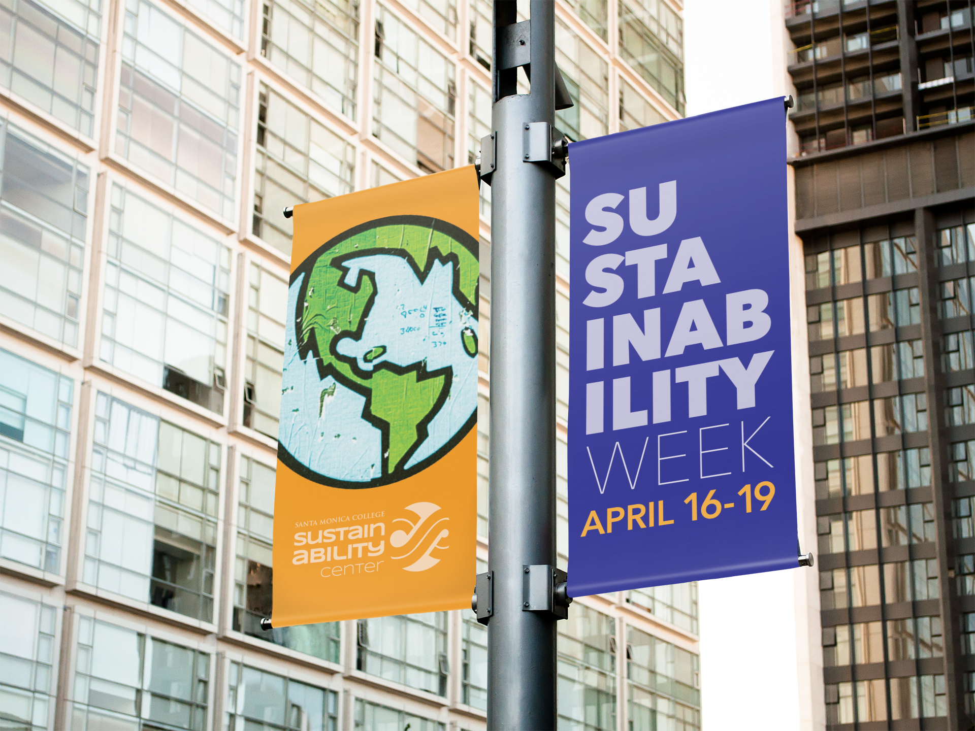
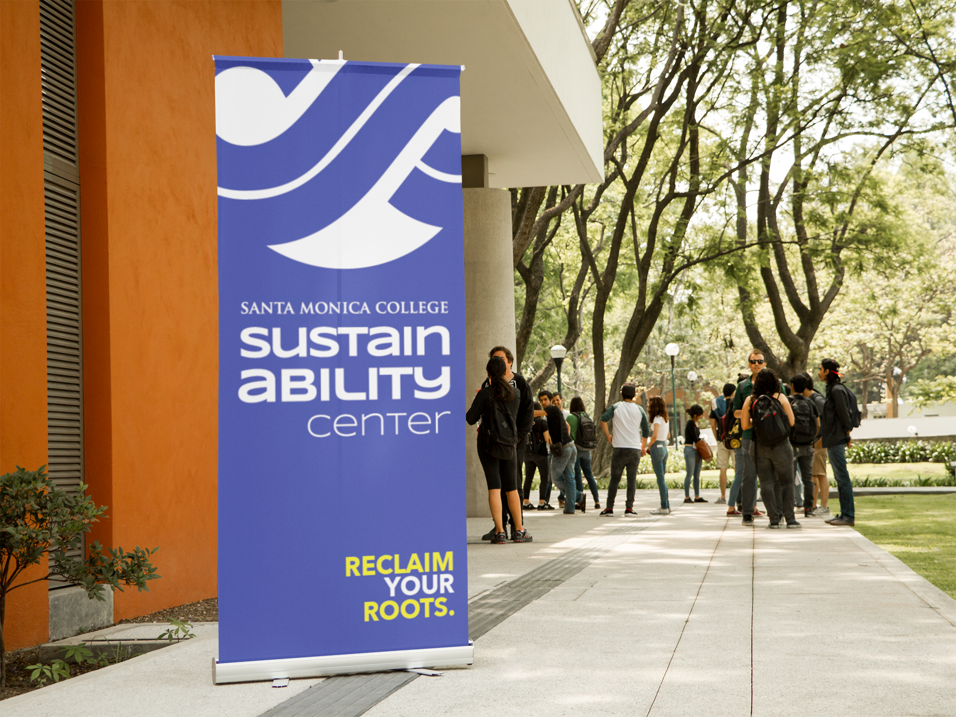
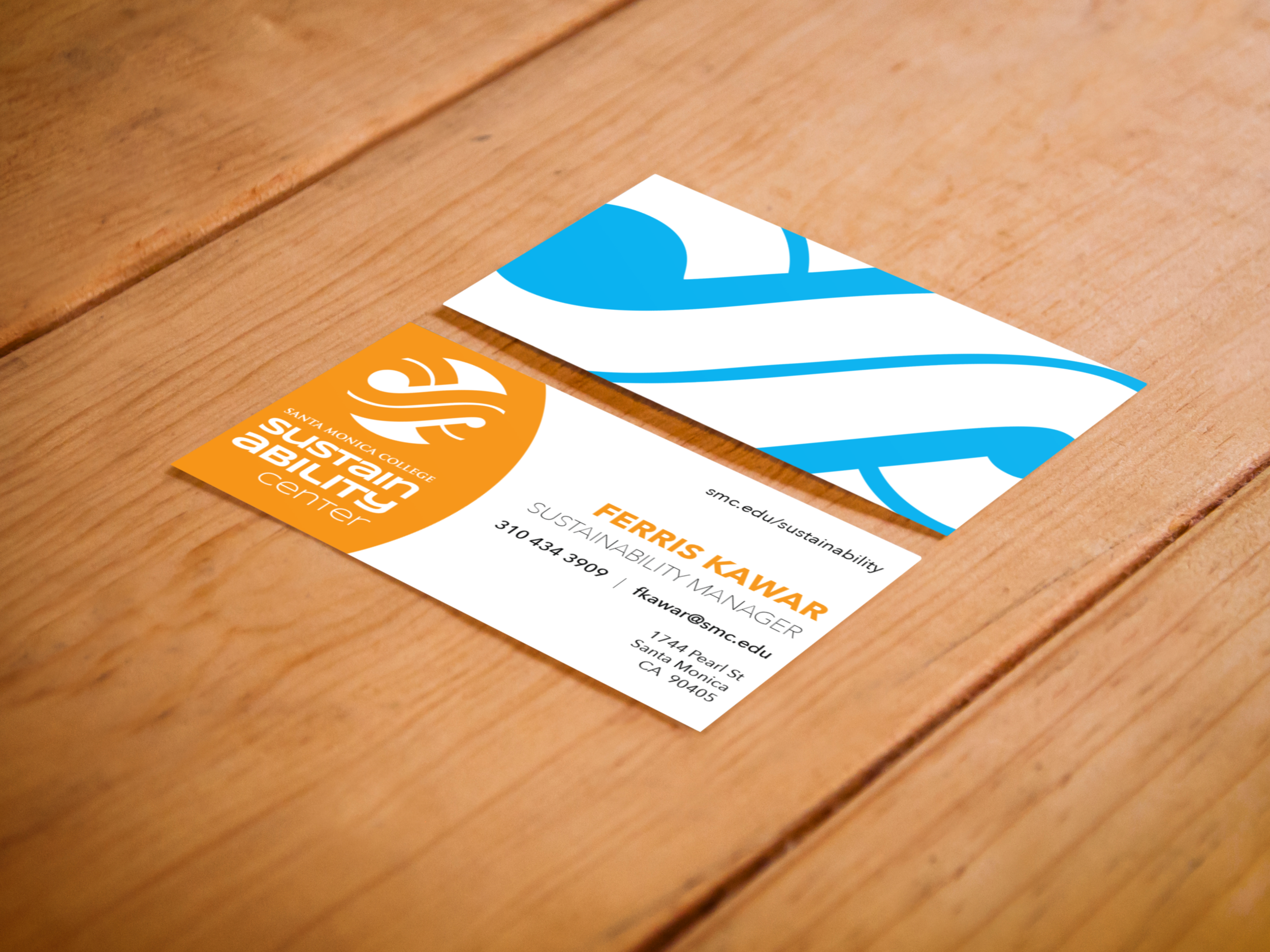
Playing with images of the earth and the letters “S” and “C”, the logo icon evolved into a lemniscate appearing within the center of an Earth-shaped circle. Because the Sustainability Center is a place for students to gather, learn, and create around the ideas of sustainability & environmentalism, I wanted the logo, itself, to interact with—and become a part of—its environment as well. Therefore, the negative space created by the lemniscate is not white, but transparent; it picks up the background colors and textures of whatever it rests upon.
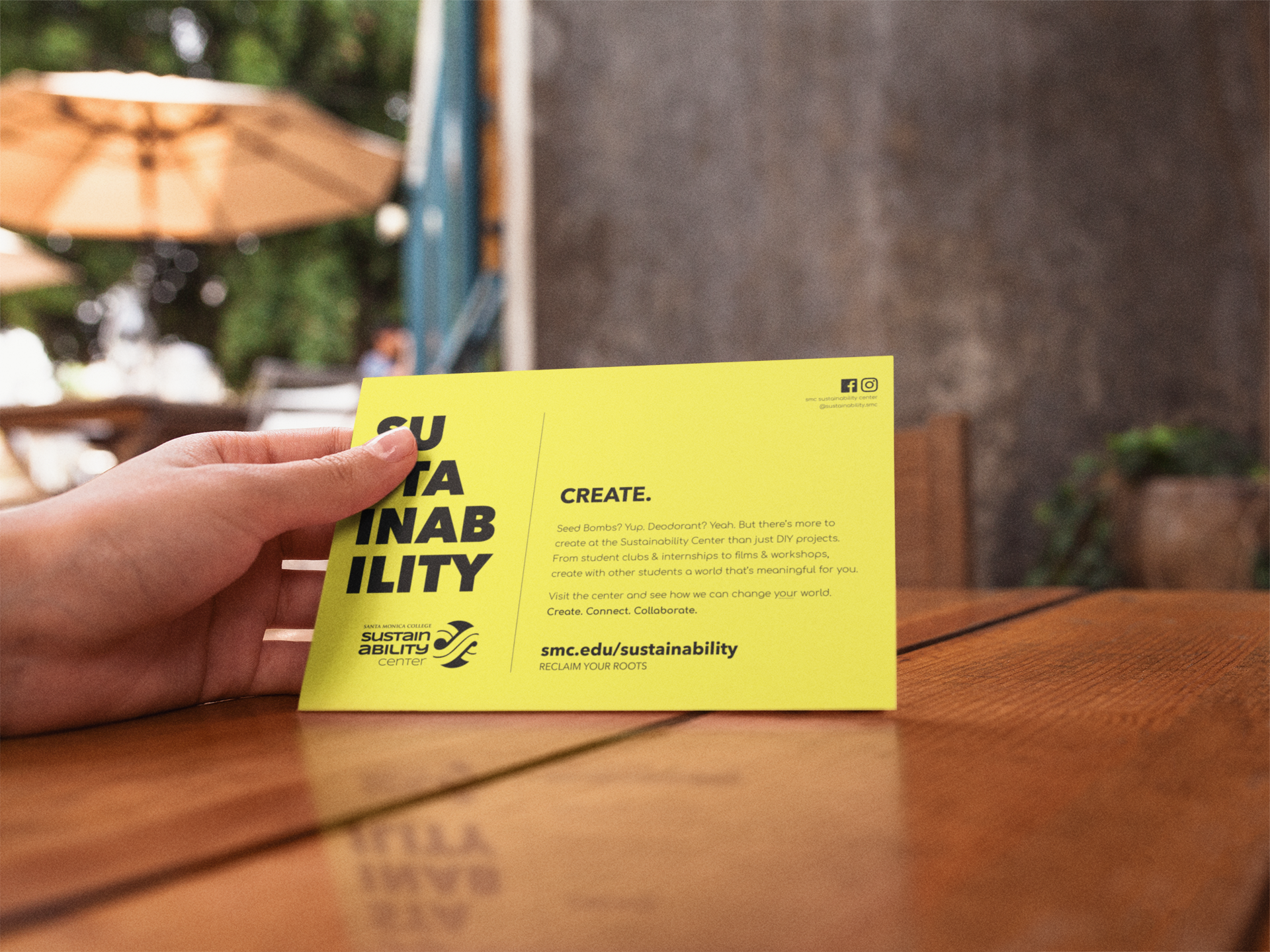
For the wordmark, “Sustainability” is split in half. This not only reduces the word’s line length, but it also helps emphasize the “ability” we all possess to help sustain the planet.